challenge 09; round 01: results
Thank you to everyone who participated and voted this round. Keep up the good work! Unfortunately one person must go this round...
ELIMINATED \\ untiitled

with -10 votes
Sorry to see you go, but I hope you stick around to vote and come back for the next challenge!
VOTER'S CHOICE \\ exotic-xia

with +6 votes
BANNER
MOD'S CHOICE \\ tory_guvera

BANNER
TALLY:
If your number is not listed, you received no comments.
01: - + | 0 |
02: - - - - - - - - - - | -10 | ELIMINATED
03: - + + + + + | +4 |
04: - + + | +1 |
05: + | +1 |
06: | |
07: + + + + | +4 |
08: + + + + + + | +6 | VOTER'S CHOICE
09: + + + + | +4 | MOD'S CHOICE
10: - - - - | -4 |
11: - | -1 |
12: - + | 0 |
13: - - - - - | -5 |
COMMENTS:
01.

by jelly-head91
- Though the creativity is appreciated, the background used doesn't suite the image well, I think if a different background would have been used, it would be better.
+ The coloring is gorgeous, the texture in the background works really well with Britney - it complements the original image really well.
02.
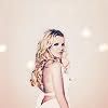
by untiitled
- The image is very poor quality, it looks like it may have been very oversharpened.
- It's over sharpened and you can't see Britney's face very well.
- Whilst I like the texture and the concept of the icon, for me the image of Britney is slightly oversharpened and it seems as though Britney is just blending into the texture
- too sharpened
- The icon looks dull and colorless; maybe a little bit of contrast would've improved it. Apart from that, I see that it is saved as .jpg, this may be the reason it seems to have very low quality. .jpg files compress the image, causing them to become grainy. It is better to save icons under .png :)
- This icon is either oversharpened, or wasn't saved at a high enough quality, because there are a lot of "artifacts" around her clothes, hair, and face.
- the quality of this icon is pretty low..probably because it's a .jpg. be sure to save all your images in .png because it always keeps the quality of the image high and doesn't turn low quality over time.
- the coloring of her face blends in to much with the background.
- the coloring is really awkward. Britney pretty much blends into the background
- colors look dirty, and I see the pixels around hair
03.
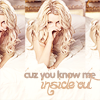
by dudette-in-town
- i think the text ruins it... bad font choice. also the cutting is awkward.
+ lovely use of repetition, gorgeous colouring and I love the text use
+ the cutting/blending is superb!and the coloring is spot on...
+ The repetition is interesting, and the coloring is subtle and suits the image very well.
+ i like how the pic is repeated in the icon. good choice of lyrics too. the font and the coloring of the font is really good and matches the color of the icon.
+ I love the 3-peat, and the text takes up all of the empty space the crop left over
04.

by jorge-2
- i think the light texture is hiding her eye way too much
+ i like the lighting at the top of the icon..it gives it a neat effect. i also like the font and the colors of the font..it goes well with the coloring of the icon. and i like how the text is at an angle. and the icon is very high quality.
+ the combination of the crop and text is really well balanced.
05.
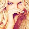
by creative-candy
+ i love how they cropped her dead center and i like the hot pink tint
06.
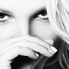
by fuuurs
NO VOTES
07.
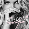
by redhour
+ Nice text placement and good crop. however, the icon could use some more brightness.
+ love the b/w contrast and the text is brilliant
+ love the text and the pop of pink on the black and white
+ Text placement's just clever. Beautiful crop, too
08.

by exotic-xia
+ The cropping has been very well done and the coloring is wonderful for this image.
+ Good crop and nice colouring.
+ Excellent cropping. The bright spot adds emotion to the picture, it looks really good.
+ Great crop, pretty coloring, and the contrast is just right!
+ eye catching crop and nicely colored.
+ pretty colors and crop
09.

by tory-guvera
+ The crop and color is beautiful and the way they just took Britney and took the rest of the picture away and replaced it with a neutral color makes the icon simple in wonderful way.
+ i love the usage of empty space and the soft coloring brings out the icon
+ The color is amazing, the use of white space is very well done.
+ Great use of negative space. Even with that cropping, and all the blank space around, Britney remains the focal point. It's very simple, which proves that sometimes less is more. I do think her skin is a little too orange, though.
10.

by hermionesparkle
- For a textless icon the crop doesn't work, it's unbalanced - there's too much 'weight' in the upper left corner.
- the coloring of this could be improved by using the 'color balance'..it looks too yellowish/orange-ish for my taste. and it could be sharpen a little bit more.
- the picture is a little blurry; the crop is really awkward-there's empty space but no reason for it.
- i like the crop but the coloring is too yellowy and she looks blurry... not sharp enough
11.

by cuyler-morgan
- The crop is sort of strange (her foreheard is so blank, it's not very interesting to look at; having more of her hand would have been more interesting), and the coloring is sort of off. The range of colors is VERY small, the whites of her eyes are yellow (same with her nails) and the contrast is off.
12.
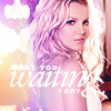
by gettingdrastic
- The text is difficult to read.
+ I really just like the coloring, lol!
13.

by x-sweetsurprise
- I feel that the image is over sharpened and the text use is a little awkward
- The coloring is a bit dark. Also the font choice doesn't match the overall icon.
- Your text use here doesn't blend into the icon, it just looks something pasted at the end. You could've played around a little more, changing the colors and/or finding another position to put it. Sencond, the image looks way too sharp on the edges of her hair.
- the coloring is to dark and it makes her face look pixelated around the edges.
- too sharpened; text doesn't go well with the image
Did I miscount the votes? Does a comment not make sense? Think a comment needs to be fixed? Let me know about any of those things, or even anything at all about the entire round. I will do the best that I can to fix!
ELIMINATED \\ untiitled

with -10 votes
Sorry to see you go, but I hope you stick around to vote and come back for the next challenge!
VOTER'S CHOICE \\ exotic-xia
with +6 votes
BANNER
MOD'S CHOICE \\ tory_guvera

BANNER
TALLY:
If your number is not listed, you received no comments.
01: - + | 0 |
02: - - - - - - - - - - | -10 | ELIMINATED
03: - + + + + + | +4 |
04: - + + | +1 |
05: + | +1 |
06: | |
07: + + + + | +4 |
08: + + + + + + | +6 | VOTER'S CHOICE
09: + + + + | +4 | MOD'S CHOICE
10: - - - - | -4 |
11: - | -1 |
12: - + | 0 |
13: - - - - - | -5 |
COMMENTS:
01.

by jelly-head91
- Though the creativity is appreciated, the background used doesn't suite the image well, I think if a different background would have been used, it would be better.
+ The coloring is gorgeous, the texture in the background works really well with Britney - it complements the original image really well.
02.

by untiitled
- The image is very poor quality, it looks like it may have been very oversharpened.
- It's over sharpened and you can't see Britney's face very well.
- Whilst I like the texture and the concept of the icon, for me the image of Britney is slightly oversharpened and it seems as though Britney is just blending into the texture
- too sharpened
- The icon looks dull and colorless; maybe a little bit of contrast would've improved it. Apart from that, I see that it is saved as .jpg, this may be the reason it seems to have very low quality. .jpg files compress the image, causing them to become grainy. It is better to save icons under .png :)
- This icon is either oversharpened, or wasn't saved at a high enough quality, because there are a lot of "artifacts" around her clothes, hair, and face.
- the quality of this icon is pretty low..probably because it's a .jpg. be sure to save all your images in .png because it always keeps the quality of the image high and doesn't turn low quality over time.
- the coloring of her face blends in to much with the background.
- the coloring is really awkward. Britney pretty much blends into the background
- colors look dirty, and I see the pixels around hair
03.

by dudette-in-town
- i think the text ruins it... bad font choice. also the cutting is awkward.
+ lovely use of repetition, gorgeous colouring and I love the text use
+ the cutting/blending is superb!and the coloring is spot on...
+ The repetition is interesting, and the coloring is subtle and suits the image very well.
+ i like how the pic is repeated in the icon. good choice of lyrics too. the font and the coloring of the font is really good and matches the color of the icon.
+ I love the 3-peat, and the text takes up all of the empty space the crop left over
04.

by jorge-2
- i think the light texture is hiding her eye way too much
+ i like the lighting at the top of the icon..it gives it a neat effect. i also like the font and the colors of the font..it goes well with the coloring of the icon. and i like how the text is at an angle. and the icon is very high quality.
+ the combination of the crop and text is really well balanced.
05.

by creative-candy
+ i love how they cropped her dead center and i like the hot pink tint
06.

by fuuurs
NO VOTES
07.

by redhour
+ Nice text placement and good crop. however, the icon could use some more brightness.
+ love the b/w contrast and the text is brilliant
+ love the text and the pop of pink on the black and white
+ Text placement's just clever. Beautiful crop, too
08.

by exotic-xia
+ The cropping has been very well done and the coloring is wonderful for this image.
+ Good crop and nice colouring.
+ Excellent cropping. The bright spot adds emotion to the picture, it looks really good.
+ Great crop, pretty coloring, and the contrast is just right!
+ eye catching crop and nicely colored.
+ pretty colors and crop
09.

by tory-guvera
+ The crop and color is beautiful and the way they just took Britney and took the rest of the picture away and replaced it with a neutral color makes the icon simple in wonderful way.
+ i love the usage of empty space and the soft coloring brings out the icon
+ The color is amazing, the use of white space is very well done.
+ Great use of negative space. Even with that cropping, and all the blank space around, Britney remains the focal point. It's very simple, which proves that sometimes less is more. I do think her skin is a little too orange, though.
10.

by hermionesparkle
- For a textless icon the crop doesn't work, it's unbalanced - there's too much 'weight' in the upper left corner.
- the coloring of this could be improved by using the 'color balance'..it looks too yellowish/orange-ish for my taste. and it could be sharpen a little bit more.
- the picture is a little blurry; the crop is really awkward-there's empty space but no reason for it.
- i like the crop but the coloring is too yellowy and she looks blurry... not sharp enough
11.

by cuyler-morgan
- The crop is sort of strange (her foreheard is so blank, it's not very interesting to look at; having more of her hand would have been more interesting), and the coloring is sort of off. The range of colors is VERY small, the whites of her eyes are yellow (same with her nails) and the contrast is off.
12.

by gettingdrastic
- The text is difficult to read.
+ I really just like the coloring, lol!
13.

by x-sweetsurprise
- I feel that the image is over sharpened and the text use is a little awkward
- The coloring is a bit dark. Also the font choice doesn't match the overall icon.
- Your text use here doesn't blend into the icon, it just looks something pasted at the end. You could've played around a little more, changing the colors and/or finding another position to put it. Sencond, the image looks way too sharp on the edges of her hair.
- the coloring is to dark and it makes her face look pixelated around the edges.
- too sharpened; text doesn't go well with the image
Did I miscount the votes? Does a comment not make sense? Think a comment needs to be fixed? Let me know about any of those things, or even anything at all about the entire round. I will do the best that I can to fix!