challenge 7; round 9: results
ELIMINATED \\ Nadya149

with -4 votes
Sorry to see you go, but I hope you stick around to vote!
VOTER'S CHOICE \\ value

with +3 votes | BANNER
MOD'S CHOICE \\ alice-trip

the coloring and crop are just absolutely wonderful in this icon. | BANNER
TALLY:
If your number is not listed, you received no comments.
01: + + + | VOTER'S CHOICE
02: + +
03: - - - - | ELIMINATED
04: -
COMMENTS:
01.
+ great use of textures very original
+ The iconist did very well on the icon overall.
+ this one seems most original and it's something new, and it looks awesome! the coloring is just right, and i like how Britney is outlined. And I like the texture used. But there is one little thing that doesn't feel right. The size (I think Britney should have been just slightly bigger in size)
02.
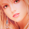
+ the cropping is great! I love how it shows the earring, but still doesn't focus on it!
+ I love the crop, it's very simple and understated. The coloring is nice, it's very well done.
03.
- too blurry around the face also the eyes look darker than the rest of the face
- The icon is too blurry, and the coloring is a pit too pink.
- The cropping doesn't flatter Britney's face and the coloring is overpowering.
- the coloring is not the best. the avatar seems blurry/soft. i don't exactly feel right about the cropping (her right eye is cut off, it feels wrong). the size (maybe she/he could have made her more smaller like what #04 did)
04.
- over sharpen and the coloring is really green! the cropping is also centered which makes it look boring!