challenge 7; round 4: results
ELIMINATED \\ latteea

with -4 votes
ELIMINATED \\ jane498
with -4 votes
Sorry to see you go, but I hope you stick around to vote!
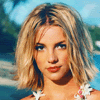
VOTER'S CHOICE \\ alice-trip

with +1 votes | BANNER
MOD'S CHOICE \\ buffymars
nice crop, great coloring. | BANNER
TALLY:
If your number is not listed, you received no comments.
01: - - +
02: -
03:
04: - - +
05: - - - - + +
06: - + + | VOTER'S CHOICE
07: - - - - | ELIMINATED
08: - - - - | ELIMINATED
If you'd like to see your comments, reply with your number.
For now on I'm posting comments in the post.
01.
- The icon is too dark
- the colouring isn't quite right
+ for nice bronze-colors and right crop
02.
- I really like the cropping, but the coloring is really bright, specially on her face!
04.
- too much red, crop actually is not good
- Oversharpened
+ I love the cropping, and it's nice and bright, I like the simplicity
05.
- icon need more contrast
- the icon is blury and very bright
- the texture is to busy and takes focus away from Britney
- It's a little blurry and the coloring/texture used isn't the right color, it's distracting
+ nice colouring.
+ Good crop & color
06.
- Lovely crop and colour but the choice of texture overpowers the image and doesn't fir the mood of the icon at all.
+ the rounded border really compliments the whole icon!
+ it is a simple but pretty icon, the lighting is good.
07.
- bad b/w contrast
- The contrast is too low, causing Britney, the focus of the icon to blend into the background.
- The black & white needs more contrast
- Too dark, bad quality
08.
- the cropping is very dull, and the coloring is weird! so much "selective coloring"
- The icon is too sharp
- not much has been done to the icon, to simple, needs something more for it to be a excellent icon
- I don't like the crop, and the quality is a little low