Anatomy of a comic page
I drew most of my recent "How the Little Mermaid should have ended" comic on my lunch breaks at work. My co-workers saw me working on it in the break room and they were actually pretty fascinated/shocked to find out that so much planning and math goes into making a comic page (they saw me using a ruler and calculator while drawing and thought that seemed weird). So I stopped to explain to them that I had to measure how much panel/paper space I was working with and figure out how much space each panel needed to get the point across. I also explained the process of trimming the dialog and scenes in order to figure out how to get the point across in just one page. To my surprise, they found it to be really interesting; so I thought I'd put my scratch pages with the measurements here just so you guys can see it, too.
Initial Idea Page
This is where I brain-stormed my idea for the comic and which scenes I wanted to include.
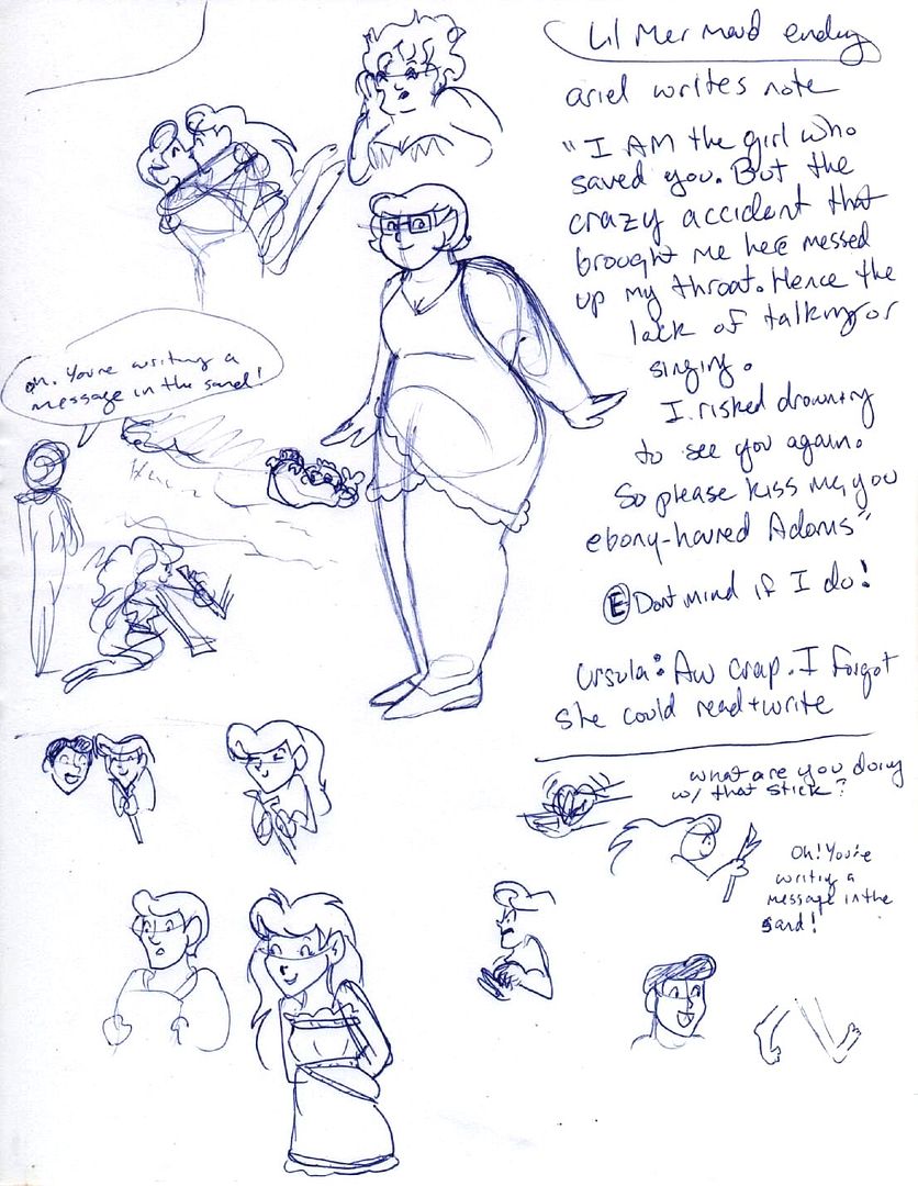
As you can tell, this page started it's life as a simple Velma drawing. But my muse had other ideas. LOL
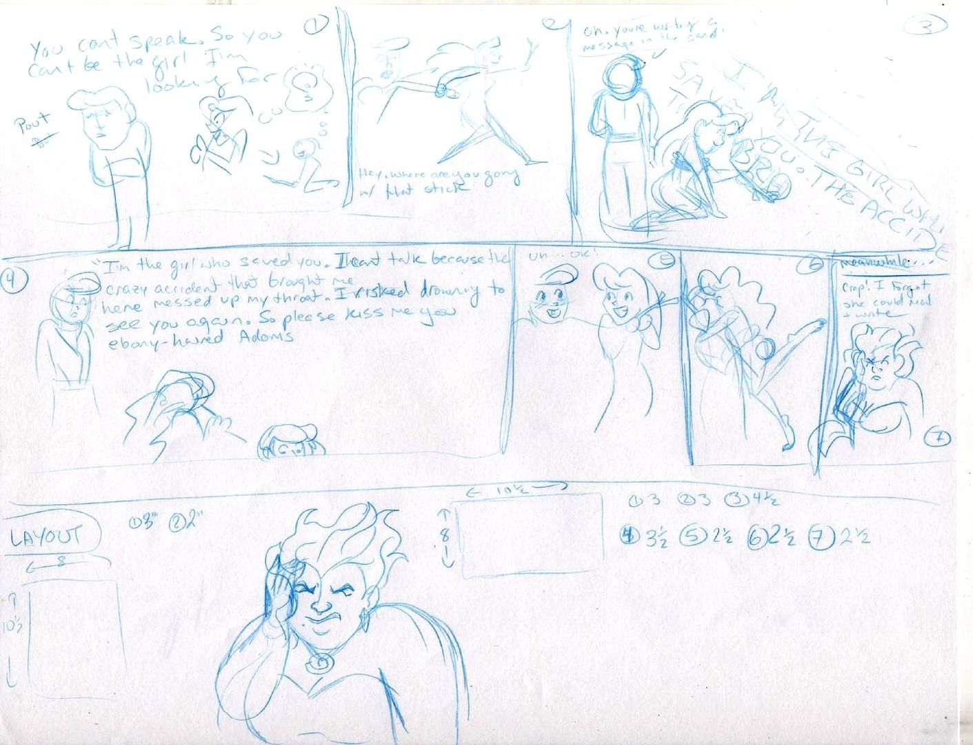
The "Planning Page"
This is where I started measuring how much panel space I would need (I measured for both a vertical and horizontal layout), how the panels should look, how many panels there should be, and which ideas needed to be cut to make the joke come across better. It's also the step where I start trimming the dialog so the comic doesn't end up being too text-heavy.
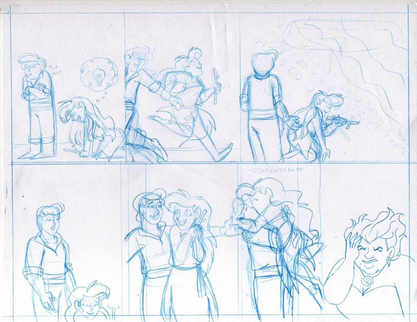
The finished comic (pre-inking)
Finished comic!

Well, there it is! That's my creative process. I typically don't show off my brain-storming doodles because they tend to be ugly and boring. But my co-workers thought that the comic-making process was interesting. So I figured I'd share it here, too.
Initial Idea Page
This is where I brain-stormed my idea for the comic and which scenes I wanted to include.

As you can tell, this page started it's life as a simple Velma drawing. But my muse had other ideas. LOL
The "Planning Page"
This is where I started measuring how much panel space I would need (I measured for both a vertical and horizontal layout), how the panels should look, how many panels there should be, and which ideas needed to be cut to make the joke come across better. It's also the step where I start trimming the dialog so the comic doesn't end up being too text-heavy.

The finished comic (pre-inking)

Finished comic!

Well, there it is! That's my creative process. I typically don't show off my brain-storming doodles because they tend to be ugly and boring. But my co-workers thought that the comic-making process was interesting. So I figured I'd share it here, too.