Tutorial 2
So, I've had a couple of people asking about the colouring for some of my FMA icons, and instead of just handing out the .psd, I decided to write a tutorial.

This tutorial will work best with bright images with a lot of blues, yellows and reds.
I've bolded the important steps and input values for those who don't want to read my massive explanations.
Note: If your image contains more green than it does blue, this tutorial will not preserve it's original colour, unless it's a very bright green. Counter this by changing the selective colouring steps so that in cyans and blues the section for yellows is not decreased.
Ok, start off with your resized and cropped base. Here's my base:

Step 1: If you've resized your original image to make your base, then it probably needs sharpening.
So, duplicate your base , and sharpen it using smart sharpen.
Filter → Sharpen → Smart Sharpen
Amount: 25%
Radius: 1.0 px
Duplicating your base allows you to return to the original if you oversharpen your base by mistake.
If you have oversharpened, you could also try lowering the opacity of your sharpened base so it blends with the
original layer underneath until you get the right amount of...sharp.
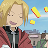
Step 2: It needs brightening! You could achieve this with a simple screen layer, but I prefer to use levels.
It gives you a lot more control over how bright you want to make your image, and lets you increase the
contrast in the same step too. It's like combining a screen layer and soft light layer together.
Layer → New Adjustment Layer → Levels
RGB: 10, 1.15, 240
Red: 3, 0.94, 249
Blue: 5, 0.97, 246
Because of how specific levels are, the same setting will not work for every image.
Play around with it until you get your desired outcome - I only wanted to increase the brightness,
not the contrast (I'll do that later).
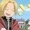
Step 3: Ok, it's bright, but it still lacks a lot of depth. So I'm going increase the overall saturation of the image
using a Hue/saturation adjustment layer.
Layer → New Adjustment Layer → Hue/Saturation
Master Saturation : +25
Set this layer to saturation blending mode so that it doesn't effect the lighting in the icon, just the colours.
Adjust the opacity until it suits your image - mine is set at 65%.
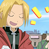
Step 4: Now for the fun part - selective colouring! There wasn't a specific colouring I wanted to achieve,
so I tried to just increase the colours of pretty much everything in the icon.
Layer → New Adjustment Layer → Selective Colour
Red: -100, 0, +2, 0
Yellow: -100, -15, +13, 0
Cyan: +100, 0, -100, 0
Blue: +100, 0, -100, 0
(Make sure relative is checked!!)

Step 5: Better! But now I don't think there's enough definition between the two shades in Ed's hair,
and it's still not bright enough. I also wanted to add contrast to the image, as I didn't do this in the levels layer (step 2).
So, add another selective colour adjustment layer.
Layer → New Adjustment Layer → Selective Colour
Red: -29, 0, -12, +20
Yellow: -25, +28, +18, 0
Green: -46, -60, +65, 0
Cyan: +100, 0, -64, 0
White: 0, +7, +12, 0
(Make sure relative is checked!!)
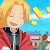
Step 6: Nearly there! But again, I wanted there to be more contrast and more colour.
Add a last selective colour adjustment layer.
Layer → New Adjustment Layer → Selective Colour
Reds: -48, -10, -29, +20
Yellows: -41, +4, -10, +12
Cyans: +81, 0, -95, -22
Blues: +71, -37, -58, +100
Whites: -28, +13, -22, 0
Neutrals: 0, 0, 0, +9
Blacks: 0, 0, 0, +5
(Make sure relative is checked!!)
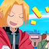
Done! Easy, wasn't it?
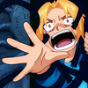
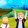
Other examples of this colouring:

Also - there won't be a .psd for this. Why?
Firstly, because it won't work for every image you have.
Secondly, because this is a tutorial - it's meant to teach. The only way you can learn from something is to do it by yourself.
So, please, even though it's short, take the time to experiment with every step. If you don't have
anything to follow along with, grab my base at the top and try it out. I hope this helps :)
If I've confused you, or you want me to clarify a certain step, just comment and I would be happy to help you out.

This tutorial will work best with bright images with a lot of blues, yellows and reds.
I've bolded the important steps and input values for those who don't want to read my massive explanations.
Note: If your image contains more green than it does blue, this tutorial will not preserve it's original colour, unless it's a very bright green. Counter this by changing the selective colouring steps so that in cyans and blues the section for yellows is not decreased.
Ok, start off with your resized and cropped base. Here's my base:

Step 1: If you've resized your original image to make your base, then it probably needs sharpening.
So, duplicate your base , and sharpen it using smart sharpen.
Filter → Sharpen → Smart Sharpen
Amount: 25%
Radius: 1.0 px
Duplicating your base allows you to return to the original if you oversharpen your base by mistake.
If you have oversharpened, you could also try lowering the opacity of your sharpened base so it blends with the
original layer underneath until you get the right amount of...sharp.

Step 2: It needs brightening! You could achieve this with a simple screen layer, but I prefer to use levels.
It gives you a lot more control over how bright you want to make your image, and lets you increase the
contrast in the same step too. It's like combining a screen layer and soft light layer together.
Layer → New Adjustment Layer → Levels
RGB: 10, 1.15, 240
Red: 3, 0.94, 249
Blue: 5, 0.97, 246
Because of how specific levels are, the same setting will not work for every image.
Play around with it until you get your desired outcome - I only wanted to increase the brightness,
not the contrast (I'll do that later).

Step 3: Ok, it's bright, but it still lacks a lot of depth. So I'm going increase the overall saturation of the image
using a Hue/saturation adjustment layer.
Layer → New Adjustment Layer → Hue/Saturation
Master Saturation : +25
Set this layer to saturation blending mode so that it doesn't effect the lighting in the icon, just the colours.
Adjust the opacity until it suits your image - mine is set at 65%.

Step 4: Now for the fun part - selective colouring! There wasn't a specific colouring I wanted to achieve,
so I tried to just increase the colours of pretty much everything in the icon.
Layer → New Adjustment Layer → Selective Colour
Red: -100, 0, +2, 0
Yellow: -100, -15, +13, 0
Cyan: +100, 0, -100, 0
Blue: +100, 0, -100, 0
(Make sure relative is checked!!)

Step 5: Better! But now I don't think there's enough definition between the two shades in Ed's hair,
and it's still not bright enough. I also wanted to add contrast to the image, as I didn't do this in the levels layer (step 2).
So, add another selective colour adjustment layer.
Layer → New Adjustment Layer → Selective Colour
Red: -29, 0, -12, +20
Yellow: -25, +28, +18, 0
Green: -46, -60, +65, 0
Cyan: +100, 0, -64, 0
White: 0, +7, +12, 0
(Make sure relative is checked!!)

Step 6: Nearly there! But again, I wanted there to be more contrast and more colour.
Add a last selective colour adjustment layer.
Layer → New Adjustment Layer → Selective Colour
Reds: -48, -10, -29, +20
Yellows: -41, +4, -10, +12
Cyans: +81, 0, -95, -22
Blues: +71, -37, -58, +100
Whites: -28, +13, -22, 0
Neutrals: 0, 0, 0, +9
Blacks: 0, 0, 0, +5
(Make sure relative is checked!!)

Done! Easy, wasn't it?
Other examples of this colouring:


Also - there won't be a .psd for this. Why?
Firstly, because it won't work for every image you have.
Secondly, because this is a tutorial - it's meant to teach. The only way you can learn from something is to do it by yourself.
So, please, even though it's short, take the time to experiment with every step. If you don't have
anything to follow along with, grab my base at the top and try it out. I hope this helps :)
If I've confused you, or you want me to clarify a certain step, just comment and I would be happy to help you out.