2 Steve Rogers/Captain America Tutorials
These two tutorials were requested by vapor at icon_talk
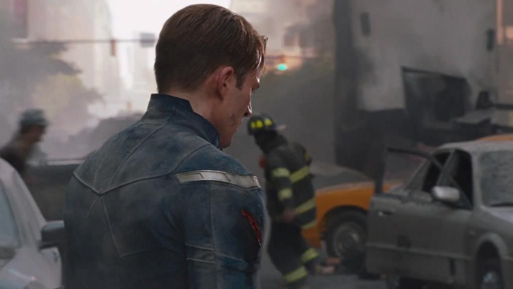
->
Judging by the fact the first bit I have in my PSD looks like the base has had some work done before I cropped it, I guess I did all the prep on the cap itself. Unfortunately I cannot tell you exactly what I did, but I'm guess it was the triple duplicate - screen / blurred screen / blurred soft light - method I detailed in the Clara tutorial.
Anyway, this is stage one:
The reason I think it was the method I used before is because it comes from roughly the same era of icons and it's a bit blurred! So first step was sharpen.
The type of sharpen is lost, but at the time I was running with 'smart sharpen' a lot so I imagine that's what it was [exact specifics unknown, sorry!], it's also set onto 61% opacity as full 100% was too sharp. Looking at it now, I should have just masked certain parts like the collar's edge, but oh well. Hindsight and new knowledge, eh?
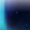
What I've got next is a bit surprising as at that time I usually ran with curves and vibrance first, but what I have is two textures.
and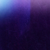
(both from midnight_road)
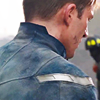
The first is set to screen on 17% opacity and the second on soft light on 37% opacity.

->
->
Next is the curves. It's a weird one.
This is all on the RGB graph.
Point 1 - Input: 111, Output: 106
Point 2 - Input: 159, Output: 161
Point 3 - Input: 207, Output: 203.
It's only subtle, but it's a step nonetheless.
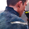
And now vibrance (Vibrance +100) set on color layer type.
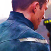
Then you've got your bog standard black -> transparent gradient set (angle 90, you know, black at the bottom) set on soft light.
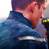
Now it's time for one of my most used textures. You know when you find a texture and use it on EVERYTHING. This was that texture a few months ago. I still use it a lot, mind, just finally decided to try other ones out :P.
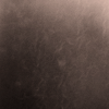
(also midnight_road)
Set it on screen.
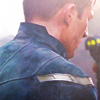
Duplicate the base layer and drag it on top on soft light to get some darkness and contrast back...
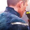
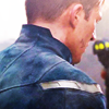
Now I've got two identical gradient maps, both #455168 to #f8ead9, the first set on soft light (25% opacity) for a bit more contrast, the second is the big changer, it's set onto color (50% opacity). I'm not sure why I did it, must have been one of those moments. Because the gradient is blue to a pale skin tone type colour, he retains the blueness of the suit better whilst also getting a muted effect. At least, that's my reasoning anyway!

->
->
And that's that, really!
->
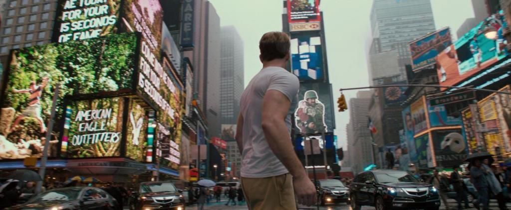
Now, again, I think I did my standard base prep [see Clara tutorial for that] but anyway, I started this particular PSD file like this:

Which again, I immediately sharpened to:

I think I decided that the background was too busy but must have also determined it had some worth because I used it to my advantage by getting out the smudge (and a bit of blur tool, from what I remember), working diagonally until it looked like this.
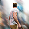
I then duplicated this, and thank god I hadn't used motion blur since because I just ran it again and the settings that were already on it gave me the same as the layer that already existed! Anyway, angle was 27 degrees on a 28px distance. Set the layer to soft light.
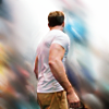
Curves time. Another fiddly one, I'm afraid. It's actually a similar shape to the last one but offset more :P.
Point 1 - Input: 109, Output: 93
Point 2 - Input: 158, Output: 148
Point 3 - Input: 206, Output: 192
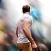
A black to white gradient layer, soft lighted, gives this:
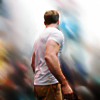
And then a Vibrance+100 (set on color again)
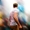
Now, I've got another gradient layer, and don't ask why I did this, because I'm not at all sure, but its #e9e9f8 (light pastel blue) to #f9f8e4 (light skin toney yellow) angle 180, set on multiply.
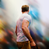
Now, another fun curves layer! Woo!
Point 1 - Input: 124, Output: 134
Point 2 - Input: 184, Output: 190
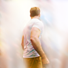
Point 3 - Input: 243, Output: 254
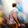
An transparent to black radial layer set on soft light follows:
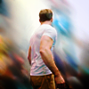
Now the fun bit. I took this texture:
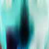
(by val_valerie)
duplicated it and flipped it horizontally and set that to lighten, and stamped that. I think at that point I put it on the icon, and proceed to smudge it until it look like this:
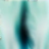
Setting that on screen yields this:
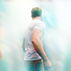
Deciding that I didn't like the colour, I added a Hue/Saturation layer to the texture layer only. (Hue -152)

Duplicating the smudged base I set one of those on top on soft light and that was that.

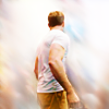
The funny thing was I wanted to tweak it and show you what I'd do now if I did it, and I did save the .png... but I forgot to write down to keep the PSD of the new altered one. It involved using a gradient map at the end instead, I know that much. This was the result, anyway:

Ah well.
I hoped you enjoyed these, and that this was of some worth to someone!

->

Judging by the fact the first bit I have in my PSD looks like the base has had some work done before I cropped it, I guess I did all the prep on the cap itself. Unfortunately I cannot tell you exactly what I did, but I'm guess it was the triple duplicate - screen / blurred screen / blurred soft light - method I detailed in the Clara tutorial.
Anyway, this is stage one:

The reason I think it was the method I used before is because it comes from roughly the same era of icons and it's a bit blurred! So first step was sharpen.

The type of sharpen is lost, but at the time I was running with 'smart sharpen' a lot so I imagine that's what it was [exact specifics unknown, sorry!], it's also set onto 61% opacity as full 100% was too sharp. Looking at it now, I should have just masked certain parts like the collar's edge, but oh well. Hindsight and new knowledge, eh?
What I've got next is a bit surprising as at that time I usually ran with curves and vibrance first, but what I have is two textures.

and

(both from midnight_road)
The first is set to screen on 17% opacity and the second on soft light on 37% opacity.

->

->

Next is the curves. It's a weird one.
This is all on the RGB graph.
Point 1 - Input: 111, Output: 106
Point 2 - Input: 159, Output: 161
Point 3 - Input: 207, Output: 203.
It's only subtle, but it's a step nonetheless.

And now vibrance (Vibrance +100) set on color layer type.

Then you've got your bog standard black -> transparent gradient set (angle 90, you know, black at the bottom) set on soft light.

Now it's time for one of my most used textures. You know when you find a texture and use it on EVERYTHING. This was that texture a few months ago. I still use it a lot, mind, just finally decided to try other ones out :P.

(also midnight_road)
Set it on screen.

Duplicate the base layer and drag it on top on soft light to get some darkness and contrast back...

Now I've got two identical gradient maps, both #455168 to #f8ead9, the first set on soft light (25% opacity) for a bit more contrast, the second is the big changer, it's set onto color (50% opacity). I'm not sure why I did it, must have been one of those moments. Because the gradient is blue to a pale skin tone type colour, he retains the blueness of the suit better whilst also getting a muted effect. At least, that's my reasoning anyway!

->

->

And that's that, really!

->

Now, again, I think I did my standard base prep [see Clara tutorial for that] but anyway, I started this particular PSD file like this:

Which again, I immediately sharpened to:

I think I decided that the background was too busy but must have also determined it had some worth because I used it to my advantage by getting out the smudge (and a bit of blur tool, from what I remember), working diagonally until it looked like this.

I then duplicated this, and thank god I hadn't used motion blur since because I just ran it again and the settings that were already on it gave me the same as the layer that already existed! Anyway, angle was 27 degrees on a 28px distance. Set the layer to soft light.

Curves time. Another fiddly one, I'm afraid. It's actually a similar shape to the last one but offset more :P.
Point 1 - Input: 109, Output: 93
Point 2 - Input: 158, Output: 148
Point 3 - Input: 206, Output: 192

A black to white gradient layer, soft lighted, gives this:

And then a Vibrance+100 (set on color again)

Now, I've got another gradient layer, and don't ask why I did this, because I'm not at all sure, but its #e9e9f8 (light pastel blue) to #f9f8e4 (light skin toney yellow) angle 180, set on multiply.

Now, another fun curves layer! Woo!
Point 1 - Input: 124, Output: 134
Point 2 - Input: 184, Output: 190

Point 3 - Input: 243, Output: 254

An transparent to black radial layer set on soft light follows:

Now the fun bit. I took this texture:

(by val_valerie)
duplicated it and flipped it horizontally and set that to lighten, and stamped that. I think at that point I put it on the icon, and proceed to smudge it until it look like this:

Setting that on screen yields this:

Deciding that I didn't like the colour, I added a Hue/Saturation layer to the texture layer only. (Hue -152)

Duplicating the smudged base I set one of those on top on soft light and that was that.

The funny thing was I wanted to tweak it and show you what I'd do now if I did it, and I did save the .png... but I forgot to write down to keep the PSD of the new altered one. It involved using a gradient map at the end instead, I know that much. This was the result, anyway:

Ah well.
I hoped you enjoyed these, and that this was of some worth to someone!