taking a break from the noughties spam to bring you...
1. I'm doing a big marathon Lost right now (my plan is to continue the marathon right up until season 6, so that's it's all just one big story and I don't have to wait every week for the last few episodes) and I'll tell you what, it's so much better than I remember it being! I mean, I remember being impressed but the level of scriptwriting brilliance that goes into this show (in the first two seasons at least, I'm only up to 2x19 so far) is outstanding! Everything is so psychological and underhanded and the structure of the seasons is flawless with all of the right stories being told at the right times, with the perfect amount of foreshadowing and aftermath. I also think it's safe to say that they've really mastered the flashback B-story; it's always carefully interwoven with the A-story and there are always with repercussions and rarely just a story for story's sake. I can see why I would get frustrated if I had to wait a week for each episode because in the short-term there is very little major arc development, but I think the short-term payoffs are worth that.
Now on a much more shallow note - WOW veryone is really sexy in the earlier seasons! And good lord the lighting in the hatch is rocking my world right now.
All in all, I can still understand why I'd listed this show so low on my 'favourite shows list' for so long, but now I think it was undeserved.
2. I'm setting up a graphic journal so people don't have to friend me to see what I make. I'm going to continue posting all of the same things here with my thoughts on them (sidenote: I'm actually going to try and bump this up a knotch and be even more analytical because I realised being aware of the details your work is how you improve) but every now and again I'll update the graphic journal with all of my recent work, like for archival purposes :D
Poll
3. icons!
a)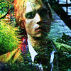
I really think this was the wrong type of texture to use with this picture. It's completely overpowering and very granular, which is a look I'm trying to avoid at the moment. I love the tiny patches of purples and reds throughout the green, but I doubt anyone but me would notice them :P
b)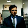
could do with a lot more saturation/variety in colours and some textures. It's like the blandest of the bland right now (but that okay, because that and the next few were me just testing out how the caps would work in 100x100 px, I don't really care about them)
c)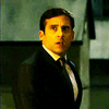
I think a bit of texture to give it a bit more depth would've gone a long way.
d)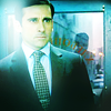
yowza! light splodge is WAY too overpowering. Also it might've been nice to have some colours other than cyan in there...
e)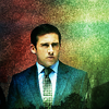
I like this! Well, the bottom half at least (I think it looks like a painting which is pretty much my prime objective when making any graphic these days), the top half of the background is lacking any real shape or direction.
f)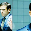
I think that the composition is a bit out. I was going for a little bit abstract but it's not really abstract enough. Again, I would've liked to have seen some more variety in colours and I think maybe it's too bright for my style, darker tends to work better for me.
g)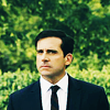
the background is a bit too splotchy and distracting. I think I should've switched it out for a texture that's a little more even. And I think the placement of the crop is a little too off-centered to be a center-crop. I like the colours on his face, though
h)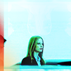
I like this, both the warmer and the colder colours are really punchy and balance off each other really well. I like that there's a hardness to it, but there's also a softness. However I think the greens in her hair are a little much and I wish that there were some warmer colours going on in the bottom right-hand quadrant.
i)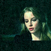
I love this. This cap is SO beautiful, absolutely one of my favourite things of the series. The colours and textures are very nicely subtle and vaired yet cohestive. Normally I'd fret over being able to see the edges of the cap but I think fact that the texture covers both the cap and the background makes up for it.
j)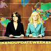
hm, it's very bright and there's a lot of brown... I think it's a bit awkward. I'm going to try and recreate this using caps from when they've changed the design of the newsdesk so that it's a lot more naturally colourful and cyan-ey. I really like the way I've retouched them together though and how faking scenes is becoming something I do :D
k)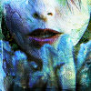
made using the same textures as the o'pry icon, but clearly it turned out a lot less impressively :P There's not nearly the variety in colours and tones and the way I've used the texture is a lot granier and less defined. I do like it though, I like the touches of greens and how it looks like her face is cracking a bit on the left, but if I had taken the time to use a texture that fitted the subject more I think it would be a lot better.
l)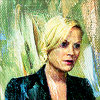
also made using the same texture, but wow... this is absolutely horrible. It just goes to show that it's not the texture that makes the icon, but the relationship between the texture and the cap and the way they're used. I like the variety in colours with the splashes of blue, but the icon as a whole... no.
m)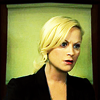
there we go, much better. Having everything be very clean works well here I think. The colourscheme is alright, but I think it could do with a few of the splashes of blue from 'l'. I'm really happy with how she looks; her hair is INSANE and I've retouched her face but I don't think it's too obvious that I have. I'm not too thrilled with the background. I like that the black around the edge frames the scene but I think the shape of it is a bit uncomfortable.
n)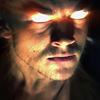
I'm so obsessed with the 1x22 Ordin scenes it's ridiculous. I feel like with a shot this close the crop has to be a bit more abstract and having him just in the center is falling a bit flat. The colours are alright, but they lack a bit of the kick that enhanced saturation and contrast would bring. Overall my biggest problem with this is the lack of Cara/Kahlan.
o)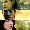
I couldn't find any caps with the three of them so this was my first method of fixing that. I'm not happy with my choice of Kahlan cap, it's not nearly as iconic as the other two. And I don't like how separate the three of them feel, it doesn't seem like one icon at the moment. Looking back I think I should've taken a page from prettybutt's book and done something a bit like this.
p)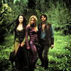
an attempt at retouching together full-body shots. I don't think this was the best cap to choose (it was originally one cap so the lighting is the same, but they weren't standing together like that) because these aren't really their best looks. I've always missed Kara's Mord-Sith uniform and Kahlan just doesn't feel right without her white dress and Richard's hair is messed up this season. Compositionally I think they're all a bit too scrunched together. I like how dark it is, but I could've done with some light blues or something to give the colour and brightness spectrums some more depth
q)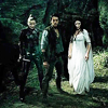
BAM, this is it! It has none of the cap problems I had with the previous one. Everybody looks their best and I love the way the poses fit together. Admittedly I haven't done a LOT to the colours because LotS cap colouring is naturally icon-ready and I guess it could do with some more variety of colours, but really, that doesn't bother me. I've done a lot of manipulating of the original cap (Cara wasn't originally standing next to them, I've cleaned up the background and the floor and lighting a bit and Zed was originally standing with them but he's not as pretty so he got cut :P) so it feels like the icon is very personalised. Usually I make sure that my icons stand out from the crowd using colours and textures in a way that I know nobody else will, but in this case it's the composition of the cap and that's fine with me (and as I mentioned for 'j' I like that faked scenes is a thing I'm doing) :D
r)
I'm a bit concerned about how light and uncontrasted this is because it's feeling a bit flat. Also I think if I'd tried something with textures that would have improved it. Ultimately I'm not a huge fan of the cap, the background's a bit distracting and she's not looking as good as I know she can.
s)
again, I don't really know why I made this (experimentation I guess... :/) because I don't actually like the cap. Again, I wanted to go for something abstract but I should've pushed it a lot further. I kind of like the golden bronze tones on her cheeks, but the background is letting me down with the greens and the whites that have lost almost all of their depth.
t)
made because I wanted to see if something I made on a larger scale (for the noughties spam by the way, if you didn't see it) whether would work in an icon. In this case I think it does. Of course it needs some textures or something to jazz it up, but I'm relatively content with the colours and shapes. I think that the background would look better if the line wasn't running through her head and it was just that top green gradient throughout.
u)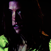
I like the colours (yet again purple and green are proving to be a winning couple), but the cap is hardly the most flattering and I wish I'd added in a bit of texture to give some depth to the shadows.
v)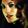
I like this! Definitely a lot more than 'u'. I like that she looks good and there's some angst (you know I love the angst!) and this is from one of my favourite scenes of her: when she's vulnerable after being captured by Dexter's brother, whatshisname. Also I like that Dexter's there but he's not the primary subject of the icon, which is how I feel about the series. I fairly happy with the colours but not exactly over the moon. I think maybe some textures would get me a bit more excited.
w)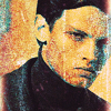
good lord this is horrible. It's like a nightmare come to life. REALLY bad texture use on my part, it's so lumpy and distracting. And the colours are so washed out, they need a bit of a kick of vibrance or something. I made this for a theskilltester entry but I couldn't even bare to submit it as a placeholder.
x)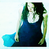
yeah, I'm not crazy about this. I don't think it's the best cap of River and I just with there were some warmer colours to balance out the colder ones. Also that white border is weird :/
y)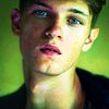
I love this so much more than I thought I would when I was making it. I was getting so frustrated that I couldn't find any textures that worked with the picture, but I think this is a really good example of an icon not needing textures. The colours are CRAZY, I love the greens and the purples and how clean the whites are. I've made it that there's a bit of a halo spotlight in the background, which I love. It's a great photo of him. The crop seems very appropriate. I actually can't fault this right now, I love it.
z)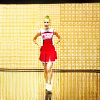
I just made this so my thoughts are still in their developing stages. I really like that it reresents my favourite scene and character of Glee. I like that it feels spacious (thanks to some handy dandy scene manipulation again!) and like that it feels like an iconic 100x100 representation of Glee. I'm slghtly concerned that it's too light, I think. But maybe the black lines make up for it? Maybe the colours aren't rich enough? I don't know at this point, you tell me :P
4.

I love this set so much. The variety in colours and textures is excellent (I'm particularly proud of 1, 4, 7, 19, 21, 22, 25 and 29 because of their colours) but it's all still very seamless as a set. I really like that they've got a black background because I often want to put textures on 'screen' but usually the inversion process makes them look weird. I'm not quite as excited by the black and white ones (although I do like the textures they make!) so I'm going to always try and add colour from now on.

can I just say how much I like these previews! I think they're all fairly strong from a design perspective but they're also good representations of what you can find inside :D
As far as the textures, I definitely prefer the other two sets, this one seems a lot less realtistically usable. I like some of the interesting shapes I achieved from this, but the lack of colours frustrates me. Also there are a few words in there - I haven't gone all philisophical on you, I just write little notes to myself all the time and I liked some of the shapes that the words made :P

I'm really proud of this set. It's a style I'd never even thought about before, but it just happened so naturally. The colourschemes turned out so well; very natural and cohesive. Someone said the blue one reminded them of Van Gogh and I agree! But... on a much less hisorically epic scale of course... :P
5. Tafe started back up again (hence the lateness of the picspam segments by the way). We were given a rough rundown of our assignments and it looks like it's going to be a really fun year! There's a lot more free-choice and the deadlines are a lot less threatening than last year!
They've given us a lot more theory work but I think the final results are going to be better because of it so I'm fine with that :P
We've got a new segment on video photography, which I'm exited for. We've only had a brief rundown on how to use the cameras so far, and the tv-fan inside of me can't wait to see where this leads. at the moment it looks like it's going to have to lead to a bunch of boring documentary-style interviews unfortunately (based on what we've seen previous students do), but we haven't been given any assignments yet so maybe I'll be able to work them into something fun :D
Now on a much more shallow note - WOW veryone is really sexy in the earlier seasons! And good lord the lighting in the hatch is rocking my world right now.
All in all, I can still understand why I'd listed this show so low on my 'favourite shows list' for so long, but now I think it was undeserved.
2. I'm setting up a graphic journal so people don't have to friend me to see what I make. I'm going to continue posting all of the same things here with my thoughts on them (sidenote: I'm actually going to try and bump this up a knotch and be even more analytical because I realised being aware of the details your work is how you improve) but every now and again I'll update the graphic journal with all of my recent work, like for archival purposes :D
Poll
3. icons!
a)

I really think this was the wrong type of texture to use with this picture. It's completely overpowering and very granular, which is a look I'm trying to avoid at the moment. I love the tiny patches of purples and reds throughout the green, but I doubt anyone but me would notice them :P
b)

could do with a lot more saturation/variety in colours and some textures. It's like the blandest of the bland right now (but that okay, because that and the next few were me just testing out how the caps would work in 100x100 px, I don't really care about them)
c)

I think a bit of texture to give it a bit more depth would've gone a long way.
d)

yowza! light splodge is WAY too overpowering. Also it might've been nice to have some colours other than cyan in there...
e)

I like this! Well, the bottom half at least (I think it looks like a painting which is pretty much my prime objective when making any graphic these days), the top half of the background is lacking any real shape or direction.
f)

I think that the composition is a bit out. I was going for a little bit abstract but it's not really abstract enough. Again, I would've liked to have seen some more variety in colours and I think maybe it's too bright for my style, darker tends to work better for me.
g)

the background is a bit too splotchy and distracting. I think I should've switched it out for a texture that's a little more even. And I think the placement of the crop is a little too off-centered to be a center-crop. I like the colours on his face, though
h)

I like this, both the warmer and the colder colours are really punchy and balance off each other really well. I like that there's a hardness to it, but there's also a softness. However I think the greens in her hair are a little much and I wish that there were some warmer colours going on in the bottom right-hand quadrant.
i)

I love this. This cap is SO beautiful, absolutely one of my favourite things of the series. The colours and textures are very nicely subtle and vaired yet cohestive. Normally I'd fret over being able to see the edges of the cap but I think fact that the texture covers both the cap and the background makes up for it.
j)

hm, it's very bright and there's a lot of brown... I think it's a bit awkward. I'm going to try and recreate this using caps from when they've changed the design of the newsdesk so that it's a lot more naturally colourful and cyan-ey. I really like the way I've retouched them together though and how faking scenes is becoming something I do :D
k)
made using the same textures as the o'pry icon, but clearly it turned out a lot less impressively :P There's not nearly the variety in colours and tones and the way I've used the texture is a lot granier and less defined. I do like it though, I like the touches of greens and how it looks like her face is cracking a bit on the left, but if I had taken the time to use a texture that fitted the subject more I think it would be a lot better.
l)

also made using the same texture, but wow... this is absolutely horrible. It just goes to show that it's not the texture that makes the icon, but the relationship between the texture and the cap and the way they're used. I like the variety in colours with the splashes of blue, but the icon as a whole... no.
m)

there we go, much better. Having everything be very clean works well here I think. The colourscheme is alright, but I think it could do with a few of the splashes of blue from 'l'. I'm really happy with how she looks; her hair is INSANE and I've retouched her face but I don't think it's too obvious that I have. I'm not too thrilled with the background. I like that the black around the edge frames the scene but I think the shape of it is a bit uncomfortable.
n)

I'm so obsessed with the 1x22 Ordin scenes it's ridiculous. I feel like with a shot this close the crop has to be a bit more abstract and having him just in the center is falling a bit flat. The colours are alright, but they lack a bit of the kick that enhanced saturation and contrast would bring. Overall my biggest problem with this is the lack of Cara/Kahlan.
o)

I couldn't find any caps with the three of them so this was my first method of fixing that. I'm not happy with my choice of Kahlan cap, it's not nearly as iconic as the other two. And I don't like how separate the three of them feel, it doesn't seem like one icon at the moment. Looking back I think I should've taken a page from prettybutt's book and done something a bit like this.
p)

an attempt at retouching together full-body shots. I don't think this was the best cap to choose (it was originally one cap so the lighting is the same, but they weren't standing together like that) because these aren't really their best looks. I've always missed Kara's Mord-Sith uniform and Kahlan just doesn't feel right without her white dress and Richard's hair is messed up this season. Compositionally I think they're all a bit too scrunched together. I like how dark it is, but I could've done with some light blues or something to give the colour and brightness spectrums some more depth
q)

BAM, this is it! It has none of the cap problems I had with the previous one. Everybody looks their best and I love the way the poses fit together. Admittedly I haven't done a LOT to the colours because LotS cap colouring is naturally icon-ready and I guess it could do with some more variety of colours, but really, that doesn't bother me. I've done a lot of manipulating of the original cap (Cara wasn't originally standing next to them, I've cleaned up the background and the floor and lighting a bit and Zed was originally standing with them but he's not as pretty so he got cut :P) so it feels like the icon is very personalised. Usually I make sure that my icons stand out from the crowd using colours and textures in a way that I know nobody else will, but in this case it's the composition of the cap and that's fine with me (and as I mentioned for 'j' I like that faked scenes is a thing I'm doing) :D
r)
I'm a bit concerned about how light and uncontrasted this is because it's feeling a bit flat. Also I think if I'd tried something with textures that would have improved it. Ultimately I'm not a huge fan of the cap, the background's a bit distracting and she's not looking as good as I know she can.
s)

again, I don't really know why I made this (experimentation I guess... :/) because I don't actually like the cap. Again, I wanted to go for something abstract but I should've pushed it a lot further. I kind of like the golden bronze tones on her cheeks, but the background is letting me down with the greens and the whites that have lost almost all of their depth.
t)

made because I wanted to see if something I made on a larger scale (for the noughties spam by the way, if you didn't see it) whether would work in an icon. In this case I think it does. Of course it needs some textures or something to jazz it up, but I'm relatively content with the colours and shapes. I think that the background would look better if the line wasn't running through her head and it was just that top green gradient throughout.
u)

I like the colours (yet again purple and green are proving to be a winning couple), but the cap is hardly the most flattering and I wish I'd added in a bit of texture to give some depth to the shadows.
v)

I like this! Definitely a lot more than 'u'. I like that she looks good and there's some angst (you know I love the angst!) and this is from one of my favourite scenes of her: when she's vulnerable after being captured by Dexter's brother, whatshisname. Also I like that Dexter's there but he's not the primary subject of the icon, which is how I feel about the series. I fairly happy with the colours but not exactly over the moon. I think maybe some textures would get me a bit more excited.
w)
good lord this is horrible. It's like a nightmare come to life. REALLY bad texture use on my part, it's so lumpy and distracting. And the colours are so washed out, they need a bit of a kick of vibrance or something. I made this for a theskilltester entry but I couldn't even bare to submit it as a placeholder.
x)

yeah, I'm not crazy about this. I don't think it's the best cap of River and I just with there were some warmer colours to balance out the colder ones. Also that white border is weird :/
y)

I love this so much more than I thought I would when I was making it. I was getting so frustrated that I couldn't find any textures that worked with the picture, but I think this is a really good example of an icon not needing textures. The colours are CRAZY, I love the greens and the purples and how clean the whites are. I've made it that there's a bit of a halo spotlight in the background, which I love. It's a great photo of him. The crop seems very appropriate. I actually can't fault this right now, I love it.
z)

I just made this so my thoughts are still in their developing stages. I really like that it reresents my favourite scene and character of Glee. I like that it feels spacious (thanks to some handy dandy scene manipulation again!) and like that it feels like an iconic 100x100 representation of Glee. I'm slghtly concerned that it's too light, I think. But maybe the black lines make up for it? Maybe the colours aren't rich enough? I don't know at this point, you tell me :P
4.

I love this set so much. The variety in colours and textures is excellent (I'm particularly proud of 1, 4, 7, 19, 21, 22, 25 and 29 because of their colours) but it's all still very seamless as a set. I really like that they've got a black background because I often want to put textures on 'screen' but usually the inversion process makes them look weird. I'm not quite as excited by the black and white ones (although I do like the textures they make!) so I'm going to always try and add colour from now on.

can I just say how much I like these previews! I think they're all fairly strong from a design perspective but they're also good representations of what you can find inside :D
As far as the textures, I definitely prefer the other two sets, this one seems a lot less realtistically usable. I like some of the interesting shapes I achieved from this, but the lack of colours frustrates me. Also there are a few words in there - I haven't gone all philisophical on you, I just write little notes to myself all the time and I liked some of the shapes that the words made :P

I'm really proud of this set. It's a style I'd never even thought about before, but it just happened so naturally. The colourschemes turned out so well; very natural and cohesive. Someone said the blue one reminded them of Van Gogh and I agree! But... on a much less hisorically epic scale of course... :P
5. Tafe started back up again (hence the lateness of the picspam segments by the way). We were given a rough rundown of our assignments and it looks like it's going to be a really fun year! There's a lot more free-choice and the deadlines are a lot less threatening than last year!
They've given us a lot more theory work but I think the final results are going to be better because of it so I'm fine with that :P
We've got a new segment on video photography, which I'm exited for. We've only had a brief rundown on how to use the cameras so far, and the tv-fan inside of me can't wait to see where this leads. at the moment it looks like it's going to have to lead to a bunch of boring documentary-style interviews unfortunately (based on what we've seen previous students do), but we haven't been given any assignments yet so maybe I'll be able to work them into something fun :D