(no subject)
1. I'm insanely hooked on Legend of the Seeker this season, it's incredible how much it's improved since season 1. I think the addition of Cara was excactly what they needed; she's so sexy (right on par with Richard and Kahlen) and provides some really exciting tension in the group along with a much-needed immoral point of view. The writing feels like it's been kicked up a knotch; in season 1 I drifted off to sleep every other minute but I can't keep myself away from these latest batch of episodes. The stories are progressing a lot faster and it feels like they've removed all of the boring characters and plot devises and replaced them with significantly more interesting ones. Also this is still Legend of the Seeker so it should go without saying but aesthetically it's flawless; definitely my prime photographic inspiration right now. (Now lovers of pretty things, I'm looking at you; this show will make you cry yourself to sleep with glee)
2. Another show that should definitely be on your watch list this season: Dexter. Season 3 was a bit dry but 4 is bringing it like you wouln't believe. The plot twists continue to keep coming and knocking me square off my seat. Also I can't remember season 1 and 2 very well, but it's been really creepy, which I think is fun and appropriate given it's the story of a serial killer. :D
3.
a)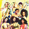
ugh, wow. I think this is the best icon I've ever made. The colours are nuts, the textures are subtle yet are ingrained and give it a kick it wouldn't have otherwise. Filling up that empty space at the bottom of the original version does wonders for the composition. For the reference this and my Natalia icon (my second favourite I've made) were both made for a challenge at theskilltester which required all layers to be set at a maximum of 50% opacity, so I think I'm onto something with that.
b)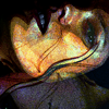
not... quite as amazing... I'm finding myself at a bit of a loss for what to do with the latest paths-based theskilltester challenge :/
c)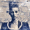
also made for theskilltester (don't you love how subtle my pimping is?) That texture was so interesting to work with, I wish I had the motivation to put more colour into it and make it even better.
d)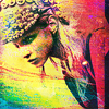
I feel like I should like this, it's got all of the things I like: colours, textures, Anna Selezneva... but it just doesn't feel organised enough. Sloppy, as if I didn't put enough effort in, which is weird because I gave it all I could but it just wasn't working :/
maybe I needed to set my laters to less than 50% opacity ;)
e)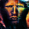
I really like this. The colours on the right feel like an explosion of glee, but the red covering the majority of the icon feels like it's holding them back. I made a version with the red masked back selectively, but it doesn't have the same intensity to it, so I don't know... :/
f)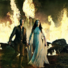
I really like this composition of this, it was put together using about four caps. And I like the soft colouring, but I felt like with more saturation and contrast it would have been a lot more striking.
g)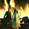
eek, not better :/ the colouring's WAY too warm
h)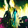
there we go! I really like the way the yellows have turned out, they're bright but they're not blown out. And the added greens and purples work off each other nicely I think. My main fault with this is that it's missing my favourite new Mord-Sith, but also from a technical point of view I feel like the textures look like they were added as an afterthought (which they were) so I'm planning on doing my texturing before my colouring from now on (because looking back, the ones which I've done that for have been my best).
i)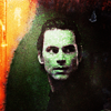
I like that I can feel my point of view coming from this. It's dark, it feels like me. I'm not crazy about how it looks though - there isn't enough variety of colours and the texture doesn't really fit I don't think
4. I got tagged by iladora and motorized for an icon meme!
1. Reply to this post with 'ICONS!', and I will pick five of your icons.
2. Make a post (including the meme info) and talk about the icons I chose.
3. Other people can then comment to you and make their own posts.
4. This will create a never-ending cycle of icon squee. Whoo!

it's no secret that my favourite aspect of Torchwood was Toshiko (I'm still grieving!) and this is the icon where I think she looks the best. I feel a bit rude saying that because you can't see her face, but I think it's really beautiful and subtle and it's not often that I'm impressed by cropping/cap choice.

I'm digging Anna Seleneva so much right now. She's got a personality that it's impossible to ignore; so cute and exciting. And the structure of her face is so severe it gives her modelling style a lot of flexibility which she takes advantage of by trying unexpected poses and angles. However this is a temporary icon, I intend to switch it out with something better ultimately.

I love Glee, but I don't think this does the show justice, it doesn't capture all of the elements that I love about the show. It'll definitely be switched out as well.

eek, this is awkward. I'm probably going to delete this when all of the episodes have finished airing :P
I've been really underwhelmed with the show as a whole and while this was my best icon for a long while, it can't hold a candle to what I've been producing recently.

love this. Rose looks undeniably beautiful here and I think it's one of my better icons, showing a different side of my abilities.

I loved Veronica Mars season 1, Kristen was so cute with the short hair :P I love the shapes that this icon makes and how strong they are from a design point of view. For once I don't wish that there was more saturation and contrast and I think that's really impressive.

placeholder Tru Calling/White Collar/Matthew Bomer icon :P It's my favourite one I've seen of him (when it comes to the style of icons I use) but it could be a lot better.

I think Jessica Stam has a really beautiful profile, I like the simplity, I like the colours, I like that one of the graphic makers I look up to most: uglybusiness complimented me on it XD

no offense to hellododger but this is a temporary icon. I love it (the textures are perfect, subtle yet they make a big difference), but there's not nearly enough variety in the colours for it to be a permanent one.
5. Okay, I have seven Google Wave invites so roll up, roll up and I'll send you one! :D
2. Another show that should definitely be on your watch list this season: Dexter. Season 3 was a bit dry but 4 is bringing it like you wouln't believe. The plot twists continue to keep coming and knocking me square off my seat. Also I can't remember season 1 and 2 very well, but it's been really creepy, which I think is fun and appropriate given it's the story of a serial killer. :D
3.
a)

ugh, wow. I think this is the best icon I've ever made. The colours are nuts, the textures are subtle yet are ingrained and give it a kick it wouldn't have otherwise. Filling up that empty space at the bottom of the original version does wonders for the composition. For the reference this and my Natalia icon (my second favourite I've made) were both made for a challenge at theskilltester which required all layers to be set at a maximum of 50% opacity, so I think I'm onto something with that.
b)

not... quite as amazing... I'm finding myself at a bit of a loss for what to do with the latest paths-based theskilltester challenge :/
c)

also made for theskilltester (don't you love how subtle my pimping is?) That texture was so interesting to work with, I wish I had the motivation to put more colour into it and make it even better.
d)

I feel like I should like this, it's got all of the things I like: colours, textures, Anna Selezneva... but it just doesn't feel organised enough. Sloppy, as if I didn't put enough effort in, which is weird because I gave it all I could but it just wasn't working :/
maybe I needed to set my laters to less than 50% opacity ;)
e)

I really like this. The colours on the right feel like an explosion of glee, but the red covering the majority of the icon feels like it's holding them back. I made a version with the red masked back selectively, but it doesn't have the same intensity to it, so I don't know... :/
f)

I really like this composition of this, it was put together using about four caps. And I like the soft colouring, but I felt like with more saturation and contrast it would have been a lot more striking.
g)

eek, not better :/ the colouring's WAY too warm
h)

there we go! I really like the way the yellows have turned out, they're bright but they're not blown out. And the added greens and purples work off each other nicely I think. My main fault with this is that it's missing my favourite new Mord-Sith, but also from a technical point of view I feel like the textures look like they were added as an afterthought (which they were) so I'm planning on doing my texturing before my colouring from now on (because looking back, the ones which I've done that for have been my best).
i)

I like that I can feel my point of view coming from this. It's dark, it feels like me. I'm not crazy about how it looks though - there isn't enough variety of colours and the texture doesn't really fit I don't think
4. I got tagged by iladora and motorized for an icon meme!
1. Reply to this post with 'ICONS!', and I will pick five of your icons.
2. Make a post (including the meme info) and talk about the icons I chose.
3. Other people can then comment to you and make their own posts.
4. This will create a never-ending cycle of icon squee. Whoo!
it's no secret that my favourite aspect of Torchwood was Toshiko (I'm still grieving!) and this is the icon where I think she looks the best. I feel a bit rude saying that because you can't see her face, but I think it's really beautiful and subtle and it's not often that I'm impressed by cropping/cap choice.
I'm digging Anna Seleneva so much right now. She's got a personality that it's impossible to ignore; so cute and exciting. And the structure of her face is so severe it gives her modelling style a lot of flexibility which she takes advantage of by trying unexpected poses and angles. However this is a temporary icon, I intend to switch it out with something better ultimately.
I love Glee, but I don't think this does the show justice, it doesn't capture all of the elements that I love about the show. It'll definitely be switched out as well.
eek, this is awkward. I'm probably going to delete this when all of the episodes have finished airing :P
I've been really underwhelmed with the show as a whole and while this was my best icon for a long while, it can't hold a candle to what I've been producing recently.
love this. Rose looks undeniably beautiful here and I think it's one of my better icons, showing a different side of my abilities.
I loved Veronica Mars season 1, Kristen was so cute with the short hair :P I love the shapes that this icon makes and how strong they are from a design point of view. For once I don't wish that there was more saturation and contrast and I think that's really impressive.
placeholder Tru Calling/White Collar/Matthew Bomer icon :P It's my favourite one I've seen of him (when it comes to the style of icons I use) but it could be a lot better.
I think Jessica Stam has a really beautiful profile, I like the simplity, I like the colours, I like that one of the graphic makers I look up to most: uglybusiness complimented me on it XD
no offense to hellododger but this is a temporary icon. I love it (the textures are perfect, subtle yet they make a big difference), but there's not nearly enough variety in the colours for it to be a permanent one.
5. Okay, I have seven Google Wave invites so roll up, roll up and I'll send you one! :D