(no subject)
1. I checked out the season 10 of American Big Brother (because harbourlight said so. It wasn't on my own free will, I promise!) and it's crazy. It's nothing at all like the Australian Big Brother (it makes ours look classy all of a sudden). It's more like a combination between Survivor and ANTM, but if they were locked in a house. I don't really like anyone at the moment, but I think I'm missing a couple of weeks. I loved the challenge when they had to crawl though the honey, though. That was hilarious! :D
2. I finally finished off my battle with saeva and _rhea at icon_battle, now I've just got to post the results and finish off the one with mouthfullofdust :D
3. I want a new desktop, but I have absolutely no inspiration to change the one I have at the moment. I need more Photoshoots or more TV or something to motivate me :(
I have been crazily obsessed with 30 Rock lately, but they don't have particularly interesting promo shoots :(
4. I had my first car accident today. It's alright, it wasn't my fault. A deaf mailman crashed into my car on his bike :P I was pretty dramatic, but also totally awesome. We're all fine, by the way :D
5. Mum had an art exhibition thing today in town. But this was no oridinary art exhibition, no no. She'd designed an animation and it was being projected onto a wall! Yay! It was actually pretty fun to go along. It was all very much like what you'd see in a movie with crazy generic artsy people and oh! I know what it was like! It was like that episode of himym where Lily was envy and then later on Barney was a robot in love :P Only the weird play involving envy was being projected onto a wall.
6. icons!
a)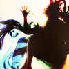
I love the colours on this. I really like the subtlety in the colouring. Like, if you go in really close to the screen you can see that there's a little blue, a little red, a little green, a little... well, you get the point. But my absolute favourite thing about it is that it's about a million times better than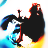
which I made for the textureless challenge at iconplay. So I'm improving! Yay! :D
b)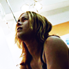
I liked the darkness of this when I made it, but now it just seems dry and lifeless.
c)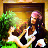
eh.
d)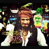
if this is going to be my style I've got to say... I'm very happy with it. I really like the way the rectangular cropping looks and I can't get over how much I love that font.
e)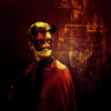
I don't like my texture, but I do like the colouring. His original background was pretty boring, so I'm glad I changed it :D
f)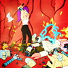
colouring-wise this reminds me of mouthfullofdust's Futurama entry to iconplay in a really good way. And I guess that's appropriate because I stole her caps :D
g)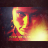
and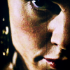
for some reason I wasn't able to get a decent outcome for this cap. I liked both of these a lot when I was making them, but they just seem horrible now.
h)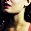
this reminds me of nightcomes's style :D
i)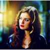
I'd probably like this more if I hadn't toned up the saturation quite so high. It reminds me of something I'd have made about 3 months ago when there were a few complains about grainyness.
j)
I think this was a great cap choice but it's not bright enough.
k)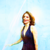
I think the colouring seems fairly unique and the bright cyan background reminds me of letsey-x's older icons. But for some reason I like this less every time I look at it.
l)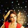
yuck, no. get it away from me!
m)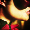
I think the obscure cropping is fun, but I think I did something weird with my light splodges
n)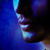
and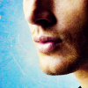
I honestly can't decide which I prefer. Help me pick one! One one hand I like the dark blueness of the first one, but on the other hand I like the simplicity and the brightness of the second :(
o)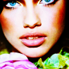
ah, I think this is a MUCH better Adriana icon than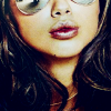
which I made a few weeks ago. I prefer the other photo, but I think this one has much better colouring.
p)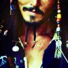
is his face green? That's weird... other than that, colouring and cropping: A- :)
q)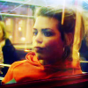
another icon that reminds me of something I would have made several months ago. I didn't think this would have been such a difficult cap to work with. Balancing all of the colours was really difficult. Sometimes it would be too yellow, but then when I take away the yellow it wouldn't be yellow enough! ARGH! I do like the subtle hints of green up the top, though.
r)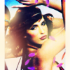
I made this about 5 minutes ago. It's from the newly released ANTM cycle 11 promo. I have no idea who this girl is, but I love her. I really like my light splodges, especially the one in the bottom left that is a bit pink-y/red-y. I think I should've used a texture or two to add some green over to the right and overall it's getting a bit too bright.
2. I finally finished off my battle with saeva and _rhea at icon_battle, now I've just got to post the results and finish off the one with mouthfullofdust :D
3. I want a new desktop, but I have absolutely no inspiration to change the one I have at the moment. I need more Photoshoots or more TV or something to motivate me :(
I have been crazily obsessed with 30 Rock lately, but they don't have particularly interesting promo shoots :(
4. I had my first car accident today. It's alright, it wasn't my fault. A deaf mailman crashed into my car on his bike :P I was pretty dramatic, but also totally awesome. We're all fine, by the way :D
5. Mum had an art exhibition thing today in town. But this was no oridinary art exhibition, no no. She'd designed an animation and it was being projected onto a wall! Yay! It was actually pretty fun to go along. It was all very much like what you'd see in a movie with crazy generic artsy people and oh! I know what it was like! It was like that episode of himym where Lily was envy and then later on Barney was a robot in love :P Only the weird play involving envy was being projected onto a wall.
6. icons!
a)

I love the colours on this. I really like the subtlety in the colouring. Like, if you go in really close to the screen you can see that there's a little blue, a little red, a little green, a little... well, you get the point. But my absolute favourite thing about it is that it's about a million times better than

which I made for the textureless challenge at iconplay. So I'm improving! Yay! :D
b)

I liked the darkness of this when I made it, but now it just seems dry and lifeless.
c)

eh.
d)

if this is going to be my style I've got to say... I'm very happy with it. I really like the way the rectangular cropping looks and I can't get over how much I love that font.
e)

I don't like my texture, but I do like the colouring. His original background was pretty boring, so I'm glad I changed it :D
f)

colouring-wise this reminds me of mouthfullofdust's Futurama entry to iconplay in a really good way. And I guess that's appropriate because I stole her caps :D
g)

and

for some reason I wasn't able to get a decent outcome for this cap. I liked both of these a lot when I was making them, but they just seem horrible now.
h)

this reminds me of nightcomes's style :D
i)

I'd probably like this more if I hadn't toned up the saturation quite so high. It reminds me of something I'd have made about 3 months ago when there were a few complains about grainyness.
j)

I think this was a great cap choice but it's not bright enough.
k)

I think the colouring seems fairly unique and the bright cyan background reminds me of letsey-x's older icons. But for some reason I like this less every time I look at it.
l)

yuck, no. get it away from me!
m)

I think the obscure cropping is fun, but I think I did something weird with my light splodges
n)

and

I honestly can't decide which I prefer. Help me pick one! One one hand I like the dark blueness of the first one, but on the other hand I like the simplicity and the brightness of the second :(
o)

ah, I think this is a MUCH better Adriana icon than

which I made a few weeks ago. I prefer the other photo, but I think this one has much better colouring.
p)

is his face green? That's weird... other than that, colouring and cropping: A- :)
q)

another icon that reminds me of something I would have made several months ago. I didn't think this would have been such a difficult cap to work with. Balancing all of the colours was really difficult. Sometimes it would be too yellow, but then when I take away the yellow it wouldn't be yellow enough! ARGH! I do like the subtle hints of green up the top, though.
r)

I made this about 5 minutes ago. It's from the newly released ANTM cycle 11 promo. I have no idea who this girl is, but I love her. I really like my light splodges, especially the one in the bottom left that is a bit pink-y/red-y. I think I should've used a texture or two to add some green over to the right and overall it's getting a bit too bright.