one house
I made seven new icons (mostly Doctor Who) for my challenge at icon_battle
1.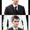
I love this icon. I have no idea where this black and white exclusion inspiration came from, but it's awesome. :D
2.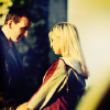
I'm loving this colouring. To be honest, when I saw this cap I just thought to myself "oh geez, there is no way I can make a good icon out of that", but I think I did actually.
3.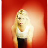
I don't particularly love this because it didn't take any skill to make, but a few people have said it's their favourite of this batch.
4.
I love this font and for once it actually makes the icon look better instead of worse :D Ironically this reminds me of the layout I designed for my very own icon battling comm :P
5.
this looked amazing on my other computer (my usual computer with a very old, very non-flat screen) but it doesn't so much on this one. It sucks how much the screen you view/make icons on determines how people are going to percieve them.
6.
again, this looked better on my other screen. I'm gonna tone down the purples a bit for the official presentation :P
7.
I think this icon is a mess, but I've also recieved several compliments on it.
1.

I love this icon. I have no idea where this black and white exclusion inspiration came from, but it's awesome. :D
2.

I'm loving this colouring. To be honest, when I saw this cap I just thought to myself "oh geez, there is no way I can make a good icon out of that", but I think I did actually.
3.

I don't particularly love this because it didn't take any skill to make, but a few people have said it's their favourite of this batch.
4.

I love this font and for once it actually makes the icon look better instead of worse :D Ironically this reminds me of the layout I designed for my very own icon battling comm :P
5.

this looked amazing on my other computer (my usual computer with a very old, very non-flat screen) but it doesn't so much on this one. It sucks how much the screen you view/make icons on determines how people are going to percieve them.
6.

again, this looked better on my other screen. I'm gonna tone down the purples a bit for the official presentation :P
7.

I think this icon is a mess, but I've also recieved several compliments on it.