(no subject)
everybody go read this tutorial by kawaii_chicken because it's amazing and inspiring and reminded me of why I love icons and art and all of that. SPECIFICALLY the video, watch that video because it's full of so many fun ideas (done very very slowly :P I also recommend skipping through the slow parts)
anyway, that inspired me to make my first icon in months for my icon battle with neversleeps

I want to do that thing where I evaluate the pros and the cons of the icon, but I literally finished making it 5 minutes ago so my thoughts are still all very fresh but whatever, I'm giving it a try
First of all, I LOVE being inspired on this level again. I keep on forgetting how broad the icon genre can be and how many infinite possibilities a cap can hold. But most importantly while I was massively inspired by kawaii_chicken's tutorial, it still looks like one of my icons. I feel like it could have been very easy to fall into the trap of having my icon look exactly like one of hers
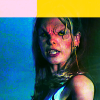
I love the subtle gradient to her skin, I love the noise in the blues on the left. I'm all about the blues in the shadows but I think maybe the blues on her shirt are a little too bright. There's a greenish screen gradient running along the bottom and I love that because it brings in a lot of tones that remind me of renaissance paintings.
I LOVE the top colours because I've previously been using a lot of black bars to break up the monotony of the 100x100px square, but with this there is not only a bit of colour but having the two colours adds another dimension that I didn't foresee.
If I were to critique this now, I'd just say I'm itching for more blending. Having the 'one cap per icon' thing is getting a bit tired. I'm just not sure what I would like to have done instead? I need to do some blending research...
anyway, that inspired me to make my first icon in months for my icon battle with neversleeps

I want to do that thing where I evaluate the pros and the cons of the icon, but I literally finished making it 5 minutes ago so my thoughts are still all very fresh but whatever, I'm giving it a try
First of all, I LOVE being inspired on this level again. I keep on forgetting how broad the icon genre can be and how many infinite possibilities a cap can hold. But most importantly while I was massively inspired by kawaii_chicken's tutorial, it still looks like one of my icons. I feel like it could have been very easy to fall into the trap of having my icon look exactly like one of hers
I love the subtle gradient to her skin, I love the noise in the blues on the left. I'm all about the blues in the shadows but I think maybe the blues on her shirt are a little too bright. There's a greenish screen gradient running along the bottom and I love that because it brings in a lot of tones that remind me of renaissance paintings.
I LOVE the top colours because I've previously been using a lot of black bars to break up the monotony of the 100x100px square, but with this there is not only a bit of colour but having the two colours adds another dimension that I didn't foresee.
If I were to critique this now, I'd just say I'm itching for more blending. Having the 'one cap per icon' thing is getting a bit tired. I'm just not sure what I would like to have done instead? I need to do some blending research...