also check out my tumblr because I'm tumbing lots
1. So Christmas happened! The actual Christmas bit of Christmas was a bit underwhelming, I must say. It was my first year since moving out of home and over the past few years the amount of presents exchanged has decreased exponentially. Not to mention with the grandparents reaching "that age" and a lot of the youthes coupling off and having to go to other family Christmases, it's just not the big event that it used to be.
HOWEVER, it was my first Christmas since leaving Adelaide and coming back gave me a world of perspective. I really don't feel like I've changed that much since moving to Sydney, but being back, everything seemed totally different and yet exactly the same, it's the weirdest feeling and it made me really appreciate the new life and independance I have set up for me here.
2. So I've just started watching a british comedy called Outnumbered and I have to tell everybody about it!! I'm so disappointed that nobody got me on to it sooner because it is HILARIOUS, one of the best comedies I've seen in ages.
It's just about a standard British family, but what makes it special is that the children are unscripted (they're just given prompts for each scene) and so it gives everything a really real and believable quality that is just unparalleled. The parents are realistic also but the kids take everything to a whole other level (and Jake IS my youth, it's like his character was written specifically for me)
3. xmaidelx did this meme aeons ago and I've been meaning to do it ever since
1. Open your .gif folder.
2. Use every third .gif as a reaction to the statement.
(done reverse-chronologically because my old gifs are rubbish)
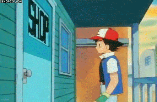
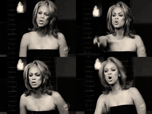
Your parents reaction when you were born:
How you felt on your first day of school:
well this is how I am every day, all the time so yes
Your reaction when you learned to ride a bike:
Your reaction to getting a birthday present from your best friend:
I get the feeling a lot of my reactions are going to look like a whore in this post XD
How you felt when you got your first crush:
DEAD
How your first crush felt when you told them:
GET IT, ME
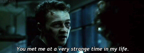
Your reaction when your parents sat you down to have 'the talk':
How you felt after your first kiss:
Your partner's reaction to that kiss:
LOL OMG
How you felt after your very first hangover:
How you felt after having sex for the first time:
omg....
How you felt waiting for your exam results:
well me always, so yeah
Your reaction to failing an exam:
doesn't matter, had sex
Your reaction to passing an exam:
How you felt after getting into your chosen university:

Your reaction to being dumped by your partner:
How you felt after smoking pot for an evening:
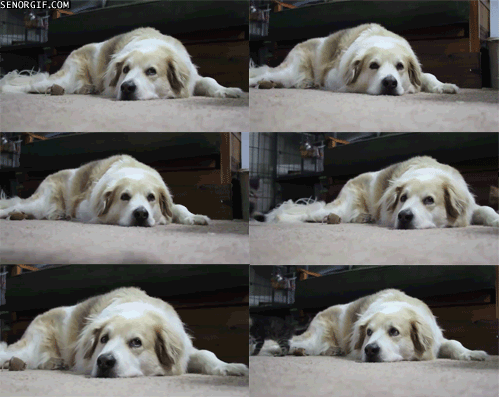
Everyone's reaction to a party you organised:
my parties don't go all that well...
Your reaction to finding your true love:
Your reaction to graduating:
How you felt on your wedding day:
How you felt during your wedding night:
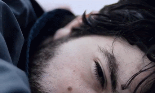
Your reaction when you find out you're pregnant:
The .gif that describes the rest of your life:
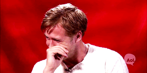
Your family's reaction when you pass away:
WHY FRIENDS, WHY ;___;
4.
So, lets talk New Years Resolutions. Last year I had intentions to:
-move out of home - check
-re-establish my fannish roots - check
-get better at talking to people - check
-make new friends - check
-shoot 3 shoots a month - not quite check, but I moved cities and had to build a life from scratch so I think I did pretty decently considering.
-work solely as a photographer - I've started along that journey but not quite there yet
So for this next year:
-I REALLY need to be working in a purely artistic/aesthetic area, none of this bakery rubbish. I need my job to be creation because it's what I've devoted my life to and doing everything else feels like a colossal waste of time.
-I really want to keep up the whole graphic-a-day thing. I've made a rule that if my shift is more than 8 hrs then it's okay for me to not have enough energy to do it (but hopefully if my job is to make graphics then it really CAN be a daily thing)
-be published. Ties in closely with the first two points, but it really is the next step for me
-exhibit in an art gallery. Not sure how possible this is but it's something I'd like to explore a lot more
-I took out a loan to buy the car, it's not totally realistic to finish it but I'd like to have made a considerable dent in it.
-Find friends that I really love. I've got a decent number of people in my life since I've moved cities, but I feel like the quality of people could be improved upon.
-and lastly: meet and/or shoot Tabrett Bethell. I hear she's living in Sydney again and she's still technically signed to a model agency here so... it's a goal! Again, whether or not it's realistic is another thing but it's on the board!
5. So before I get into talking icons, I just thought I'd mention that I've made a graphic journal feed_themachine. I've only done a little bit so far but the intent is to archive every graphic I've ever made. There is a LOT of old stuff, so at the moment I wouldn't say I'm proud of much other than the previews for each category but it's interesting to see the different stages of my progression bundled together like that. Over time I will include more icons, my textures and also my photos but it's a work in progress :)
a)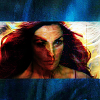
Love this. Love the intensity and the contrast and the texture and the blue in the bars. My main problem is that the hue of her skin is rather splotchy? There are bits of blue and pink and green all over the place and it's not super attractive... but overall - yes!
b)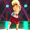
really like this one, I feel like texturally it could have a bit more going on, the tonality feels a bit flat and there is a bit of pixellation in the image and it could have distracted from that. But I am very much enjoying the colours and their juxtaposition with each other.
c)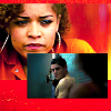
for me, this represents everything I love about misfits all in one place, I love it so much. I love how pensive Aleisha looks (the scene that cap is from KILLS. ME.) and that it's not a super attractive expression from her but weirdly I'm really liking unattractive photos of people right now. Also it looks like she's reminiscing on her encounter with Future!Simon
Love how blown out the reds are and how "ultra real" it is, juxtaposed with the dark, dullness of the other cap. I think that's a genre I really want to explore more in icons - combining very different colourings within the one icon. My main issue is that the colouring on the Simon cap isn't particular unique or creative and took me about ten seconds and I expect more from myself
d)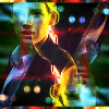
mmmmmyeah... not crazy about this. I like some of the colours around her face but there's another two thirds of the cap that aren't all that eventful... I prescribe more textures!!! (except it was for a 'normal' challenge at theskilltester so textures were banned)
e)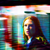
again, not wild about it... the colours are alright but the crop isn't all that exciting and I don't think it was the best crop either. And also the wrong textures for the job.
f)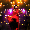
I like this. I think it's a nice cap choice and I've cleaned up the scene nicely, but it's a little plain-looking. I don't love the colours, it could do with some more "cool" colours because there are reds and purples and it's all just very warm.
g)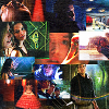
oh lord what is this mess... I really need to learn how to blend caps better because this is a nightmare. I love ALL of the caps, but there is NOTHING good about this.
h)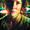
I'm not massively invested in this cap, but I'm really happy with the colours I brought out of it, especially the greens and that red lens flare (so into lens flairs right now)
i)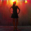
I like the simplity of this, the thing that bugs me most is the huge lack of contrast in the lower half. The top is really pleasant but the bottom just loses everything
j)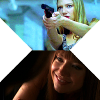
not a fan. I wanted to show the contrast between the two universes but I think I picked the wrong caps, but I was too lazy to go hunting for them so yeah. I do think if I went in and cropped them as icons individually then it would be nice (very much liking the cyans up the top) but just as a cohesive whole it's not working for me.
k)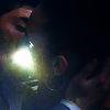
I really like how abstract this is. Even people who know the show probably aren't going to be able to tell what's going on (it's the kiss from the end of the Hitler episode of Misfits) but I think the colours are very wrong. I think it's a bit TOO saturated? I'm not sure
l)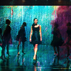
love this, love this, love this. My favourite icon in this post, I think it goes right up there with the other top icons I've made, except it's with a subject I'm currently really passionate about! Santana is the star of Glee at the moment and I am loving every minute of it, ESPECIALLY the Someone Like You/Rumor Has It performance. So this is just the epitome of my Glee obsession.
Not to mention the colours!! And the textures!! Just perfection in every way!!
m)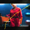
once again digging the abstractness. Really like the colours and how they work together, they're all so distinct. The gradient of it all is really nice and that yellow line just ties it all together.
n)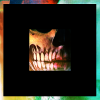
really like this. the colours are just so ME with the vibrancy and the variance. I've been meaning to do a black obscuring box like this for a while now so that's all good. I just know nothing about the cap or scene is all :/
o)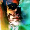
obviously a variant on 'n'. I like it less. I feel like because I see more colour I should like it more, but I don't... I think perhaps I'm more into obscuring than I thought.
p)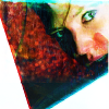
ugh reeeealy like this. The expression and the intensity and her EYES, just ugh. I like the splotch of paint texture in there, also. My one problem is that the colours could be a bit more refined, where it blows out at the white blocks it's a bit too saturated and there are some bits that are a bit TOO green but yeah overall I'm a fan!
q)
would you look at that, the same expression as 'p', it appears I have a look :P
Like the texture use, like the crop, I feel like the edge to the texture on the right is a bit too harsh and that the colours could have a bit more of a kick but yeah, overall I dig it!
r)
yeeeesh, why... the texture looked so good at 300x300px but nothing I did could make it look even half decent resized down :/ Love the crop - the colours are unpleasant.
s)
I like this more than the previous, but not by much. I do actually like the texture, I do actually like the colours, but in putting those in you've totally lost the actual image and all of its depth
t)
very happy with this, I like the crop (it's not often I can do far out crops well) I like the reds and the texture, but I feel like the sky isn't all that interesting and either the colours should have been adjusted or another image should have been shopped in.
u)
I like that there is more variation in colour, but overall I think this is worse than the previous. If this was just cropped on his face I think I would have liked it more because I really like the colours there but the contrast on his body and the sky is just so intense and unfortunate :/
HOWEVER, it was my first Christmas since leaving Adelaide and coming back gave me a world of perspective. I really don't feel like I've changed that much since moving to Sydney, but being back, everything seemed totally different and yet exactly the same, it's the weirdest feeling and it made me really appreciate the new life and independance I have set up for me here.
2. So I've just started watching a british comedy called Outnumbered and I have to tell everybody about it!! I'm so disappointed that nobody got me on to it sooner because it is HILARIOUS, one of the best comedies I've seen in ages.
It's just about a standard British family, but what makes it special is that the children are unscripted (they're just given prompts for each scene) and so it gives everything a really real and believable quality that is just unparalleled. The parents are realistic also but the kids take everything to a whole other level (and Jake IS my youth, it's like his character was written specifically for me)
3. xmaidelx did this meme aeons ago and I've been meaning to do it ever since
1. Open your .gif folder.
2. Use every third .gif as a reaction to the statement.
(done reverse-chronologically because my old gifs are rubbish)
Your parents reaction when you were born:
How you felt on your first day of school:

well this is how I am every day, all the time so yes
Your reaction when you learned to ride a bike:

Your reaction to getting a birthday present from your best friend:

I get the feeling a lot of my reactions are going to look like a whore in this post XD
How you felt when you got your first crush:

DEAD
How your first crush felt when you told them:

GET IT, ME
Your reaction when your parents sat you down to have 'the talk':

How you felt after your first kiss:

Your partner's reaction to that kiss:

LOL OMG
How you felt after your very first hangover:

How you felt after having sex for the first time:

omg....
How you felt waiting for your exam results:

well me always, so yeah
Your reaction to failing an exam:

doesn't matter, had sex
Your reaction to passing an exam:

How you felt after getting into your chosen university:

Your reaction to being dumped by your partner:

How you felt after smoking pot for an evening:

Everyone's reaction to a party you organised:

my parties don't go all that well...
Your reaction to finding your true love:

Your reaction to graduating:

How you felt on your wedding day:

How you felt during your wedding night:

Your reaction when you find out you're pregnant:

The .gif that describes the rest of your life:

Your family's reaction when you pass away:

WHY FRIENDS, WHY ;___;
4.
So, lets talk New Years Resolutions. Last year I had intentions to:
-move out of home - check
-re-establish my fannish roots - check
-get better at talking to people - check
-make new friends - check
-shoot 3 shoots a month - not quite check, but I moved cities and had to build a life from scratch so I think I did pretty decently considering.
-work solely as a photographer - I've started along that journey but not quite there yet
So for this next year:
-I REALLY need to be working in a purely artistic/aesthetic area, none of this bakery rubbish. I need my job to be creation because it's what I've devoted my life to and doing everything else feels like a colossal waste of time.
-I really want to keep up the whole graphic-a-day thing. I've made a rule that if my shift is more than 8 hrs then it's okay for me to not have enough energy to do it (but hopefully if my job is to make graphics then it really CAN be a daily thing)
-be published. Ties in closely with the first two points, but it really is the next step for me
-exhibit in an art gallery. Not sure how possible this is but it's something I'd like to explore a lot more
-I took out a loan to buy the car, it's not totally realistic to finish it but I'd like to have made a considerable dent in it.
-Find friends that I really love. I've got a decent number of people in my life since I've moved cities, but I feel like the quality of people could be improved upon.
-and lastly: meet and/or shoot Tabrett Bethell. I hear she's living in Sydney again and she's still technically signed to a model agency here so... it's a goal! Again, whether or not it's realistic is another thing but it's on the board!
5. So before I get into talking icons, I just thought I'd mention that I've made a graphic journal feed_themachine. I've only done a little bit so far but the intent is to archive every graphic I've ever made. There is a LOT of old stuff, so at the moment I wouldn't say I'm proud of much other than the previews for each category but it's interesting to see the different stages of my progression bundled together like that. Over time I will include more icons, my textures and also my photos but it's a work in progress :)
a)

Love this. Love the intensity and the contrast and the texture and the blue in the bars. My main problem is that the hue of her skin is rather splotchy? There are bits of blue and pink and green all over the place and it's not super attractive... but overall - yes!
b)

really like this one, I feel like texturally it could have a bit more going on, the tonality feels a bit flat and there is a bit of pixellation in the image and it could have distracted from that. But I am very much enjoying the colours and their juxtaposition with each other.
c)

for me, this represents everything I love about misfits all in one place, I love it so much. I love how pensive Aleisha looks (the scene that cap is from KILLS. ME.) and that it's not a super attractive expression from her but weirdly I'm really liking unattractive photos of people right now. Also it looks like she's reminiscing on her encounter with Future!Simon
Love how blown out the reds are and how "ultra real" it is, juxtaposed with the dark, dullness of the other cap. I think that's a genre I really want to explore more in icons - combining very different colourings within the one icon. My main issue is that the colouring on the Simon cap isn't particular unique or creative and took me about ten seconds and I expect more from myself
d)

mmmmmyeah... not crazy about this. I like some of the colours around her face but there's another two thirds of the cap that aren't all that eventful... I prescribe more textures!!! (except it was for a 'normal' challenge at theskilltester so textures were banned)
e)

again, not wild about it... the colours are alright but the crop isn't all that exciting and I don't think it was the best crop either. And also the wrong textures for the job.
f)

I like this. I think it's a nice cap choice and I've cleaned up the scene nicely, but it's a little plain-looking. I don't love the colours, it could do with some more "cool" colours because there are reds and purples and it's all just very warm.
g)

oh lord what is this mess... I really need to learn how to blend caps better because this is a nightmare. I love ALL of the caps, but there is NOTHING good about this.
h)

I'm not massively invested in this cap, but I'm really happy with the colours I brought out of it, especially the greens and that red lens flare (so into lens flairs right now)
i)

I like the simplity of this, the thing that bugs me most is the huge lack of contrast in the lower half. The top is really pleasant but the bottom just loses everything
j)

not a fan. I wanted to show the contrast between the two universes but I think I picked the wrong caps, but I was too lazy to go hunting for them so yeah. I do think if I went in and cropped them as icons individually then it would be nice (very much liking the cyans up the top) but just as a cohesive whole it's not working for me.
k)

I really like how abstract this is. Even people who know the show probably aren't going to be able to tell what's going on (it's the kiss from the end of the Hitler episode of Misfits) but I think the colours are very wrong. I think it's a bit TOO saturated? I'm not sure
l)

love this, love this, love this. My favourite icon in this post, I think it goes right up there with the other top icons I've made, except it's with a subject I'm currently really passionate about! Santana is the star of Glee at the moment and I am loving every minute of it, ESPECIALLY the Someone Like You/Rumor Has It performance. So this is just the epitome of my Glee obsession.
Not to mention the colours!! And the textures!! Just perfection in every way!!
m)

once again digging the abstractness. Really like the colours and how they work together, they're all so distinct. The gradient of it all is really nice and that yellow line just ties it all together.
n)

really like this. the colours are just so ME with the vibrancy and the variance. I've been meaning to do a black obscuring box like this for a while now so that's all good. I just know nothing about the cap or scene is all :/
o)

obviously a variant on 'n'. I like it less. I feel like because I see more colour I should like it more, but I don't... I think perhaps I'm more into obscuring than I thought.
p)

ugh reeeealy like this. The expression and the intensity and her EYES, just ugh. I like the splotch of paint texture in there, also. My one problem is that the colours could be a bit more refined, where it blows out at the white blocks it's a bit too saturated and there are some bits that are a bit TOO green but yeah overall I'm a fan!
q)

would you look at that, the same expression as 'p', it appears I have a look :P
Like the texture use, like the crop, I feel like the edge to the texture on the right is a bit too harsh and that the colours could have a bit more of a kick but yeah, overall I dig it!
r)

yeeeesh, why... the texture looked so good at 300x300px but nothing I did could make it look even half decent resized down :/ Love the crop - the colours are unpleasant.
s)

I like this more than the previous, but not by much. I do actually like the texture, I do actually like the colours, but in putting those in you've totally lost the actual image and all of its depth
t)

very happy with this, I like the crop (it's not often I can do far out crops well) I like the reds and the texture, but I feel like the sky isn't all that interesting and either the colours should have been adjusted or another image should have been shopped in.
u)

I like that there is more variation in colour, but overall I think this is worse than the previous. If this was just cropped on his face I think I would have liked it more because I really like the colours there but the contrast on his body and the sky is just so intense and unfortunate :/