(no subject)
1. So just a bit of a life update - I'm very much settled in Sydney now. I've got a teeny little apartment in a REALLY nice neighborhood (but it's okay, I don't need much space, I've still got room to spare even!) I'm not sharing which is AWESOME! Seriously, not having to deal with living with other people is SO WORTH THE MONEY YOU GUYS! I have an entire fridge all to myself!!! and there's no chance of somebody else using up all the hot water! Nobody else can use up all of the internet bandwidth! And nobody complains if I don't do the dishes right away! Everything is just the way I want it 100% of the time, it's so amazing!
And it's kind of funny because I've sort of turned my life into a "best of" from all of the other periods of my life. I was probably at my happiest during my gap year when I was working at the bakery and doing graphics on the side, except this time I'm working at a much more prestigious bakery with much nicer people and better food/hours/etc. And instead of just working on icons, I've got two years of photographic training behind me! HOORAY!
Also I'm not sure if you all remember but I set myself a new years resolution last year to make a graphic a day and it just increased my productivity and creativity tenfold (but then life stuff happened and it had to be stopped) but now I've picked that up again and as I've said before, I cannot recommend you do this enough! Everything just comes so much more naturally and you feel productive just constantly creating, and you know you're never going to fall into that "oh, I'll just do some tomorrow" mentality, it's fantastic!
I'm skyping with family and friends so I don't really feel out of touch with them. Because Skype is amazingly fast these days it really is as if I'm just sitting down and having a regular conversation with them.
All in all, life just keeps on taking leaps and bounds towards my fantasy life.
2. So long story short, I did a photoshoot in January for a friend of mine who works for a phone company and in exchange he could get me a two year prepaid phone contract with any phone I want (and a new lens!) I decided on the iPhone and since I've become dependent on it for almost everything (I honestly can't promote it enough, I love mine so much) so I thought I'd share with you some of my favourite apps
Plaintext - it's like a standard .txt file with no frills, except on your phone! You can set it up to sync to your computer so that you always have your stuff with you (except for some reason mine has problems with that). Very simple - much better than the notepad that comes with the iphone
LED Flashlight - turns your camera flash into a torch! And now your phone is a torch along with doing all of the other things it already does! HOORAY!
Facebook - eh, not that great honestly, but lots of people contact me via facebook and it sends messages through as pop-up messages like when you get a new text so there's that.
Skype - It's Skype and on your phone. Need I say more...
Plants Vs. Zombies - I've talked about how much I love this game before (I believe the words "best game of the decade" were used) and now you can play it on the bus or while you're in queue at the bank. WIN:WIN
Peggle - made by the same guys as Plants Vs. Zombies. It's good, just... better on the computer. You don't have as much control as you have with a mouse... but it's still worth paying $2 or whatever it's worth nowadays.
The Secret of Monkey Island and Monkey Island 2: LeChuck's Revenge - AWESOME awesome games. Best games of the 90's by far, bound to go down in gaming history, etc. And again, now you can just play it while you're waiting for your friend to finish looking at clothes!
Tetris - I mean... it's tetris...
Fruit Ninja - mindless fun!! That said a bit easy to "finish", but did I mention the fun?
Jetpack Joyride - my current drug. I'd say it's very close on the heels of PvZ for 'best iPhone game'. It's very simple but VERY well designed. And I'm not just talking graphically but gameplay-wise there are lot of clever features that make it really easy to play and feel accomplished while still being challenging but not overwhelming.
realestate.com - don't think this really applies if you're outside of Aus but I would have gone insane looking for an apartment without this. It's so easy to use and the map design just feels so natural
3. This is a segment for me to post pictures of attractive slightly older people. For a long time I've felt that 21 was the height of beauty and then it's only downhill from there (or 'here' as the case may be for me) but these people give me hope for the future
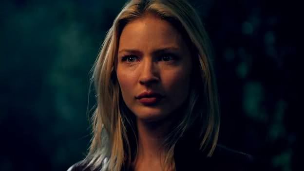
okay so she's not OLD, she's only 28 but seriously I would never have guessed that! I would have suspected 22-23ish!
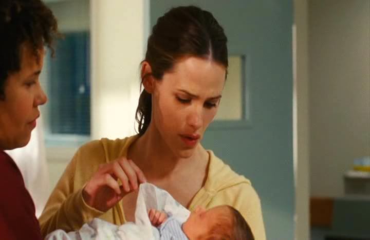
I don't understand why she isn't aging! She looks exactly the same as she did on Alias 10 years ago!

She just gets more and more adorable doesn't she? And I think her story applies best to this segment because she's said previously that she only really started taking care of the way she looked in the past decade and DOESN'T IT SHOW! The difference it makes is unbelievable, here's a shot of her in her 20's (ok still kind of adorable, but honestly there's no comparison)
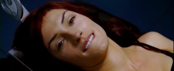
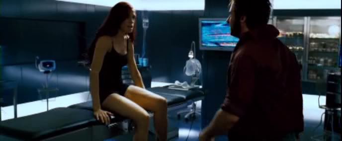
Ok here's the real reason I posted this segment... UGH SHE IS 42 YOU GUYS!! HOW IS THIS EVEN POSSIBLE!? THAT IS THE SAME AGE AS MY PARENTS!! THERE IS HOPE FOR EVERYONE!!! (on a technical note, 42 at the age of shooting X-Men 3, currently 46)
And now it's your turn, play along and post attractive older people so we can all feel a bit less worried when our birthdays roll around
4. So... icons! It's been a while! Damn some of these are old!
a)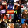
made for the current 20inspirations challenge (which is to epitomize your subject). I've just recently watched Firefly and fell COMPLETELY IN LOVE WITH EVERYTHING EVERYBODY WATCH THIS SHOW RIGHT NOW but the problem is that I wanted to epitomize everything I love about Firefly and I love too many things. I think that I'm going to do is go back and look at my cap choices and see if there are any strong recurring themes and keep it a bit simpler...
b)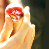
but oh wait, I already did that! Except now it's too simple. I mean, I really like the overexposure, but for it to be "my style" it really needs to be darker and have more texture. And maybe if the hand was a little more centered and I used a bit of the texture to cover River's face so the focus was still on the hand...
c)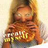
so... uh... just to explain...
Yeah, I think this is my first "joke" icon! I'm usually very serious! Although it is still fairly dark and moody for a "joke" icon :P I think it turned out really well, it definitely gets the message across. I think if I were judging it technically, I'd say that it needs a bit more texture (just something subtle to make it feel a little crisper) and the font is not great, but really... I made it in 20 minutes and as a joke so lets give me a break, yeah?
d)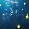
noooot a fan... I really loved Black Swan but I think maybe this wasn't the best cap choice, it doesn't really tell a lot about how Black Swan makes me feel (perhaps there could be a multiple cap blend?). I'd really forgotten how frustrating low quality caps can be to work with, it makes such a difference, but I think if I'd used textures then that could have taken the colouring somewhere else without me having to rely on the original image.
e)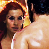
so, this was my first icon back after the year-long break! I don't really like it... I'm really into the Phoenix and everything she represents and I'm just getting way too much of Hugh Jackman's back (who could have thought that would be a bad thing?). And colouring-wise, I'm seeing a lot of reds but almost nothing else
f)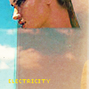
like the colours here, like the segments, like her FACE. Do not like the text in the corner. I like the composition of it, but the yellow was a very wrong choice and I wish it was more illegible because it was just supposed to be a design element, and now everybody who looks at it is going to be asking "electricity why?"
g)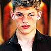
Like this a lot! It's very simple but the colours are still strong, the balance of yellows and reds throughout his skin tone. The composition is nice, reminds me of this one and the background as a nice framing element to it, but it's a little TOO TOO symmetrical, gotta mix it up a little bit!
h)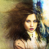
don't really like anything about this one. It was the wrong picture choice, the composition is off, the contrast is completely out of control... nup. just nup.
i)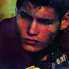
Made for the dark theskilltester challenge. It made me realise that no dark graphic is THAT dark and that the line of darkness should take into consideration saturation and slight highlights as well.
j)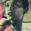
for a black and white, I don't hate this! The pink works well, the composition is nice, it's just... it could be so much better if it had colour
k)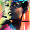
CASE. IN. POINT. Colours A+, textures A+... I think the contrast is a little much but other than that - YAY!
l)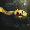
ugh this cap, I just melt when I see it. Nice texture use - as proven by previous icons - could be a lot better. Why so murky and brown? :/
m)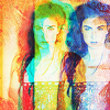
probably my least favourite of all of these. And as an abstract I actually don't hate it, the colours are very nice but you totally lose all depth to Jacqueline's face and it doesn't even come close to conveying how beautiful she is.
n)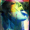
probably my favourite of the lot. My favourite thing is that yes, I've got colours, I've got saturation and textures and all of that but there's also desaturation in amongst it and I think that makes the strong points even stronger by comparison. I think this is something I really want to keep in mind in my future work
o)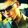
good cap, good colours... and yet no textures... why do I do this to myself? Textures are awesome, how can I keep forgetting that?
And it's kind of funny because I've sort of turned my life into a "best of" from all of the other periods of my life. I was probably at my happiest during my gap year when I was working at the bakery and doing graphics on the side, except this time I'm working at a much more prestigious bakery with much nicer people and better food/hours/etc. And instead of just working on icons, I've got two years of photographic training behind me! HOORAY!
Also I'm not sure if you all remember but I set myself a new years resolution last year to make a graphic a day and it just increased my productivity and creativity tenfold (but then life stuff happened and it had to be stopped) but now I've picked that up again and as I've said before, I cannot recommend you do this enough! Everything just comes so much more naturally and you feel productive just constantly creating, and you know you're never going to fall into that "oh, I'll just do some tomorrow" mentality, it's fantastic!
I'm skyping with family and friends so I don't really feel out of touch with them. Because Skype is amazingly fast these days it really is as if I'm just sitting down and having a regular conversation with them.
All in all, life just keeps on taking leaps and bounds towards my fantasy life.
2. So long story short, I did a photoshoot in January for a friend of mine who works for a phone company and in exchange he could get me a two year prepaid phone contract with any phone I want (and a new lens!) I decided on the iPhone and since I've become dependent on it for almost everything (I honestly can't promote it enough, I love mine so much) so I thought I'd share with you some of my favourite apps
Plaintext - it's like a standard .txt file with no frills, except on your phone! You can set it up to sync to your computer so that you always have your stuff with you (except for some reason mine has problems with that). Very simple - much better than the notepad that comes with the iphone
LED Flashlight - turns your camera flash into a torch! And now your phone is a torch along with doing all of the other things it already does! HOORAY!
Facebook - eh, not that great honestly, but lots of people contact me via facebook and it sends messages through as pop-up messages like when you get a new text so there's that.
Skype - It's Skype and on your phone. Need I say more...
Plants Vs. Zombies - I've talked about how much I love this game before (I believe the words "best game of the decade" were used) and now you can play it on the bus or while you're in queue at the bank. WIN:WIN
Peggle - made by the same guys as Plants Vs. Zombies. It's good, just... better on the computer. You don't have as much control as you have with a mouse... but it's still worth paying $2 or whatever it's worth nowadays.
The Secret of Monkey Island and Monkey Island 2: LeChuck's Revenge - AWESOME awesome games. Best games of the 90's by far, bound to go down in gaming history, etc. And again, now you can just play it while you're waiting for your friend to finish looking at clothes!
Tetris - I mean... it's tetris...
Fruit Ninja - mindless fun!! That said a bit easy to "finish", but did I mention the fun?
Jetpack Joyride - my current drug. I'd say it's very close on the heels of PvZ for 'best iPhone game'. It's very simple but VERY well designed. And I'm not just talking graphically but gameplay-wise there are lot of clever features that make it really easy to play and feel accomplished while still being challenging but not overwhelming.
realestate.com - don't think this really applies if you're outside of Aus but I would have gone insane looking for an apartment without this. It's so easy to use and the map design just feels so natural
3. This is a segment for me to post pictures of attractive slightly older people. For a long time I've felt that 21 was the height of beauty and then it's only downhill from there (or 'here' as the case may be for me) but these people give me hope for the future

okay so she's not OLD, she's only 28 but seriously I would never have guessed that! I would have suspected 22-23ish!

I don't understand why she isn't aging! She looks exactly the same as she did on Alias 10 years ago!

She just gets more and more adorable doesn't she? And I think her story applies best to this segment because she's said previously that she only really started taking care of the way she looked in the past decade and DOESN'T IT SHOW! The difference it makes is unbelievable, here's a shot of her in her 20's (ok still kind of adorable, but honestly there's no comparison)


Ok here's the real reason I posted this segment... UGH SHE IS 42 YOU GUYS!! HOW IS THIS EVEN POSSIBLE!? THAT IS THE SAME AGE AS MY PARENTS!! THERE IS HOPE FOR EVERYONE!!! (on a technical note, 42 at the age of shooting X-Men 3, currently 46)
And now it's your turn, play along and post attractive older people so we can all feel a bit less worried when our birthdays roll around
4. So... icons! It's been a while! Damn some of these are old!
a)

made for the current 20inspirations challenge (which is to epitomize your subject). I've just recently watched Firefly and fell COMPLETELY IN LOVE WITH EVERYTHING EVERYBODY WATCH THIS SHOW RIGHT NOW but the problem is that I wanted to epitomize everything I love about Firefly and I love too many things. I think that I'm going to do is go back and look at my cap choices and see if there are any strong recurring themes and keep it a bit simpler...
b)
but oh wait, I already did that! Except now it's too simple. I mean, I really like the overexposure, but for it to be "my style" it really needs to be darker and have more texture. And maybe if the hand was a little more centered and I used a bit of the texture to cover River's face so the focus was still on the hand...
c)

so... uh... just to explain...
Yeah, I think this is my first "joke" icon! I'm usually very serious! Although it is still fairly dark and moody for a "joke" icon :P I think it turned out really well, it definitely gets the message across. I think if I were judging it technically, I'd say that it needs a bit more texture (just something subtle to make it feel a little crisper) and the font is not great, but really... I made it in 20 minutes and as a joke so lets give me a break, yeah?
d)

noooot a fan... I really loved Black Swan but I think maybe this wasn't the best cap choice, it doesn't really tell a lot about how Black Swan makes me feel (perhaps there could be a multiple cap blend?). I'd really forgotten how frustrating low quality caps can be to work with, it makes such a difference, but I think if I'd used textures then that could have taken the colouring somewhere else without me having to rely on the original image.
e)

so, this was my first icon back after the year-long break! I don't really like it... I'm really into the Phoenix and everything she represents and I'm just getting way too much of Hugh Jackman's back (who could have thought that would be a bad thing?). And colouring-wise, I'm seeing a lot of reds but almost nothing else
f)

like the colours here, like the segments, like her FACE. Do not like the text in the corner. I like the composition of it, but the yellow was a very wrong choice and I wish it was more illegible because it was just supposed to be a design element, and now everybody who looks at it is going to be asking "electricity why?"
g)

Like this a lot! It's very simple but the colours are still strong, the balance of yellows and reds throughout his skin tone. The composition is nice, reminds me of this one and the background as a nice framing element to it, but it's a little TOO TOO symmetrical, gotta mix it up a little bit!
h)
don't really like anything about this one. It was the wrong picture choice, the composition is off, the contrast is completely out of control... nup. just nup.
i)

Made for the dark theskilltester challenge. It made me realise that no dark graphic is THAT dark and that the line of darkness should take into consideration saturation and slight highlights as well.
j)

for a black and white, I don't hate this! The pink works well, the composition is nice, it's just... it could be so much better if it had colour
k)

CASE. IN. POINT. Colours A+, textures A+... I think the contrast is a little much but other than that - YAY!
l)

ugh this cap, I just melt when I see it. Nice texture use - as proven by previous icons - could be a lot better. Why so murky and brown? :/
m)

probably my least favourite of all of these. And as an abstract I actually don't hate it, the colours are very nice but you totally lose all depth to Jacqueline's face and it doesn't even come close to conveying how beautiful she is.
n)

probably my favourite of the lot. My favourite thing is that yes, I've got colours, I've got saturation and textures and all of that but there's also desaturation in amongst it and I think that makes the strong points even stronger by comparison. I think this is something I really want to keep in mind in my future work
o)

good cap, good colours... and yet no textures... why do I do this to myself? Textures are awesome, how can I keep forgetting that?