Tutorial#003: "Tora"
TUTORIAL#03: "TORA"
-making of TYPE B-
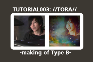
You will need...
° Photoshop C2 [mainly convertible] ° textures with contrast and/or nature patterns ° patience ° steady erasing hand ° a good half an hour °
BCL icons made with this method:
Comments: This tutorial is here to show you how I work with textures. And, hence, I'm not sure if this is usable to any of you xD My icons are mostly based on sheer luck instead of know-how made of iron. Hopefully you'll get some ideas, though.
NOTICE: Don't copy directly! Convert and apply to your own style :) Feel free to practice with the following material but don't go posting the finished icon as your own.
001: Choose your base:
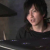
Go to
->"Layer" -> "New adjustment layer" -> "Curves"
With the curves line that now appears, create a gently arched... curve xD;; Something similar to these input and output figures:
Input: 80
Output: 118
Input: 179
Output: 219
// Now you'll understand why this tutorial sucks. Pretty much, you have to create the whole "work file" and then re-do it by adjusting all the layers and color settings to suit your base. I used a half-finished work file (just threw a new base in there) so I cannot really say, 'I did this and that to reach this sort of effect for that's sake'. For example, this following step was not included until I was finished because I felt the icon wasn't "strong" enough in shadows. You can add the following stuff now and delete it later if it makes your picture look wonky, okay?//
002: Duplicate the base twice ->the first one "screen 25%" ->the second one "overlay 36%". I often use "screen - overlay" layer couple because with it it's easy to play around with shadows.
003: "Layer" -> "New adjustment layer" -> "Color balance"
Cyan----Red -24
Magenta----Green +29
Yellow----Blue +72
Set the layer to "Normal 16%"
(->Duplicate, "Overlay 3%")
//This is an important step, babies! Because if you tweak the numbers a bit, your result will look drastically different -f.ex. this can be made:
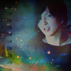
004: "Layer" -> "New adjustment layer" -> "Hue and Saturation" -> "Saturate +37"
005: Then, a wee bit of "manual" coloring:
->new layer ->paint bucket tool ->fill the layer with something similar to #49140b (I'd prefer something a bit more bluish) ->"screen 100%"
006:Texture time!
Add
by tralala_icons and set it to "multiply 42%"
Add
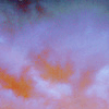
by tralala_icons and set it to "color dodge 9%"
//Color dodge is a very handy tool to give icons glow. BUT, keep the transparency number <10 in small graphics! Color Dodge is very similar to "curves" when comparing the results the different tools give.//
007: More manual coloring!
New layer ->fill it with turquoise (f.ex. #b3e6d9). Set to "overlay, 17%"
008:
Add
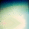
made by unknown, set it to "screen, 100%" and drag it to the bottom of the icon so the flare in the texture's upper part creates this "light effect" (you'll understand when you try this yourselves)
009: New layer ->fill with pink (f.ex. #e8b0b0) and set to "soft light, 16%)
010: "Layer" ->"New adjustment layer" ->"selective coloring"
(!photoshop only!)
Reds:
-100
+100
+100
+100
Yellows:
0
0
+100
0
Greens:
+100
+24
-91
+95
Cyans:
+100
+31
-48
-8
Blues:
+100
-57
-64
+100
Neutrals:
-21
-3
0
0
011: New layer ->fill with #35398c (midnight blue) ->set to "overlay, 30%"
012: New layer ->fill with #f7efce (skin) ->duplicate ->first one, "color burn 83%", the second "overlay 8%"
->duplicate the "color burn skin layer" and drag it past the "overlay layer". Change the transparency to "27%".
013:
Add
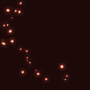
by graphic_sl and set it to "lighten 100%"
//"Lighten" and "screen" create very similar effects so really, it's up to you. However, here, "screen" will make the icon a bit more reddish than I wanted. Plus, the lights are sharper with "lighten"//
014:
Add
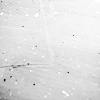
by damnicons and set it to "lighten 16%"
"Eraser tool" -> size ~22, opacity ~18%, hardness ~18% ->now, gently, delete the parts of the texture that cover Torashi's face. Notice! The tool options are like that so you can easily, step by step, "decrease" the texture on his face. If you delete all of it away, the face shows up kinda dark. Now, there's actually a very thin texture layer on his face, giving the icon this smoky feel I like. I've also softened the texture on other parts as well, stopping when the result pleased my eyes. This step is NOT a must if you prefer darker images but for the soft result this is needed.
015: Coloring continues:
->New layer ->fill it with turquoise (f.ex. #b3e6d9). Set to "overlay, 7%"
->New layer ->fill with pink (f.ex. #e8b0b0) and set to "soft light, 22%
->New layer ->fill it with turquoise (f.ex. #b3e6d9). Set to "overlay, 25%"
HALFWAY THROUGH, YEY!\o/
016: New layer ->"new adjustment layer" -> "selective coloring"
Neutrals:
Cyan: +21
Yellow: -6
New layer ->"new adjustment layer" -> "selective coloring"
Reds:
-14
+5
+13
0
Neutrals:
+13
-4
-14
0
015:
Add
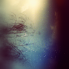
by tralala_icons and set it to "soft light 100%". "Edit" -> "Transform" -> "Rotate 90CCW"
->"Smudge tool", start with options very light, for example size 12, opacity 50, hardness 30. Smudge the shrub seen in the texture away, increasing opacity and hardness both to around 88 after a few rounds.
Add the texture again. This time set it to ->"overlay 41%". No need for smudging.
Add the texture again. Set it to "soft light 100%" ->Rotate "90CW". Smudge the parts of the shrub away that annoy you.
Add the texture again. Set "Multiplay, 71%". Now this makes sense again, yes? :D "Edit" -> "Transform" -> "Rotate Horizontal" ->smudge the shrub away. Now the icon probably looks a bit dark, so continue smudging to stretch the white part to cover a bit of Tora's chin or whatever looks good to you. Now, I have a beautiful light flare on the center of the icon, highlighting Tora's features nicely.
016:
Add

by backstage_art or a texture similar and set it to "Multiplay 100%". Move it around a bit to find a spot you like. You can include the scribbly part of the texture to your icon as well. I deleted it.
017: ALMOST FINISHED!! GO GIRLS AND BOYS, YOU~CAN~DO~IT! :D
Add this texture again:

. Set it to "Multiply 57%" to tone the icon down. Go "Image" -> "Adjustments" -> "Desaturate". "Edit" -> "Transform" -> "Rotate 90CCW"
Go the texture through with smudge tool. Because the texture is set to multiplay, you should be able to easily see which parts look good and which don't at the moment. As a general advice I could mention that try to make the layer very "medium", meaning soft down all the darkest and lightest parts. Leave a bit of dark to the upper corners. It looks neat~
//If you wish, duplicate this step: add the texture again, desaturate it and set to multiply, transparency being 100%. Rotate it "90CW". Smudge the shrub away and stretch the lighter part a bit to reach Tora slightly. Play around with the texture as much as you want: as a result you get a darker version//
018:
"Layer" -> "New adjustment layer" -> "Curves"
This step really depends on the picture you're using and its current state. I used the following figures:
Input:128
Output: 203
Now, it does look quite good. I wanted to make the icon a wee bit lighter, so I duplicated the curves layer twice, setting the first one "normal 55%" and second "normal 47%". Now as I think about it, I think I should've left the third curves layer away? Well, whatever~
019:
Add

by tralala_icons. Before doing anything else, go "Image -> "Adjustments" -> "Variations". Click "yellow" x2, "red" x1 and "cyan" x1.
Set the edited texture to "Multiply 100%" and smudge the parts that require it.
TA'DAH! WE HAVE REACHED OUR GOAL:
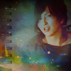
To make your icon purrrrfect, I recommend the following final touches:
Merge the icon and take "blur" tool. Set the opacity to 50, size 3, hardness 40. Zoom in till your icon is around 300%. Work your way through Tora's face with the tool, softening away "dirty looking" parts. BE CAREFUL! Don't overdo it. Don't touch hair unless necessary. Don't melt his nose away!
Now, duplicate the finished icon. "Filters" -> "Sharpen" -> "Sharpen". Set to somewhere between 10 and 20.
Merge again, save and congratulate yourselves. You made it through hell xD
Do not delete the work file after using! If you spend half an hour for this once, it pays itself back soon. Now, altering the work file is illegally easy: add new textures, delete old ones, tweak color layer settings, duplicate curves, whatever you want. I think it was this work file that eventually lead me to making this:
I'd love to see the finished pretties^_- How you felt about this tutorial? I'm humbly waiting for feedback on it~~ Would you like to see me writing another one sometimes soon?
Now, appreciate me for the pretty things I make for you xD As you can see yourselves, it's not easy.