Tutorial: Bosco from Third Watch.
My first tutorial since I started this icon journal. Hopefully you'll find it useful. I chose to do a tutorial for one of my third watch icons, but of course, you don't have to know the fandom to appreciate the tut (duh) :P
Remember
- Important: My graphic program is Corel Photo Paint 11. However, it is easily transposable to PSP or other programs.
- This tutorial is for inspiration, to show you how I do things, etc. However, it is not to be copied exactly. Where would be the creativity in that?
- Feel free to use my gradients, but if you use the textures of the other people I mention in the tutorial, please make sure you give them credit.
- In this tutorial, I use textures by lil_lj and booster_rocket.
Also bare with me, English is not my native language.
The icon is

01. This is the cap I start with:

02. I crop it and reduce it to 100x100. It's too dark, so I do the usual drill: the lightness, the contrast, the sharpening, and smoothening of parts of his face. I get this:
(a)
03. You'll notice I did not bother erasing the channel sign since I know already it will be covered. Now I crop and reduce another selection of the original cap. It's framed a bit differently. It's of course too dark as well so I repeat the lightness, etc... I get (b) and then I flip it horizontally and position it over (a). I get this:
(b)
>> (c)
04. I then add a 5px white line to separate both pics.
(d)
05. I add a new layer which I fill with (e) and set it to multiply/100%, and get (f):
(e)
>> (f)
06. I then duplicate (a) and (b) in new layers on top of (e) and set them to overlay/60%. (Note: the right part of (a) needs to be earsed of course.)I get this:
(g)
07. I create a new layer that I feel with (h) and set to red/37% and get (i):
(h)
>> (i)
08. I then use one of the great textures of lil_lj (j) and modify it a bit with the transparency tool and get (k). I then set (k) to add/44% and get (l):
(j)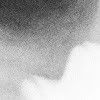
(credit to lil_lj) >> (k)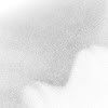
>> (l)
09. I create a new layer which I fill with (m). I set this gradient to color/27%. He's now less yellow.
(m)
>> (n)
10. I then use one the wonderful textures of booster_rocket (o), that I modify with the transparency tool and get (p). I then set (p) to screen/100% and get (q):
(o)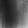
(credit to booster_rocket) >> (p)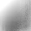
>> (q)
11. Now, you just have to place the text. I usually pick a dark color within the icon for the color of the text. Verdana, size 4 and this is it. The small text is just blah blahs that I wrote in Verdana, size 4 than I then reduced manually. And this is it!!!!
(r)
Remember
- Important: My graphic program is Corel Photo Paint 11. However, it is easily transposable to PSP or other programs.
- This tutorial is for inspiration, to show you how I do things, etc. However, it is not to be copied exactly. Where would be the creativity in that?
- Feel free to use my gradients, but if you use the textures of the other people I mention in the tutorial, please make sure you give them credit.
- In this tutorial, I use textures by lil_lj and booster_rocket.
Also bare with me, English is not my native language.
The icon is
01. This is the cap I start with:
02. I crop it and reduce it to 100x100. It's too dark, so I do the usual drill: the lightness, the contrast, the sharpening, and smoothening of parts of his face. I get this:
(a)
03. You'll notice I did not bother erasing the channel sign since I know already it will be covered. Now I crop and reduce another selection of the original cap. It's framed a bit differently. It's of course too dark as well so I repeat the lightness, etc... I get (b) and then I flip it horizontally and position it over (a). I get this:
(b)
>> (c)
04. I then add a 5px white line to separate both pics.
(d)
05. I add a new layer which I fill with (e) and set it to multiply/100%, and get (f):
(e)
>> (f)
06. I then duplicate (a) and (b) in new layers on top of (e) and set them to overlay/60%. (Note: the right part of (a) needs to be earsed of course.)I get this:
(g)
07. I create a new layer that I feel with (h) and set to red/37% and get (i):
(h)
>> (i)
08. I then use one of the great textures of lil_lj (j) and modify it a bit with the transparency tool and get (k). I then set (k) to add/44% and get (l):
(j)
(credit to lil_lj) >> (k)
>> (l)
09. I create a new layer which I fill with (m). I set this gradient to color/27%. He's now less yellow.
(m)
>> (n)
10. I then use one the wonderful textures of booster_rocket (o), that I modify with the transparency tool and get (p). I then set (p) to screen/100% and get (q):
(o)
(credit to booster_rocket) >> (p)
>> (q)
11. Now, you just have to place the text. I usually pick a dark color within the icon for the color of the text. Verdana, size 4 and this is it. The small text is just blah blahs that I wrote in Verdana, size 4 than I then reduced manually. And this is it!!!!
(r)