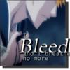
The simplicity of such icons...how well they work is shown in 16. It always nice to see minimal tweaking with teh coloring and such, so the only thing I'll have to comment on is your typography. The placement of text is critical, and its font (plus size, etc.) can make or break an icon.
Thanks for the critique. Any advice I can get is much appreciated. I wasn't sure if you liked the text I used or if I should work on it. Can you give me any adivce? Also, I've yet to discover how to make text and even pictures almost transparent. Any hints on that?
I'm not sure what people like when it comes to icons, so I've been playing around. Would you say the simpler the better?
Heh, for me, simple is best when it lets other concepts shine (colour, subject, sentiments, text). That, and it's easier. what is more "complicated," i.e. masks, floral brushes, desaturation, light textures, tiny text, repeated images, ON AND ON AND ON... just seems a little pretentious and boring. If not done well.
So, someone has to start somewhere.
The text - I say you just have to look at those who are better and those who are worse to see what works if you want a certain look. Like I said, colours should come from the same palate of the base image. They should also be subtle in their placement. 'Bored now' in 15 doesn't have to be so large and stick-out. So long as we can read it. :3
Comments 7
Reply
Reply
Keep on truckin'. :3
Reply
I'm not sure what people like when it comes to icons, so I've been playing around. Would you say the simpler the better?
Reply
So, someone has to start somewhere.
The text - I say you just have to look at those who are better and those who are worse to see what works if you want a certain look. Like I said, colours should come from the same palate of the base image. They should also be subtle in their placement. 'Bored now' in 15 doesn't have to be so large and stick-out. So long as we can read it. :3
/blablablab
Reply
Reply
Reply
Leave a comment