TUTORIAL: icon #2
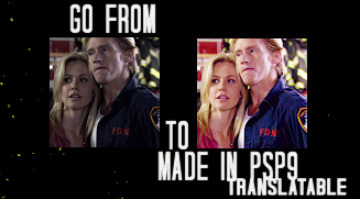
Translatable; color balance - levels - curves - hue/sat.
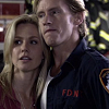
crop your base 100x100, don't sharpen yet
duplicate your base and set to screen 100%
layers - new adjustment layer - color balance: midtones/-7,7,-6
layers - new adjustment layer - color balance: midtones/10,0,0
layers - new adjustment layer - hue/saturation: master-22
layers - new adjustment layer - color balance: midtones/ 7,-5,-1
layers - new adjustment layer - levels: input- 0,1.12,255
new raster layer: #d7b241 / saturation 12%
duplicate your base, drag it to the top, set to luminance 16%
flatten your image, this is important or your icon will be too yellow
layers - new adjustment layer - curves: input-105 output-139
layers - new adjustment layer - hue/saturation: master-28
flatten, sharpen if needed, and do text,brushes,ect.
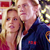
other examples:

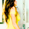
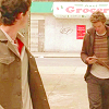
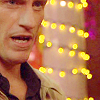
This tutorial won't work with all images, if it's too dark it will turn out too pixely and if it's too light it's just obnoxious, so screw around with the settings a little. What I found with most caps was it was either too red or too dark, and both of those can be fixed with a new color balance or curves layer. Or if the tutorial only works to a certain point do that, I learned from tutorials myself, it's all trial and error. In any case I'd love to see what you guys come up with, and if you have ask questions ask away!