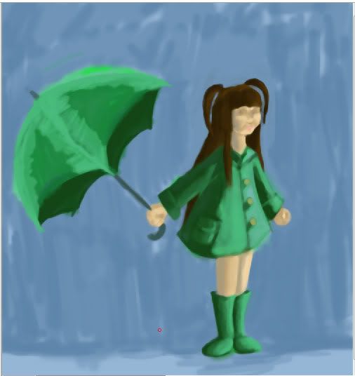
(no subject)
So I was reading ImagineFX over spring break and it was talking about using more saturated color. In the same article, the artist said something along the lines of "don't worry, the colors'll seem less saturated on the canvas. This clicked in my head because I tend to go towards the more tinted (i think thats the word, lol) colors when I work. Because of this, I couldn't figure out why some of my works seemed so 'blah' sometimes. There may be another aspect to it, but I think the color thing was the main part.
So after this thought, I took an practice painting I did a while back and redid the colors so that they're more saturated. Oh mi goodness, I had no idea that it'd make THAT big a difference. I'm still working on it but it look 20 times better with new colors. Funny what one little idea can do
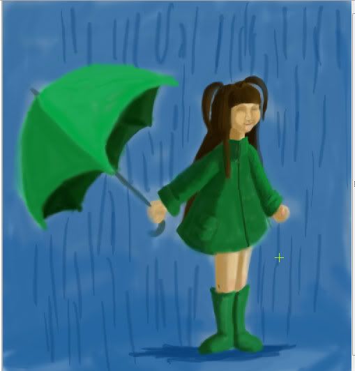
Even though the colors look a lot richer, I still don't know what the heck she's doing. I just wanna make her face cute XD
So after this thought, I took an practice painting I did a while back and redid the colors so that they're more saturated. Oh mi goodness, I had no idea that it'd make THAT big a difference. I'm still working on it but it look 20 times better with new colors. Funny what one little idea can do
Even though the colors look a lot richer, I still don't know what the heck she's doing. I just wanna make her face cute XD