.004
ASK THE MAKER TUTORIAL
requested by lumsx

>>>
using Adobe Photoshop CS
this is relatively easy coloring using gradient fill layers. Steps are not 100% accurate since I go back and forth and sometimes change my mind about adjustment layers until the very end haha. but this is as close to it as I remember^^
ONE
Prep the cap. I duplicate the image and set the it to multiply first to retain some of the color so it doesn't become washed-out with brightening. I duplicate again and set it to screen. It's still too dark so I duplicate the screened layer. Now for contrast, create a new layer and stamp the visible image (Shift-Ctrl-Alt-E) and set it to soft light. I find the image a bit too bright so I lower the opacity of one of the screen layers to 50%. The cap now looks like this:

TWO
Crop the cap. I like to work directly in 100x100 pixels. So I stamp the image on a new layer and change the canvas size. I decide to crop it centered.

THREE
I add lighting by creating a new gradient fill layer, white to transparent and set it to linear -90 degrees, normal blending mode. I rasterize the gradient layer and stretch (Ctrl-T) it so only the more translucent part is in the canvas (gradient pictured below against black)

>>>
FOUR
Now for coloring. below the white gradient, I create a new gradient fill layer, choose a shade of orange #FFA526 to transparent, linear 90 degrees, and set it to multiply 50%. I rasterize the gradient layer again and transform it again just so the coloring is more subtle. (gradient pictured against white)

>>>
FIVE
I want the bottom part to be a bit more orange so I duplicate the gradient fill layer and set it to linear burn 100% and move it so only the bottom part is touched. (gradient pictured against white)

>>>
SIX
I'm satisfied with the coloring now so I create a new layer, stamp the visible image on it and set it to multiply 33%. This makes the colors a little bit richer.

SEVEN
I find the lighting a bit flat so below the multiply layer I create a new layer and with a soft round brush, paint white light blobs on the side of her face. I set it to soft light 100%

>>>
EIGHT
At this point, I know I want to put text on this icon so I want to add more shadows to make sure the text stands out. I create a new levels layer and set it to these values:
RGB > 0 | 0.58 | 255

NINE
I want it to be more glowy so I create a new layer, stamp the visible image, go to filter > blur > gaussian blur 1.0 pixels and then set it to soft light 50%. I desaturate it so the coloring is not affected.

>>>
TEN
I want her eye area to be more shadowed so I create a new gradient fill layer, black to white, linear -124.99 degrees and set it to soft light 50% (gradient pictured against black).

>>>
ELEVEN
I think that her right shoulder needs more light so I duplicate the light blob layer in step 7 and transform it so only the right side is lightened.

>>>
TWELVE
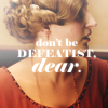
I'm now ready for text. I write in HBIC Violet's quote using the Elephant font and then play around with it until I'm satisfied. Once it's perfect, I rasterize the layer, go to filter > blur and then fade blur 50% to make it blend more with the image.

THIRTEEN
The icon is almost finished! I create a brightess/contrast layer and set it to +5/+2...

FOURTEEN
...and my last step is how I make things sharp/soft. I create a new layer, stamp the visible image and go to filter > sharpen. The text is too sharp so I blur the area around it using the blur tool. I then set the layer to hard light, 10% and voila! we're done!

>>>
click the finished icon to see layers
hope this was helpful! :D
ask the maker thread
profile | resources | tags | watch | request
requested by lumsx
>>>

using Adobe Photoshop CS
this is relatively easy coloring using gradient fill layers. Steps are not 100% accurate since I go back and forth and sometimes change my mind about adjustment layers until the very end haha. but this is as close to it as I remember^^
ONE
Prep the cap. I duplicate the image and set the it to multiply first to retain some of the color so it doesn't become washed-out with brightening. I duplicate again and set it to screen. It's still too dark so I duplicate the screened layer. Now for contrast, create a new layer and stamp the visible image (Shift-Ctrl-Alt-E) and set it to soft light. I find the image a bit too bright so I lower the opacity of one of the screen layers to 50%. The cap now looks like this:
TWO
Crop the cap. I like to work directly in 100x100 pixels. So I stamp the image on a new layer and change the canvas size. I decide to crop it centered.
THREE
I add lighting by creating a new gradient fill layer, white to transparent and set it to linear -90 degrees, normal blending mode. I rasterize the gradient layer and stretch (Ctrl-T) it so only the more translucent part is in the canvas (gradient pictured below against black)
>>>
FOUR
Now for coloring. below the white gradient, I create a new gradient fill layer, choose a shade of orange #FFA526 to transparent, linear 90 degrees, and set it to multiply 50%. I rasterize the gradient layer again and transform it again just so the coloring is more subtle. (gradient pictured against white)
>>>
FIVE
I want the bottom part to be a bit more orange so I duplicate the gradient fill layer and set it to linear burn 100% and move it so only the bottom part is touched. (gradient pictured against white)
>>>
SIX
I'm satisfied with the coloring now so I create a new layer, stamp the visible image on it and set it to multiply 33%. This makes the colors a little bit richer.
SEVEN
I find the lighting a bit flat so below the multiply layer I create a new layer and with a soft round brush, paint white light blobs on the side of her face. I set it to soft light 100%
>>>
EIGHT
At this point, I know I want to put text on this icon so I want to add more shadows to make sure the text stands out. I create a new levels layer and set it to these values:
RGB > 0 | 0.58 | 255
NINE
I want it to be more glowy so I create a new layer, stamp the visible image, go to filter > blur > gaussian blur 1.0 pixels and then set it to soft light 50%. I desaturate it so the coloring is not affected.
>>>
TEN
I want her eye area to be more shadowed so I create a new gradient fill layer, black to white, linear -124.99 degrees and set it to soft light 50% (gradient pictured against black).
>>>
ELEVEN
I think that her right shoulder needs more light so I duplicate the light blob layer in step 7 and transform it so only the right side is lightened.
>>>
TWELVE
I'm now ready for text. I write in HBIC Violet's quote using the Elephant font and then play around with it until I'm satisfied. Once it's perfect, I rasterize the layer, go to filter > blur and then fade blur 50% to make it blend more with the image.
THIRTEEN
The icon is almost finished! I create a brightess/contrast layer and set it to +5/+2...
FOURTEEN
...and my last step is how I make things sharp/soft. I create a new layer, stamp the visible image and go to filter > sharpen. The text is too sharp so I blur the area around it using the blur tool. I then set the layer to hard light, 10% and voila! we're done!
>>>
click the finished icon to see layers
hope this was helpful! :D
ask the maker thread
profile | resources | tags | watch | request