Member Stamps, Promo material & whatnot
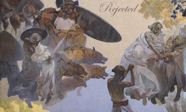
So, I'm a novice at this whole thing. I just downloaded & am using for the first time a photo-editing program called The Gimp. I made my first image-text combo thingy:

( Read more... )

( Read more... )
Reply
constructive criticism please on the ones you don't like (i want to know what you think's wrong with them; chelsea was saying some of these are 'ruined' by the text, i.e. the message gets across fine with no text at all, e.g. the Hopper-movie-theater 'rejected one or the pencil sketch where the 'r' in 'rejected' starts on the toes)
I mean, I did all of these in one sitting without a great deal of thought about font style & there's a lot of shit here, so i am looking to sort through & make decisions of which to toss out and/or redo.
Also, for the 'Beauty & Bitch' ones. It seems like what's traditionally been done is that those are used for promo material for applicants to stick in comments, journal entries & profiles, and then smaller images are made for members to stick on their profiles. So, I'm saying all this BECAUSE-
I think, maybe, some text needs to be added to the 'Beauty & Bitch' ones like 'Member of -" and for the promo, something like "Join us."
Or maybe not.
Reply
4th up from the bottom - text is too light, and seems overpowered by the rest of the image. Perhaps a darker/thicker text would work well. I have this same complaint for a lot of the rejected ones (good lord, if you want me to give you specifics these need to be numbered).
8th down from the top is my favorite.
beautyanbitch ones could have "not for the faint of heart" or whatever slogans we've used in the past added.
as well as "member of"
or
"i/we invite you to join"
Reply
lol
text is too light
I know, I know. Subtle was the idea behind a great many of the color/value/placement choices.
if you want me to give you specifics these need to be numbered
I'll do this.
I guess what was going on in my head with these was to choose images that truly ILLUSTRATE the three concepts: accepted, rejected, and Beauty & Bitch. I didn't much concern myself with thinking about the other stuff.
Maybe we can come up with new tag lines?
Reply
(i think i might just toss out 21)
...
22, 33, 39, 40, 53
Was 56 the one you had a problem with? The text of 55 seems to be equally overpowered by the image. But the idea is that the image itself communicates the idea of the elation of acceptance so that the word 'Accepted" need not be the very first thing you see- although 55's sort of funny b/c he's got the woman's eye covered.
I think I might could go with a darker purple for 56- darker like the darker parts of her dress. And I could go larger with the text on 55.
Reply
( ... )
Reply
Leave a comment