(no subject)
Icon #01 -9
[-1] The stroke on the text feels distractive. The line quality of the image and the background is really soft that the bold lines of the text stand out far too much in regards to the image. The coloring of the image feels somewhat flat too.
[-2] The text seems too bright compared to the rest of the icon.
[-2] Felt it needed a touch of colour to lift it a bit.
[-1] The image is very flat and dark here, while the text stands out a lot. Maybe some brightness/contrast layers would help bring out the details in the image.
[-2] Great work on changing the appearance but the changes can be barely seen. The font also stands out too much, hiding the significance of the icon. The background also doesn't compliment the overall icon and it stands out, making the scan too dark and insignificant.
[-1] The icon is much too dark and the text is too bulky. It's just a bit too plain - sorry.
Icon #02 +7
[-1] I think this is a great idea for the icon and the change is really obvious but I feel that the overall image is very sharp. The text is also very sharp and the lines in the texture background appear jagged.
[+1] Awesome icon! I really like how you put a corset on Lenne :)
[+2] Cool simple colouring/texture and a great idea
[+2] I love the detail in this with the corset and the accessories and the colors and font work well together
[+2] Love the manip work done here; very creative and the text is just wonderful.
[+1] I like the colouring and the text is awesome. I love how you made her clothes completely different from what she usually wears. Well done!
Icon #03 +0
[+1] This icon is terribly cute! I think the idea behind this icon is very creative and I love the little skull and cross-bone under the text, I think it gives the icon something extra.
[-1] This icon's just taken an overly simplistic interpretation of the challenge - the only change in coloring appears to be in the desaturation in the image. Besides that, the background seems too empty and the text not exactly fitting.
Icon #04 +1
[G] The coloring of the hair is really convincing. It made me smile :)
[+1] Yumminess :D I loved the little box matching with the hair colour and the subtle sparkly bits XD
[+1] The pink hair looks awesome on Yazoo - way to prove pink is a manly color. xD The text, however, seems a bit unfitting somehow, and the heart brush a bit excessive.
[-1] I love the pink hair of Yazoo. I just think it stands out too much and maybe a bit of a darker shade of pink would fit in the icon a lot more. The lights around the text is distracting especially since its in a different color and the pink heart doesn't fit in well with the icon.
Icon #05 +3
[+2] Wow so gorgeous :) The composition is fantastic, and the silver/red color scheme gives a touch of elegance.
[+2] I really like how you made Yuna look like a Geisha! Very pretty icon :)
[-2] I'm not really sure whats going on in this icon and outside of the text, I really can't see the difference in Yuna :/
[-1] I do like this icon, but you can't really see the changes as much as the other icons, but it is a very attractive icon. Sorry.
[+1] Oooh, I love the composition! You did a great job on the monochrome colors, and the cropping is great.
[+1] Yuna is a very beautiful geisha and the iconist did a well done job on manipulating it. The red, black & white matches perfectly together, making a beautiful icon.
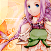
Icon #06+4
[+2] I simply adore the coloring to the icon! And the changes she made is scarcely noticeable. It's as if she didn't do anything to it. The background compliments the scan and the effects are great.
[+2] I really like the colouring - it stands out a lot. It's very pretty.
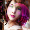
Icon #07 -15
[-2] The pink light/texture over her face is really distracting. The coloring looks like it would have been nice otherwise.
[-2] I'm not sure that I actually see a change in Yuna. The textures are really overpowering this icon and the bubble(?) texture over her face is really distracting.
[-1] Pretty icon, but the pink light texture really gets in the way of her face.
[-1] She doesn't really look that different to me, but it's a nice icon.
[-1] Though it is an interesting concept, it seems a little confusing. The light textures are overly used and the tiny text seems to have no point
[-2] All the textures and brushwork on this icon just make it look really busy and mushed up, and that bubble(?) thing just looks really out of place in the middle of Yuna's face.
[-2] Out of the lot of icons, this icon seems to be the least changed and the lighting/bubble effect is distracting. I do like how the bubble changes her hair colour.
[-2] The light texture is really bothering me here because it obstructs Yuna's face too much. I do like how nicely her lips stand out, though :)
[-2] You didn't do much whatsoever to change Yuna - you just ended up making a really messy icon and giving Yuna really creepy eyes. Sorry - doesn't work for me.
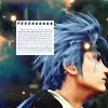
Icon #08 +9
[+1] I really love the coloring here, it gives a real aethereal feel. The paper texture feels really random, but it does add an element of balance, so it doesn't offset the mood too much.
[+2] I really love the smoothness of the image and I think that the change looks well done. Reno looks like he should have blue hair. ;) The texture work is nice and the icon doesn't look as if it is being overpowered by them. I would have done with out that notebook box with the tiny text but that's just me.
[+1] I like how the blue really stands out and how the texture was used
[+2] I love the style and colouring, it's simple but the creative crop makes it eye catching. Well done!
[+2] Love the color change, and the image quality and cropping make this a pretty good icon :)
[+1] The cropping is very well done and the blue hair is awesome.