Challenge Two Results
Unfortunately we have to say goodbye to the following participant...

by tigre86
00/-8
I'm sorry to see you go but thanks for taking part and I hope you stick around for voting and the special eliminated challenge! :)
People's Choice:

by sugarfixx
+4/00
Mod's Choice:

by crystalsc
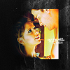
I love the colouring and composition.
Tally:
#1: +1
#2: +2
#3: -5
#4: -2
#5: -1
#6: +5
#7: -1
#8: -8
#9: -2+2 = 0
#10: -3+1 = -2
Direct Link to Voting
Positive Comments
[Please Note: Not all positive votes provided a comment so the number of comments here does not equal the number of positive votes.]
01, i like the coloring of the icon.
2 The coloring part is gorgeous!
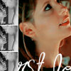
6 Love the way you take a simple center crop and make it really different. Nice texture, border and tiny text really works.
#6 - The texture, colour and the overall icon is gorgeous. :D
#6 - Grabs my attention, great border with fading towards the left. Nice colouring to contrast with the frame.
#6 - very good work with colors and text placement, and oh, five points for the cropping!
9 great effects;)
9 - i like the texture used and the high contrast is nice in b&w
The placement of the moon is very creative and the black and white of the icon matches that theme well.
Negative Comments
Leave a comment with your icon number to get your feedback. All comments are screened but you'll be able to see them if you receive email notifications. If you don't receive notifications then leave your email address and I'll send your comments via email.
The next challenge will be up shortly.

by tigre86
00/-8
I'm sorry to see you go but thanks for taking part and I hope you stick around for voting and the special eliminated challenge! :)
People's Choice:

by sugarfixx
+4/00
Mod's Choice:
by crystalsc
I love the colouring and composition.
Tally:
#1: +1
#2: +2
#3: -5
#4: -2
#5: -1
#6: +5
#7: -1
#8: -8
#9: -2+2 = 0
#10: -3+1 = -2
Direct Link to Voting
Positive Comments
[Please Note: Not all positive votes provided a comment so the number of comments here does not equal the number of positive votes.]
01, i like the coloring of the icon.
2 The coloring part is gorgeous!
6 Love the way you take a simple center crop and make it really different. Nice texture, border and tiny text really works.
#6 - The texture, colour and the overall icon is gorgeous. :D
#6 - Grabs my attention, great border with fading towards the left. Nice colouring to contrast with the frame.
#6 - very good work with colors and text placement, and oh, five points for the cropping!
9 great effects;)
9 - i like the texture used and the high contrast is nice in b&w
The placement of the moon is very creative and the black and white of the icon matches that theme well.
Negative Comments
Leave a comment with your icon number to get your feedback. All comments are screened but you'll be able to see them if you receive email notifications. If you don't receive notifications then leave your email address and I'll send your comments via email.
The next challenge will be up shortly.