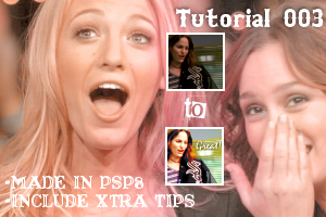
Tut 03

Tutorial 3
Okay, I want you to keep this in mind don't follow this step by step cause it might not work in the same on your pic. It all depends in your image quality so try to make things playing out with the numbers so that it fit your image. I have been in the graphic world not long enough to be an expert but do long enough to have some great tips to obtain some decent and pretty work.
An example from what I am talking about is that In this second example I put the curves to 50% so that it wouldnt look too brighten though I am sure someone still consider it too brighten but for me I think is okay that way.
Other examples:
I am gonna give a couple of tips I have learned through the years by reading tuts or just experimenting but I am keeping this short don't wanna bored you ppl!
-Don't over sharpen icons, it makes the icon look awful. Instead just sharpen it a little bit.
-Look up for good screencaps. There are some screencaps with a horrible quality that no matter what you make it wont look nice at all.
-Text placement be very careful with this sometimes it might ruin a great icon. Also keep in mind the type of font and the color this is very important. A great icon is like a puzzle you just need to find the right pieces to make it work.
-Try new stuff there so much: brushes,textures,etc.
-Don't be afraid to experiment this is the fun of this.
Now..back to business.. the tut:
1. You have your base crop it and sharpen as you like. Then set it blend mode to screen as many times as you think necessary it usually takes only twice as in this case I did.
---->
2. Now go to Adjust-Brightness and Constrast-Automatic Contrast Enhacement put this settings:
Bias:Lighter
Strength:Mild
Appearance:Flat
---->
3. Fill out now an exclusion layer of #000040
---->
4. Fill out with a burn layer of #FF0000
---->
5. Fill out with a softlight layer of #FDDDDD
---->
6. Make a new adjustment layer-color balance with this settings:
Midtones: -52 -14 21
Shadows: -20 10 -15
Highlights: -19 0 -7
The box of preserve luminance should be check
---->
7. Make another adjustment layer with curves.
Just shift the curves a little bit in RGB,RED,GREEN and BLUE.
---->
8. Now go back to the background, duplicate it, set it to luminance and drag it to the top
---->
9. Make once and again an adjustment layer this time brightness and contrast:
I used this setting but it depends on your image.
Brightness: 5
Contrast: 15
---->
10. Go back to the background layer again, duplicate it, set it to luminance and drag it to the top.
---->
11. Finally make another adjustment layer-curves shift the curve only in RGB and BLUE until you get the combination you want.
---->
12. Add some text if you like.
---->
Let me know if you have any doubt or question, it will be my pleasure to answer you.
Oh I would love to see some results.