First Icon Tut Ever!
Well this is my first attempt with a tutorial!
Hope you like it!
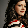
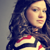
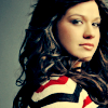
From this: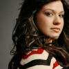
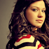
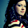
To this: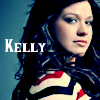
Tutorial PSP 8
Since this is my first tutorial ever I will try to be as clear as possible.
1) You crop your image and sharpen as you think it is necessary.
==>
2) Go to Adjust-Brightness and Contrast-Automatic Contrast Enhancement
Bias = Neutral
Strenght = Normal
Appearance = Flat
==>
3) Fill a 100% Exclusion Layer with #000040
==>
4) Fill with a 100% Burn Layer with #F5DFC5
==>
5) Fill with a 100% Soft Light Layer with #F771D6
==>
6) Fill with a 100% Burn Layer with #8AF8CA
==>
7) Fill with a 26% Overlay Layer with #A5BFB4 (This step depends on the types of image you have according to it adjust the opacity)
==>
8) Now make a new adjustment later-Color Balance with this settings:
Midtones: -40 40 40
Shadows: -40 -40 -11
Highlights: 0 0 0
Plus uncheck the preserve luminance box
==>
9) Again go to a new adjustment layer but now to Channel Mixer and put this settings:
Red: 100%
Green: 80%
Blue: -80
Constant: 0
This time I set the blend mode to Hue L to get a little of contrast
==>
10) Now go to new adjustment Layer and play a little bit with the curves of each.
Plus if it is necessary to contrast play with the blend mode to see which one fits the most.
==>
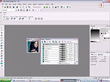
This is how all your layers should look like:
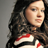
11 Final you just add any text you want or even a brush if you like.
==>
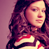
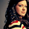
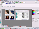
This are other examples made with the same tut and right next to them how all the layers how they should appear (In this some blend modes are different from the original of this tut but again that depends on the type of image you are working with)
Remember that the result of your icon will depend of the quality of you image and the colouring of the image itself.
If you have any doubt just let me know!
Hope you like it!
From this:
To this:
Tutorial PSP 8
Since this is my first tutorial ever I will try to be as clear as possible.
1) You crop your image and sharpen as you think it is necessary.
==>
2) Go to Adjust-Brightness and Contrast-Automatic Contrast Enhancement
Bias = Neutral
Strenght = Normal
Appearance = Flat
==>
3) Fill a 100% Exclusion Layer with #000040
==>
4) Fill with a 100% Burn Layer with #F5DFC5
==>
5) Fill with a 100% Soft Light Layer with #F771D6
==>
6) Fill with a 100% Burn Layer with #8AF8CA
==>
7) Fill with a 26% Overlay Layer with #A5BFB4 (This step depends on the types of image you have according to it adjust the opacity)
==>
8) Now make a new adjustment later-Color Balance with this settings:
Midtones: -40 40 40
Shadows: -40 -40 -11
Highlights: 0 0 0
Plus uncheck the preserve luminance box
==>
9) Again go to a new adjustment layer but now to Channel Mixer and put this settings:
Red: 100%
Green: 80%
Blue: -80
Constant: 0
This time I set the blend mode to Hue L to get a little of contrast
==>
10) Now go to new adjustment Layer and play a little bit with the curves of each.
Plus if it is necessary to contrast play with the blend mode to see which one fits the most.
==>
This is how all your layers should look like:
11 Final you just add any text you want or even a brush if you like.
==>
This are other examples made with the same tut and right next to them how all the layers how they should appear (In this some blend modes are different from the original of this tut but again that depends on the type of image you are working with)
Remember that the result of your icon will depend of the quality of you image and the colouring of the image itself.
If you have any doubt just let me know!