Icon Tutorial - Rena Tanaka (Spring Coloring)
I rather like the coloring for this, it's very light and spring-like...and yes, I know, it's summer, but it'll work :P
From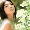
to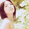
.
Start out by opening up your image you want to use and cropping it to create your base. This works best with a base that is light in color, so if needed, duplicate the base and set it to Screen as many times as necessary, adjusting the Opacity. Then, duplicate the base, move it to the top, set to Soft Light, and adjust Opacity as needed. I ended up with the base layer, one Screen layer at 30%, and one Soft Light layer at 50%.
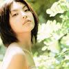
Next we want to create a dark blue exclusion layer. I used #001233 set to Exclusion 100%.
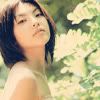
Next we will do another exclusion layer. For this I used a bright orange color, #FF9000, set to Exclusion 25%.
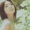
It's kind of dark again. But don't worry, it'll lighten up again.
Next we will play around with Selective Coloring. Now, I cannot stress this enough. What works in particular for THIS image may not work with what you are using! Feel free to mess about with the settings until you get a look you like. This step will basically determine what the final icon will look like, coloring-wise, so don't be afraid to experiment until you get a look you like. Selective colors lets you edit how specific colors show up in your image, and you can get some great effects with it. It's definitely a tool to experiment with.
Also, as you will notice, my numbers are all pretty random. It's because I tend to click around and see what looks good. Even in creating the same effect I never end up with the same numbers. So don't feel you need to follow my numbers exactly, in fact it will probably turn out better if you don't!
The particular settings I used for this image are as follows:
Yellows:
Cyan: -38%
Magenta: +11%
Yellow: +9%
Black: +12%
Greens:
Cyan: -100%
Magenta: -21%
Yellow: +24%
Black: +24%
Whites:
Cyan: +3%
Magenta: +2%
Yellow: -15%
Black: -17%
Neutrals:
Cyan: -9%
Magenta: -8%
Yellow: -7%
Black: -6%
Blacks:
Cyan: -21%
Magenta: +10%
Yellow: -8%
Black: +13%
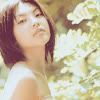
Next, we will use a Color Balance layer to brighten things up a bit more and add a touch more color. As I said above with the Selective Coloring, click around and see what looks best for your image.
My settings:
Midtones: 50, 0, 70
Shadows: -30, 70, 30
Highlights: 20, 0, -25
I then put the Color Balance layer at Soft Light 50%.
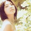
Next a curves layer, to tweak the colors a teeny bit more and lighten the icon overall. Just take the same advice as above re: messing about with values to get a result you like.
RGB: 126,146
Red: 105,130; 142,162
Green: 103,127; 123,138; 142,153
Blue: 106,131; 137,151
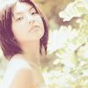
Now, duplicate your base, bring it to the top, and set it to Soft Light 50%. Then, a Channel Mixer color. This is another nifty little tool that effects the coloring; it determines how the red, blue, and green colors in an image appear. Same advice as above, play around as needed.
Red: +95%, +5%, -5%
Green: -3%, 102%, -5%
Blue: +3%, +2%, +97%

Just to add a bit more contrast, I made a new layer, filled it with #FAF3E9, and set it to Color Burn 100%.

I wanted to bring out the green from the background a bit more again, so I made a new layer and filled it with #D2F0D3 and set it at Color Burn 100%. I didn't like the effect it had on her face and wanted to keep the reddish shade in the hair, so I erased this layer around the bits I didn't like.

Then, all I did was sharpen up the icon as needed (Filter > Sharpen > Unsharp Mask at 60%), and it's done!

Please let me know if this is helpful, and I'd love to see any results! :D
From

to

.
Start out by opening up your image you want to use and cropping it to create your base. This works best with a base that is light in color, so if needed, duplicate the base and set it to Screen as many times as necessary, adjusting the Opacity. Then, duplicate the base, move it to the top, set to Soft Light, and adjust Opacity as needed. I ended up with the base layer, one Screen layer at 30%, and one Soft Light layer at 50%.

Next we want to create a dark blue exclusion layer. I used #001233 set to Exclusion 100%.

Next we will do another exclusion layer. For this I used a bright orange color, #FF9000, set to Exclusion 25%.

It's kind of dark again. But don't worry, it'll lighten up again.
Next we will play around with Selective Coloring. Now, I cannot stress this enough. What works in particular for THIS image may not work with what you are using! Feel free to mess about with the settings until you get a look you like. This step will basically determine what the final icon will look like, coloring-wise, so don't be afraid to experiment until you get a look you like. Selective colors lets you edit how specific colors show up in your image, and you can get some great effects with it. It's definitely a tool to experiment with.
Also, as you will notice, my numbers are all pretty random. It's because I tend to click around and see what looks good. Even in creating the same effect I never end up with the same numbers. So don't feel you need to follow my numbers exactly, in fact it will probably turn out better if you don't!
The particular settings I used for this image are as follows:
Yellows:
Cyan: -38%
Magenta: +11%
Yellow: +9%
Black: +12%
Greens:
Cyan: -100%
Magenta: -21%
Yellow: +24%
Black: +24%
Whites:
Cyan: +3%
Magenta: +2%
Yellow: -15%
Black: -17%
Neutrals:
Cyan: -9%
Magenta: -8%
Yellow: -7%
Black: -6%
Blacks:
Cyan: -21%
Magenta: +10%
Yellow: -8%
Black: +13%

Next, we will use a Color Balance layer to brighten things up a bit more and add a touch more color. As I said above with the Selective Coloring, click around and see what looks best for your image.
My settings:
Midtones: 50, 0, 70
Shadows: -30, 70, 30
Highlights: 20, 0, -25
I then put the Color Balance layer at Soft Light 50%.

Next a curves layer, to tweak the colors a teeny bit more and lighten the icon overall. Just take the same advice as above re: messing about with values to get a result you like.
RGB: 126,146
Red: 105,130; 142,162
Green: 103,127; 123,138; 142,153
Blue: 106,131; 137,151

Now, duplicate your base, bring it to the top, and set it to Soft Light 50%. Then, a Channel Mixer color. This is another nifty little tool that effects the coloring; it determines how the red, blue, and green colors in an image appear. Same advice as above, play around as needed.
Red: +95%, +5%, -5%
Green: -3%, 102%, -5%
Blue: +3%, +2%, +97%

Just to add a bit more contrast, I made a new layer, filled it with #FAF3E9, and set it to Color Burn 100%.

I wanted to bring out the green from the background a bit more again, so I made a new layer and filled it with #D2F0D3 and set it at Color Burn 100%. I didn't like the effect it had on her face and wanted to keep the reddish shade in the hair, so I erased this layer around the bits I didn't like.

Then, all I did was sharpen up the icon as needed (Filter > Sharpen > Unsharp Mask at 60%), and it's done!

Please let me know if this is helpful, and I'd love to see any results! :D