awmp
in
awmpdotnet
Tutorial: the making of 'porntastic'
originally posted at awmp on 3/12/05
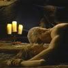
The Making of "porntastic"
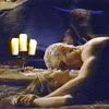
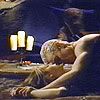
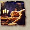
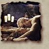
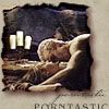
from this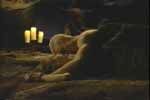
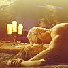
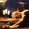
to this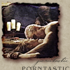
General Notes:
ok, then
Step 01: Cropping (layer 0)
- open your pic
- try to find a nice cropping area.
- I wanted to focus on the heads and the candles, so I came up with this...
Step 02: Preparing (layer 1, 2)
- I duplicated the background layer
- I used Auto-Levels on the new layer (ctrl+shift+l)
- then I set it on layer mode Screen
this step will brighten the dark picture a lot and will give it a more blueish tint.
- then I made a new layer and copied the whole icon into this layer (ctrl+shift+alt+e)
- I sharpened this layer (Filter - Sharpen - Sharpen)
and we have layer 2 now...
Step 03: Coloring (layer 3, 4)
- the next layer is a gradient on top of everything, set on Hard Light (layer 3)
- it was one of Photoshop's default gradients (brown, tan, beige), dragged from bottom to top

- after it's set on Hard Light, it looks like this
- to complete this step and intensify the colors, i added a copy of layer 2 (the sharpened one) on top of everything and set it on layer mode Hard Light
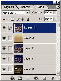
and the result of this step looks like this
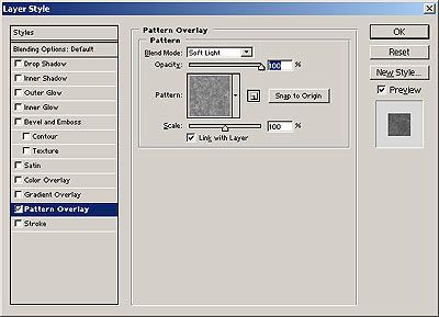
Step 04: A new Background (layer 05)
- with this step we're creating a paperlike background
- I made a new layer and filled it with #C0B6A0
- I also added a layer style to this layer (by right clicking on the layer in the Layer Pallette and choosing Blending Options). it was a Pattern Overlay, set on Soft Light, 100% Opacity, Gouache Light on Watercolor (150x150px, RGB), Scale 100%
the result is

Step 05: Adding the pic again (layer 6)
- I copied the whole icon [without the paper texture, of course] and pasted it on top, then I made the paper layer visible again
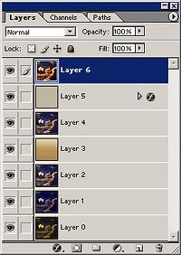
- I resized this layer a bit to about 85 % and named it layer 6
so far it looks like this
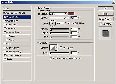
Step 06: The burnt edges (still layer 6)
- I added a layer style to layer 6
Drop Shadow: Blend Mode: Multiply, Color: #683737, Opacity: 80%, Angle: 129°, Distance/Choke/size: 5/0/5
Inner Shadow: Blend Mode: Color Burn, Color: #865757, Opacity: 75%, Angle 129°, Distance/Choke/Size: 2/0/6
Pattern Overlay: Blend Mode: Soft Light, Opacity: 100%, Gouache Light on Watercolor (150x150px, RGB), Scale 100%
- then I erased with the eraser (the tip was Chalk, 17 pixel) some parts of the edges
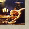
and the result of this step should look somehow like this
- it was too colorful for my taste so I lowered the saturation of this layer (ctrl+u) to -55 and got this
Step 07: Text (layers 7, 8)
- because i'm a dork I wrote 'porntastic' on the icon. twice. (yeah, that's me...)
- the bigger one is placed on the right bottom, half outside of the canvas
- the font is: Bangle, 10 pt, tracking: 100, color: #47433A, All Caps
- the smaller one was placed right under the main pic
- the font is: JohannSparkling, 20 pt, tracking: -100, color: #47433A
that's it
Step 08: Saving for the Web
- I used the png-24 format for the final image
that's about it.
if there are any questions feel free to ask :)
The Making of "porntastic"
from this
to this
General Notes:
- I used Photoshop 7.0
- the original cap was made by wisteria_. feel free to use it for this tutorial but please only for educational reasons, don't claim the final icon yours afterwards...
- I like to work on a 200x200 canvas and resize it in the end. it's just a thing of me, but for this tut I assumed to work on 100x100...
- I also assumed that you know some tools in PS
- you can download the psd-file here.
ok, then
Step 01: Cropping (layer 0)
- open your pic
- try to find a nice cropping area.
- I wanted to focus on the heads and the candles, so I came up with this...
Step 02: Preparing (layer 1, 2)
- I duplicated the background layer
- I used Auto-Levels on the new layer (ctrl+shift+l)
- then I set it on layer mode Screen
this step will brighten the dark picture a lot and will give it a more blueish tint.
- then I made a new layer and copied the whole icon into this layer (ctrl+shift+alt+e)
- I sharpened this layer (Filter - Sharpen - Sharpen)
and we have layer 2 now...
Step 03: Coloring (layer 3, 4)
- the next layer is a gradient on top of everything, set on Hard Light (layer 3)
- it was one of Photoshop's default gradients (brown, tan, beige), dragged from bottom to top
- after it's set on Hard Light, it looks like this
- to complete this step and intensify the colors, i added a copy of layer 2 (the sharpened one) on top of everything and set it on layer mode Hard Light
and the result of this step looks like this
Step 04: A new Background (layer 05)
- with this step we're creating a paperlike background
- I made a new layer and filled it with #C0B6A0
- I also added a layer style to this layer (by right clicking on the layer in the Layer Pallette and choosing Blending Options). it was a Pattern Overlay, set on Soft Light, 100% Opacity, Gouache Light on Watercolor (150x150px, RGB), Scale 100%
the result is
Step 05: Adding the pic again (layer 6)
- I copied the whole icon [without the paper texture, of course] and pasted it on top, then I made the paper layer visible again
- I resized this layer a bit to about 85 % and named it layer 6
so far it looks like this
Step 06: The burnt edges (still layer 6)
- I added a layer style to layer 6
Drop Shadow: Blend Mode: Multiply, Color: #683737, Opacity: 80%, Angle: 129°, Distance/Choke/size: 5/0/5
Inner Shadow: Blend Mode: Color Burn, Color: #865757, Opacity: 75%, Angle 129°, Distance/Choke/Size: 2/0/6
Pattern Overlay: Blend Mode: Soft Light, Opacity: 100%, Gouache Light on Watercolor (150x150px, RGB), Scale 100%
- then I erased with the eraser (the tip was Chalk, 17 pixel) some parts of the edges
and the result of this step should look somehow like this
- it was too colorful for my taste so I lowered the saturation of this layer (ctrl+u) to -55 and got this
Step 07: Text (layers 7, 8)
- because i'm a dork I wrote 'porntastic' on the icon. twice. (yeah, that's me...)
- the bigger one is placed on the right bottom, half outside of the canvas
- the font is: Bangle, 10 pt, tracking: 100, color: #47433A, All Caps
- the smaller one was placed right under the main pic
- the font is: JohannSparkling, 20 pt, tracking: -100, color: #47433A
that's it
Step 08: Saving for the Web
- I used the png-24 format for the final image
that's about it.
if there are any questions feel free to ask :)