Tutorial #024
From 
to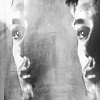
This tutorial was requested by iwantpie
Tools :
Adobe Photoshop CS5
Gradient, Vibrance, Brightness/contrast, Color balance, Exposure, Channel Mixer
Textures :
by palebird
by ohfreckle

by skydawnjade


Layer List :
The layer names correspond to the name you see in the layer list here.
1/ Layer 2 copy: Rotate and resize the picture. Use the smudge tool, strength to 50% to change the background. ALways use it at 50% so that you'll have a smooth effect. It's prettier that way.
2/ Layer 2: Duplicate your base. Set it to "Lighten", opacity 100% and move it on the left. (This technique can also be very useful to blend 2 pictures together. You can check this technique here )
Result: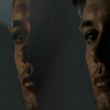
3/ Brightness/Contrast 1: Urg there's a huge needs of light there!! Open a brightness/contrast layer
Brightness: 150
Contrast: 50
4/ Layer 6 : I wanted to add more effects on the "left Dean". I use this texture and set it to screen. "Left Dean" seems more in the shadows now which makes the icon a bit less busy.
5/ Layer 2 copy 3 : Now, I want to keep the effect but I want more contrast. For that, I duplicate the base, put it on the top of the layer list and set it to soft light.
6/ Exposure 1 : I want more depth to the icon now. For that, open an exposure layer.
Gamma correction: 0.91
(I advice you to never use the Exposure scale because the reuslt is nearly 99% of the time too bright and the result can be very very weird)
Result: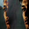
7/ Layer 4 : I wanted to add a little cloud so I made this texture and set it screen.
8/ Layer 7 : I need more blur to soften the icon. I made another texture and set it to screen.
9/ Brightness/Contrast 2 : Don't say you didn't see it coming :p
Brightness: 46
Contrast: 7
Result: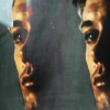
10/ Channel Mixer 1 : Now the coloring. The channel mixer is very useful to change the whole color scheme of a picture. Create one:
Red: +97%, 0, 0
Blue: -3%, 0, +164%
Result: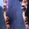
11/ Brightness/Contrast 3 : A little brightness is needed again.
Brightness: 54
Contrast: -19
I decreases the contrast because increasing the brightness has the tendency to increase the contrasts too.
12/ Layer 8 : To bring a bit of yellow in this icon, I used this texture and set it to overlay. I decrease the opacity to 58%.
Result: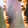
13/ Layer 9 : To add a cloudy effect, open this texture. Set it to soft light, opacity at 96%. As I didn' tlike the effect of the texture, I used the smudge tool to make the stripes disapeared and add a different aspect. My final result is this.
14/ Color Balance 1 : The yellowish coloring is not beautiful! It needs more red! Open a color balance layer.
Midtones: +65%, +3%, +68%
15/ Brightness/Contrast 4 : The icon is a way too bright. Open a brightness/Contrast layer.
Brightness: -13
Contrast: 33
16/ Vibrance 1 : I want the colors to pimp. To have this effect, there's nothing better than the vibrance tool. It will make the main color scheme more...vibrant (surprising isn't it?)
Vibrance: +15
Saturation: +15
Vibrance is used to icnrease the main colors, the saturation is about the shadows colors.
Result: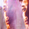
17/ Gradient Map copy : As I'm not happy with the coloring, I just..lose patience and create a black and white gradient map layer. I always use this way to make a picture black and white because it's really black and white and not grey like the desaturation tool.
18/ Merge your layers and then use the sharpness tool. Go to Edit -> fade sharpness to decrease the sharpness at will.
Result:
DO NOT ASK FOR A .PSD.
Keep in mind it's not because the settings work here that they will work on your icon.
Don't forget to credit the right maker for the textures.
Comments are always awesome.
English is not my native language so if there's anything weird, or that you don't understand, ask!

to

This tutorial was requested by iwantpie
Tools :
Adobe Photoshop CS5
Gradient, Vibrance, Brightness/contrast, Color balance, Exposure, Channel Mixer
Textures :
by palebird

by ohfreckle


by skydawnjade


Layer List :
The layer names correspond to the name you see in the layer list here.
1/ Layer 2 copy: Rotate and resize the picture. Use the smudge tool, strength to 50% to change the background. ALways use it at 50% so that you'll have a smooth effect. It's prettier that way.
2/ Layer 2: Duplicate your base. Set it to "Lighten", opacity 100% and move it on the left. (This technique can also be very useful to blend 2 pictures together. You can check this technique here )
Result:

3/ Brightness/Contrast 1: Urg there's a huge needs of light there!! Open a brightness/contrast layer
Brightness: 150
Contrast: 50
4/ Layer 6 : I wanted to add more effects on the "left Dean". I use this texture and set it to screen. "Left Dean" seems more in the shadows now which makes the icon a bit less busy.
5/ Layer 2 copy 3 : Now, I want to keep the effect but I want more contrast. For that, I duplicate the base, put it on the top of the layer list and set it to soft light.
6/ Exposure 1 : I want more depth to the icon now. For that, open an exposure layer.
Gamma correction: 0.91
(I advice you to never use the Exposure scale because the reuslt is nearly 99% of the time too bright and the result can be very very weird)
Result:

7/ Layer 4 : I wanted to add a little cloud so I made this texture and set it screen.
8/ Layer 7 : I need more blur to soften the icon. I made another texture and set it to screen.
9/ Brightness/Contrast 2 : Don't say you didn't see it coming :p
Brightness: 46
Contrast: 7
Result:

10/ Channel Mixer 1 : Now the coloring. The channel mixer is very useful to change the whole color scheme of a picture. Create one:
Red: +97%, 0, 0
Blue: -3%, 0, +164%
Result:

11/ Brightness/Contrast 3 : A little brightness is needed again.
Brightness: 54
Contrast: -19
I decreases the contrast because increasing the brightness has the tendency to increase the contrasts too.
12/ Layer 8 : To bring a bit of yellow in this icon, I used this texture and set it to overlay. I decrease the opacity to 58%.
Result:

13/ Layer 9 : To add a cloudy effect, open this texture. Set it to soft light, opacity at 96%. As I didn' tlike the effect of the texture, I used the smudge tool to make the stripes disapeared and add a different aspect. My final result is this.
14/ Color Balance 1 : The yellowish coloring is not beautiful! It needs more red! Open a color balance layer.
Midtones: +65%, +3%, +68%
15/ Brightness/Contrast 4 : The icon is a way too bright. Open a brightness/Contrast layer.
Brightness: -13
Contrast: 33
16/ Vibrance 1 : I want the colors to pimp. To have this effect, there's nothing better than the vibrance tool. It will make the main color scheme more...vibrant (surprising isn't it?)
Vibrance: +15
Saturation: +15
Vibrance is used to icnrease the main colors, the saturation is about the shadows colors.
Result:

17/ Gradient Map copy : As I'm not happy with the coloring, I just..lose patience and create a black and white gradient map layer. I always use this way to make a picture black and white because it's really black and white and not grey like the desaturation tool.
18/ Merge your layers and then use the sharpness tool. Go to Edit -> fade sharpness to decrease the sharpness at will.
Result:

DO NOT ASK FOR A .PSD.
Keep in mind it's not because the settings work here that they will work on your icon.
Don't forget to credit the right maker for the textures.
Comments are always awesome.
English is not my native language so if there's anything weird, or that you don't understand, ask!