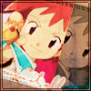
Tutorial # 1, Zoey/Nozomi icon
Oh, yeah, anyways, so this is going to be my first tutorial, ever. I dunno why, someone insisted that I should do it… if you should know it’s… manaphyone xD;; Just a little something for the New Year. And yep, haven't been updating this thing in a long time, been busy, so... D=
Anyways, I’m going to show you how I was able to make the Nozomi icon below I did before New Year… yeah, it’s actually rushed. So yeah, I am not sure if it is translatable, but I used Adobe Photoshop CS2 for this.
Turn this into
1. So first thing we need to do is well, crop the image, so go do it until you're satisfied or something. Something like this for me:

2. Now Duplicate that image and set it to Soft Light.

3. Now, this is the tough part, Selective Coloring. Oh no, we're not going to do it on the actual duplicated image, we're going to make a new layer. So go to Layer -> New Adjustment Layer -> Selective Coloring and you will see the Selective Coloring box showing up. Now, this is my adjustment, but do try experimenting on your own.
Reds: +29, -22, -27, +10
Yellows: - 40, +30, -25, -15
Magentas: -15, +15, +40, +20
Neutrals: -5, -5, +5, +5
Now it will look like this:

4. Next up is… Stamp Visible. To do this, simply press Crtl + Alt + Shift + E all at the same time. Do this again and you'll have two layers of the same thing. Now, Desaturate the first Stamp Visible image. Just make the Original and the Soft Light-ed image invisible for a while, as we're going to do some rotating next and keep the Selective Coloring layer visible.
5. Oh whee, time for some rotation, but before that, a background icon texture. I can't keep track of who made this, but if anyone could correct me, please do so. It's somewhere on my resources for sure. Set this one in the back part, just before Background.

6. Now, it's time for some rotation…Just rotate your image to any desire place you like… You can even crop it again before you rotate it… It's best if you rotate the Desaturated one before the colored one, but hey, your choice. But if you do, make the Colored one Invisible first so that you won't get confused too much… Or you can select both layers with Ctrl + click and rotate it together. Then, move the Colored one a little bit away from the Desaturated one. Mine looks like this now:


7. Next is to set the Desaturated image to Multiply.

8. Now, set the colored one to Soft Light and duplicate it 3 times, or depending on how it'll look in your background.

9. Oh, you can see some weird stuff in the colored one eh? We're going to use Polygonal Lasso Tool for this to fix that. Go to your Desaturated image layer and selected that part where the Colored image mixes with the black and white. Don't delete it, just cut it and paste it again in a new layer. Now, align that with the Desaturated image and set it to Multiply, but this time @ 30% Opacity. It'll look like this:

10. Now the final task is to put text and such… I used Carpenter ICG (which is being abused lmao), and added a few brushes and such. To do the outline in the text, click on the Text Layer, right click and go to Layer Properties. Then, go to Stroke and do you adjustments there. I recommend 2 px for the size, but it depends on your icon. I set the Opacity depending on how it'll look on my icon, so yeah. And finally, we have this:

And that ends the tutorial. If any thing in here actually confused ya or if this made any wonders or helped you, please do tell… Comments are… <3
Anyways, I’m going to show you how I was able to make the Nozomi icon below I did before New Year… yeah, it’s actually rushed. So yeah, I am not sure if it is translatable, but I used Adobe Photoshop CS2 for this.
Turn this into
1. So first thing we need to do is well, crop the image, so go do it until you're satisfied or something. Something like this for me:
2. Now Duplicate that image and set it to Soft Light.
3. Now, this is the tough part, Selective Coloring. Oh no, we're not going to do it on the actual duplicated image, we're going to make a new layer. So go to Layer -> New Adjustment Layer -> Selective Coloring and you will see the Selective Coloring box showing up. Now, this is my adjustment, but do try experimenting on your own.
Reds: +29, -22, -27, +10
Yellows: - 40, +30, -25, -15
Magentas: -15, +15, +40, +20
Neutrals: -5, -5, +5, +5
Now it will look like this:
4. Next up is… Stamp Visible. To do this, simply press Crtl + Alt + Shift + E all at the same time. Do this again and you'll have two layers of the same thing. Now, Desaturate the first Stamp Visible image. Just make the Original and the Soft Light-ed image invisible for a while, as we're going to do some rotating next and keep the Selective Coloring layer visible.
5. Oh whee, time for some rotation, but before that, a background icon texture. I can't keep track of who made this, but if anyone could correct me, please do so. It's somewhere on my resources for sure. Set this one in the back part, just before Background.

6. Now, it's time for some rotation…Just rotate your image to any desire place you like… You can even crop it again before you rotate it… It's best if you rotate the Desaturated one before the colored one, but hey, your choice. But if you do, make the Colored one Invisible first so that you won't get confused too much… Or you can select both layers with Ctrl + click and rotate it together. Then, move the Colored one a little bit away from the Desaturated one. Mine looks like this now:
7. Next is to set the Desaturated image to Multiply.
8. Now, set the colored one to Soft Light and duplicate it 3 times, or depending on how it'll look in your background.
9. Oh, you can see some weird stuff in the colored one eh? We're going to use Polygonal Lasso Tool for this to fix that. Go to your Desaturated image layer and selected that part where the Colored image mixes with the black and white. Don't delete it, just cut it and paste it again in a new layer. Now, align that with the Desaturated image and set it to Multiply, but this time @ 30% Opacity. It'll look like this:
10. Now the final task is to put text and such… I used Carpenter ICG (which is being abused lmao), and added a few brushes and such. To do the outline in the text, click on the Text Layer, right click and go to Layer Properties. Then, go to Stroke and do you adjustments there. I recommend 2 px for the size, but it depends on your icon. I set the Opacity depending on how it'll look on my icon, so yeah. And finally, we have this:
And that ends the tutorial. If any thing in here actually confused ya or if this made any wonders or helped you, please do tell… Comments are… <3