Ink and Embossing Ranger U
Went to another Ranger U this past weekend. It followed pretty much the same schedule as last time, only longer and with more techniques than the first one I attended about six months ago (which one may want to revisit as I've updated that entry with scans of the work I did then). Started at noon on Friday (and I'd shown up late for work too; the boss said I could after having been out of town for 3 days for training--which is possibly another entry), playplayplay, short break for dinner (even though they had food out for the entire time), playplayplay some more and left there around 9 pm. !!!!!! Oh but the next day is even longer. Started at 9 am, playplayplay, one hour lunch break, playplayplay, hour and a half dinner break, come back to do a project (just wanted to say "playplayplay" differently--heh) and I left there on Saturday around 10 pm. Aaaand I was one of the early leavers too. Robin excused me from the presentation on Sunday because she knew I'd been working for a couple of days straight, so I didn't have to come in on Sunday. Yay!
The class was taught jointly by Robin Beam, our Director of Education at Ranger and Tim Holtz, our Senior Educator and a designer in his own right. Tim is really huge in the industry and I think I see why. He's a very good teacher. He explains things really well--well enough so that you feel like you can do it. Also, he talks about mistakes and errors he's made so that you can prevent from making those same mistakes. However, it's in making those mistakes that one discovers other methods and techniques. I really liked this one because ever since my dad died, I feel like my creativity's been stalled a little. I didn't feel like doing anything creative. But with this class, I just want to get down and dirty and PLAY.
Here's some stuff I did.
We started with some embossing techniques.
This is done with Adirondack Embossing Powder (hereafter abbreviated as EP), a line of EP we make that has a white core.
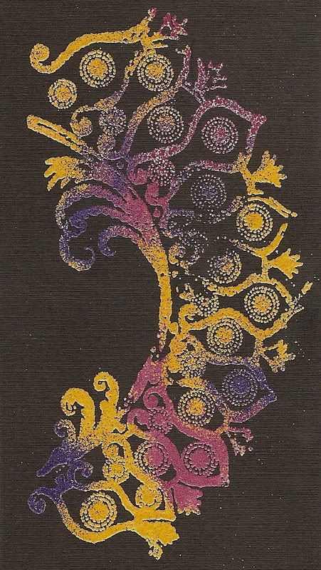
This is Verdigris EP, which is part of our Antiquities EP line. It has a patina look but doesn't really come through as well on this scan. Looks much cooler in person.
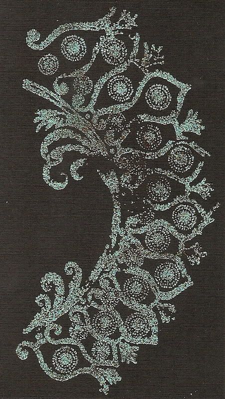
Fluorescent mix
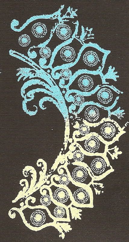
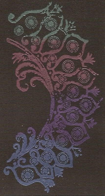
Embossing Pearls mix (not the same as Perfect Pearls): I really love these powders. I think I just like anything pearlescent. To me, I like this form of shiny better than glitter. Looks more elegant, I think. And by the way, I really love that stamp, in case you couldn't tell. Heh.
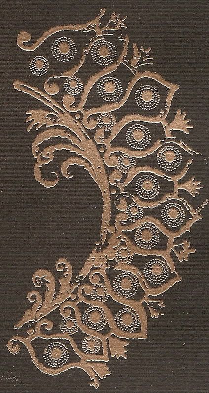
Here are two of our popular EP colors. I love 'em.
Queen's Gold (which is, for lack of a better word, softer than our regular Gold EP--I do like the
subtler one, but it totally depends on the project one is doing which EP one should use)
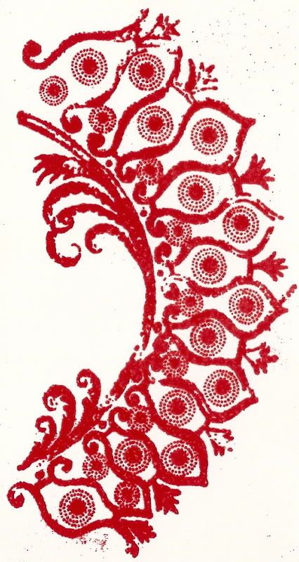
Rich Red
When we were done with embossing, Tim took over and we started with Distress, his line of inks. I love these techniques.
Wrinkled Distress
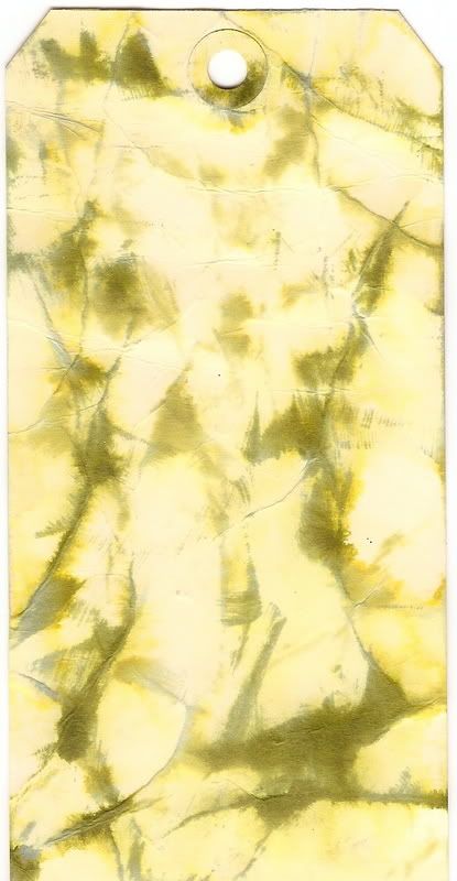
Wrinkle Free Distress
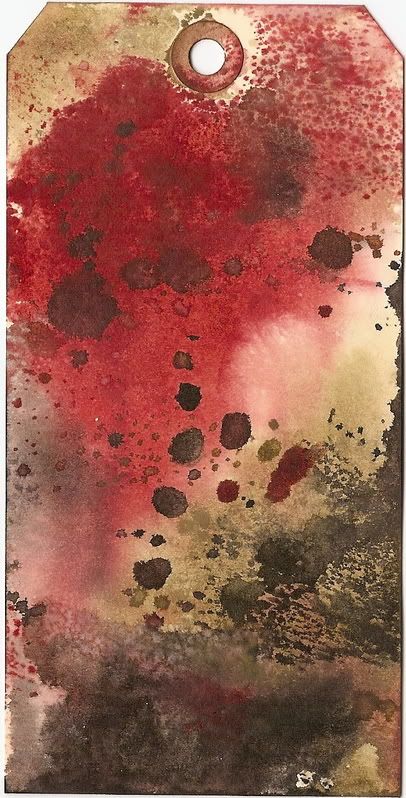
Spritz & Flick
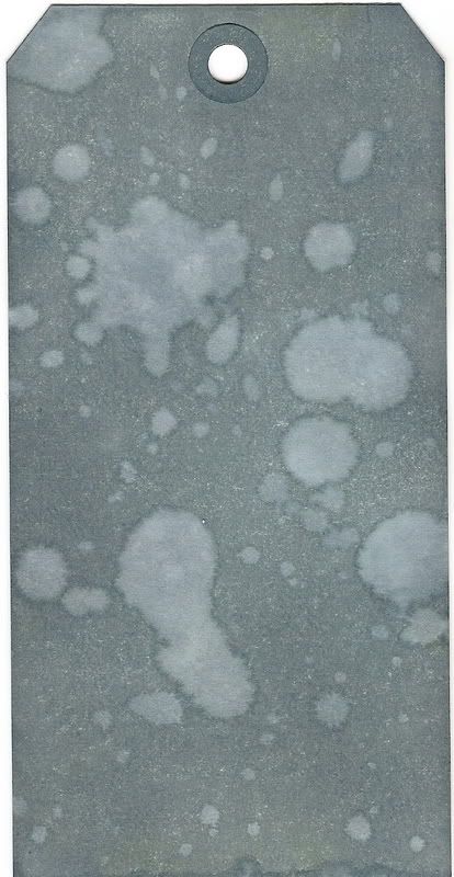
Burnt Edge Technique: I freakin love this. Like LOVE. Who knew you could make this with just a couple of brownish inks?
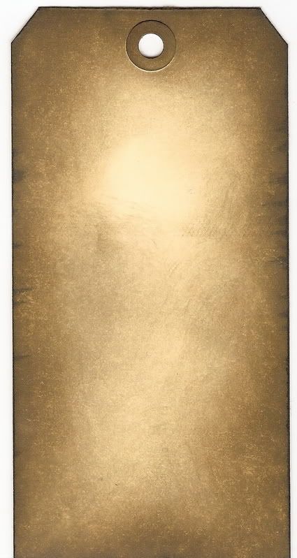
Distress Plaid: At first I didn't like this, but the more I distressed it, I swear, it changed my mind completely. I love this one.
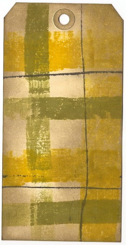
Next we did a couple of techniques with our line of coordinating inks.
(btw, omg, i'm getting tired of explaining shit! so if you guys have questions, just comment and i'd be happy to answer!)
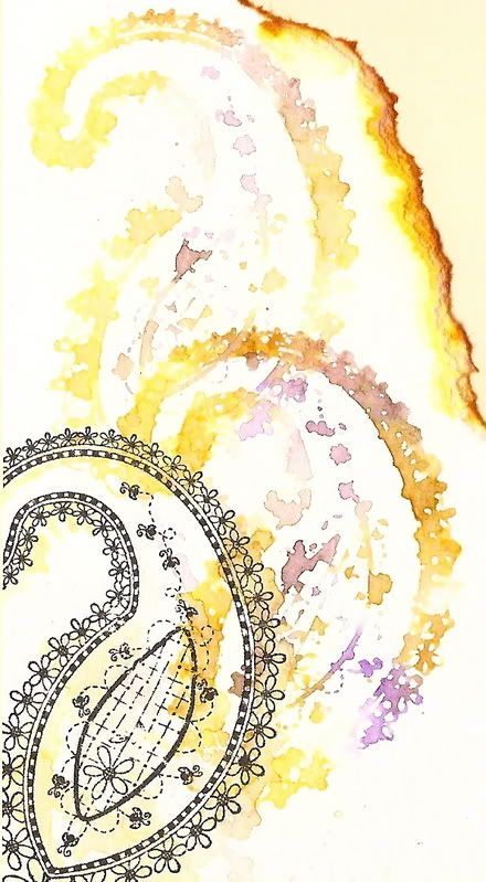
Brushless Watercolor
Adirondack coordinating colors
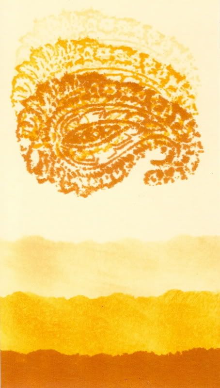
Ink Resist
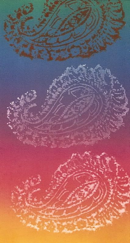
Alcohol Inks:
Alcohol Agate--there's some copper ink in this tag, but it totally doesn't show up on this scan, dangit.
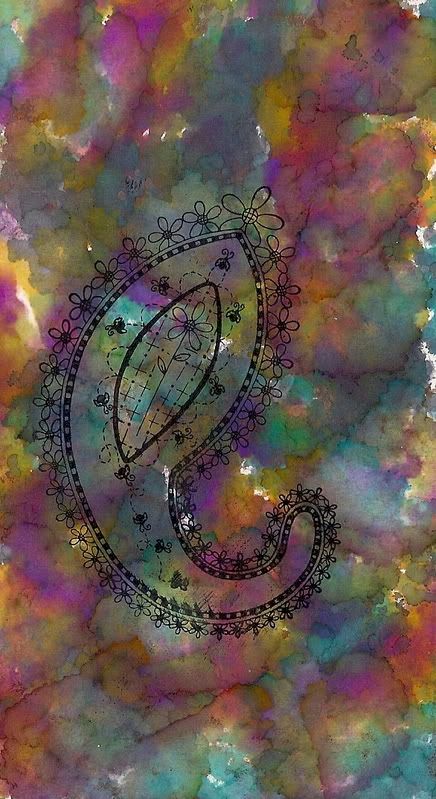
Alcohol Blended Swipe
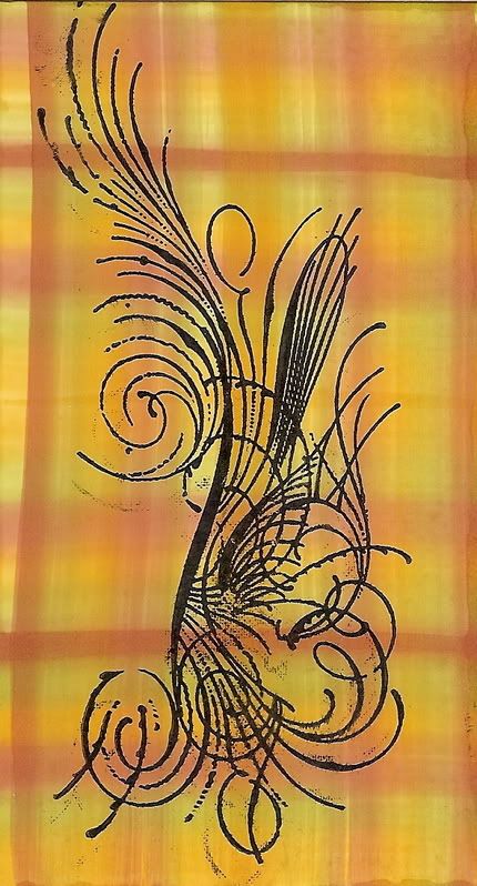
Alcohol Resist
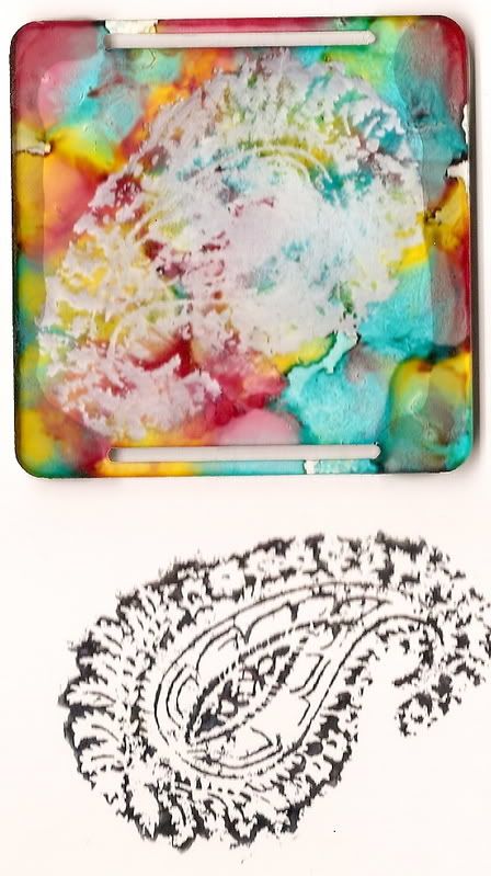
Paint Dabbers:
Coordinating color dry swipe
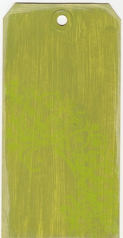
Dots and swirls
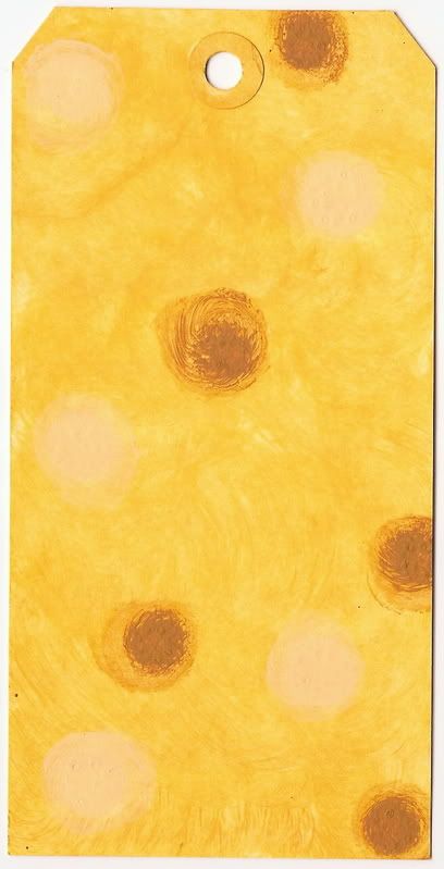
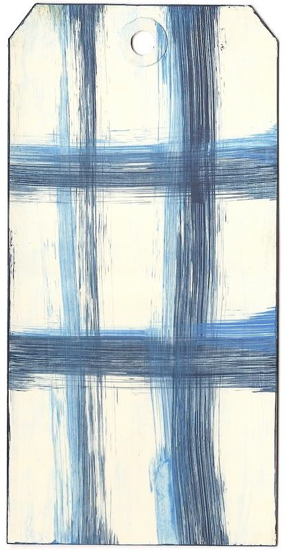
Dabber plaid
Last but not least, Dabber paint over Crackle Accents.

The class was taught jointly by Robin Beam, our Director of Education at Ranger and Tim Holtz, our Senior Educator and a designer in his own right. Tim is really huge in the industry and I think I see why. He's a very good teacher. He explains things really well--well enough so that you feel like you can do it. Also, he talks about mistakes and errors he's made so that you can prevent from making those same mistakes. However, it's in making those mistakes that one discovers other methods and techniques. I really liked this one because ever since my dad died, I feel like my creativity's been stalled a little. I didn't feel like doing anything creative. But with this class, I just want to get down and dirty and PLAY.
Here's some stuff I did.
We started with some embossing techniques.
This is done with Adirondack Embossing Powder (hereafter abbreviated as EP), a line of EP we make that has a white core.

This is Verdigris EP, which is part of our Antiquities EP line. It has a patina look but doesn't really come through as well on this scan. Looks much cooler in person.

Fluorescent mix

Embossing Pearls mix (not the same as Perfect Pearls): I really love these powders. I think I just like anything pearlescent. To me, I like this form of shiny better than glitter. Looks more elegant, I think. And by the way, I really love that stamp, in case you couldn't tell. Heh.

Here are two of our popular EP colors. I love 'em.
Queen's Gold (which is, for lack of a better word, softer than our regular Gold EP--I do like the
subtler one, but it totally depends on the project one is doing which EP one should use)

Rich Red

When we were done with embossing, Tim took over and we started with Distress, his line of inks. I love these techniques.
Wrinkled Distress

Wrinkle Free Distress

Spritz & Flick

Burnt Edge Technique: I freakin love this. Like LOVE. Who knew you could make this with just a couple of brownish inks?

Distress Plaid: At first I didn't like this, but the more I distressed it, I swear, it changed my mind completely. I love this one.

Next we did a couple of techniques with our line of coordinating inks.
(btw, omg, i'm getting tired of explaining shit! so if you guys have questions, just comment and i'd be happy to answer!)
Brushless Watercolor

Adirondack coordinating colors

Ink Resist

Alcohol Inks:
Alcohol Agate--there's some copper ink in this tag, but it totally doesn't show up on this scan, dangit.

Alcohol Blended Swipe

Alcohol Resist

Paint Dabbers:
Coordinating color dry swipe

Dots and swirls

Dabber plaid

Last but not least, Dabber paint over Crackle Accents.
