BOOK 1, CHAPTER 2: Results
ALL POLLS HAVE BEEN MOVED TO THIS ENTRY.
I'd really appreciate it if you took a few moments to give me your input! :)
I've made a slight modification to voting. Voting will be closed whenever I hit 15 votes (and the results aren't tied) or at 5PM PST on the Sunday of the challenge, whichever comes first. The reason for this is that updating these critiques and the character status page and everything take forever, so to do all that, then post results for avatar_hush, then post voting for hxh_icontest and kawaii_icontest... Yeah, you can see how it is, eh? XD;;
Anyway, moving on! The Character Status page has been updated, if you'd just like to see the quick-'n-easy view of the new rankings.
This week, I bring you the sad news that Uncle Iroh has been eliminated :( It was nice having you, and please don't feel discouraged! Take a little time to look over your critiques and improve your icon skills a bit; we'll have many more chapters in the future and many more opportunities for you to enter.
Votes for favorites are on the top, followed by votes for least favorite, and finally general comments.
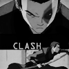
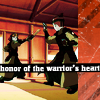
Icon #01
5 votes/comments total
[+] The black and white in the icon and the placement of the bottom image in the icon work well. The emotion in the icon is conveyed in an outstanding manner through the lack of color, textures, and brushes. The simple look of the icon through placement of the subject is the strong point of the icon.
[+] The black and white goes very well with the layout.
[+] I like the two-panel layout and also the text choice and placement. I've never seen that font used before in an icon, but I think its sharp angles fit nicely with the message. :) My only complaint would be that there should be some space before Zuko on the bottom so that it looks like he's actually going toward something. It's not a big nitpick, though. Oh, and I like the monochromatic scheme; it's not overcontrasted, which is nice.
[G] Great superimposition of the images! I like that you left it black-and-white; it maintains the dramatic nature of the caps. I would use a different font though, perhaps something grungy or stressed, though because the current font looks too tech-y and clinical for the icon.
[G] I like the layout of the icon and the images of Zuko used. Howver the font is too boring - or rather lacks the emotion you're trying to carry across in the word itself. It's light weight, not agressive enough etc. Type speaks for itself, remember that.
Icon #02
7 votes/comments total
[+] So simple and so beautiful! The colors are bright and clear, and the tinytext is perfect!
[+] I love the crop, colours, and your use of tiny text (it was very well placed!)
[+] the bright coloring is absolutely beautiful... this was the first icon to catch my eye in the set when I opened the page. I'm not not crazy about paragraph-y text brushes but here it works without overpowering the image at all.
[+] The colors in this are amazing. It manages to appear bright without being oversaturated and it still captured how colorful the serpent is. Cropping is excellet and the tiny text placement actually works. I personally think that the text was unnecessary and detracts a bit from the icon, but I think the shape and placement are ok.
[+] I really like the crisp, bright coloring, and the use of tiny text. I'm guessing that you put the tiny text on overlay or something? Because it's incorporated really well ^^ The crop is nice, too, as is the tilt. The only thing that I'd have to nitpick is the fact that it almost seems cutesy for a battle icon. XD
[-] While it is a nice icon the bright colors don't help to convey the theme of the icon. The subjects are hard to see and look too sharp making them look as though they were pasted onto the icon.
[-] You're probably going to get this more than once, but the text is too small, and the picture itself isn't interesting enough to pull the icon off on it's own.
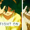
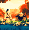
Icon #03
8 votes/comments total
[+] I love the dual paneled design. It adds interest to the icon without detracting from the details. The text works perfectly here, both in placement and in choice.
[+] Though I'm not a big fan of the blurring, the rest of the icon (text, coloring) is awesome!
[+] Very nice use of the split picture style. The text is placed in a good spot and doesn't distract or look out of place
[+] The light texture isn't overpowering and it is subtle enough to fit well with Toph's clothes. It also looks like the image was blurred at the top and bottom, which helps to put an emphasis on Toph's face. The gradient on the text is nice because it keeps it from looking pasted on and helps it fit with the texture below it.
[-] The colors seem washed out and not the best and the colors you used for the duplication of the picture [on the right] don't really fit. :-/
[G] I love the composition and the text... the font fits perfectly here. My only quibble is the coloring of the larger image; the image looks too saturated and bright that it makes Toph's hair green and blend into the background.
[G] I would have prefered to have a deeper perspective on the theme. "Fight on"? "Game on" would have worked better at that point because Toph herself is giving the viewer the hint. I'm not saying this is bad, but this is a LIMS and I'm not sure one wants to be so plain with this.
[G] I like the bright colors, though Toph's hair is a bit green. XD; The text is a nice addition, though if I were making the icon, I would have added a 3-pixel white border around the edge to kind of bring everything together, since there's that line on the side, too.
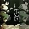
Icon #04
9 votes/comments total
[+] It's a simple icon with a simple texture that compliments the subject nicely. The placement of the subject and the font convey the overall message of the icon in a simple manner proving that you don't need a lot of textures and brushes to convey the message in an icon.
[-] I really, really hate to say this, but the icon feels too plain. I can see that you used a light texture and played with the contrast, but the cropping is rather plain, as is the colouring. Also, the 'Fight' is too big, and it is overpowering.
[-] The image itself appears blurry in some areas, while appearing overly sharp in others. The large text is competing with the subject of the icon which overall detracts from the icon as a whole.
[-] This is a composition that can totally work with the base image but the two layers of the Toph base look so similar and boring; there's no coloring or anything else to draw my attention to the icon. The font is also... weak? It isn't effective in conveying the theme.
[-] Would it be so wrong to ask what were you thinking? XD For one, the words aren't very deep into the theme and they appear hand drawn, giving it a hard look that, by all rights, looks like a mistake. I duplication of Toph in a darker shade doesn't help the icon...overall, it looks sloppy.
[-] The text just doesn't seem to fit with that font and the placement of it really isn't the best; also, the duplicated picture [on the right] isn't of the best quality and leaving it that like that subtracts from the overall feel of the icon. :-/
[-] The duplicate image doesn't fit well, it looks cut off and it's too dark. The larger image looks a bit over sharpened and is too monochromatic to be juxtaposed with the dark and desaturated copy.
[G] It's a nice icon, but it's a bit too dark. And although I like the duplication of the picture, I feel that the icon is a bit unfinished; more could have been done with the layout.
Icon #05
5 votes/comments total
[-] The text is not done well--it's too bold and the black bar beneath it is somewhat jarring.
[-] I don't think the side column with the diagnol stripes fits the subject.
[G] It's a great icon but its only downfall is the text. There's so much being said that at the small pixel size it becomes hard to read being crammed into the space of the icon. Alternate text would make things easier to read.
[G] It's a good concept, but the icon is a bit too dark and the texture doesn't really blend with the rest of the icon.
[G] I really like the color scheme, though I think the white of the text could've been in another color from the icon (maybe a light yellow). The scratchy textures on the side are a nice touch. :D
Icon #06
10 votes/comments total
[+] The coloring and composition are both lovely, and I love the text. It's appropriately placed and beautifully subtle.
[+] I like the coloring! The text could stand to be worked on, however.
[-] The contrast and saturation are both very high; which makes it hard to make out the edges of Zuko and Iroh. The text feels out of place; it's rather plain, and doesn't contribute much to the icon's design as a whole.
[-] The subjects of the icon look too fuzzy. It becomes hard to see the subjects in the icons. The text is hard to read as some letter in the chosen font appear to be quite fuzzy and does not seem to work being cut off hanging half off the bottom of the icon. A different sans serif font and better placement of the text would make this icon much better.
[-] I like the icon itself, but I fail to see the relation to the them. I've thought about it, and all I could come up with are: bitterness, sorrow, pain...but not necassarily the main theme which was "fight". I don't really see the internal conflict either but rather acceptance to what had to be done...Your font color needs to be more of a contrast to the water as well. If you didn't want to go all out and visible with whitem use a gray. Black on dark blue is hard to read.
[-] There is a nice use of color, but it's hard to see what is going on it it, so I can't really tell if it fits the theme or not. The text is not very readable either.
[-] The colors are too bright, and the image is blurry.
[G] This is a decent icon overall. The coloring is interesting and the text is certainly legible. It needs something else to make it interesting and "pop" out, such as a brush or an element put underneath the text.
[G] The icon itself is lovely, but I don't see how it relates to the battle/attack/aggression theme. This seems more calming to me than aggressive.
[G] The icon's a bit too bright for me to see what's going on. I like how you show their inner turmoil, though.
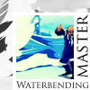
Icon #07
7 votes/comments total
[+] I love your use of saturation/de-saturation in the layout of the icon; the 'out-of-the box' effect it produces is very neat.
[+] The text and overall design is very well-done. Very crisp and clean looking!
[+] The composition on this one is just great! I love how the box works around the wave and how all the color remains within the box. Unique and inspiring!
[+] The image is crisp and beautiful and the composition of the icon is interesting with the desaturated elements and that wave thing off to the left side. My only nitpick would be the placement of "Master"... it just looks a bit awkward to me. But, overall, it's great!
[+] The use of black & white along with color really helps the flow. The way the water in the front is greyscale while the water behind is still blue adds to the depth and the splash in the top left keeps it from looking too boxy.
[+] Very well put together. It's a great angel and great mixture of elemtns!
[G] Unique layout, but I feel that the font choice could have been better. Maybe it's just me, but I think these kind of serif fonts look best when they're small.
Icon #08
4 votes/comments total
[+] The action in this captured extremely well. The texture looks very good, and the text fits perfectly.
[+] Another great concept and angel!
[G] This is a great icon! The cropping and composition is nice and the text is well-placed. The font itself is okay... it works with the icon. Perhaps you can erase the scan lines from the actual image next time to make the image pop out more. Also, I don't understand the desaturated bar above Aang; it adds a grung-y effect that would normally work with the emotion in the icon, but here it competes with the scan lines and reduces the potential simplicity of the image.
[G] I like the crop and the text, but I think that the scan lines could have been going the opposite direction to better emphasize the swirling of Aang's water :)
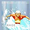
Icon #09
9 votes/comments total
[-] The coloring seems a little odd and it's a tad on the dark side. Also, the text seems somewhat slapped on.
[-] The image itself is overly saturated and the image quality is grainy (especially in the foreground). The text doesn't fit in with the rest of the icon.
[-] The base image looks unclear and rather low quality. This icon has very nice bright colors but the blurry black layers make the image fuzzy. The text looks almost like an afterthought, being in the corner.
[-] It's very hard to see who is actually in the icon becuase there seem to be too many clashing textures. The cropping it good but the text is hard to see.
[-] It's really hard to tell what the image is of and it only becomes harder with the bright, full spectrum of colors. If it was cropped in a slightly different way or if it wasn't quite so bright, it might be easier to see the subject. The text looks a little pixely, as if anti-alias wasn't used.
[-] The color, the mix of dark and extremely bright, make this somewhat hard on the eyes, as well as hard to understand.
[-] the image and colors are so blurred and over-saturated, the icon doesn't seem to have much focus.
[-] The image is really grainy and it's hard to tell what's going on. The text also doesn't seem to fit very well.
[G] I really liked the contrast between the warm and the cool colours, though it is hard to tell exactly what is going on in the image
Icon #10
7 votes/comments total
[+] I'm particularly drawn to how the theme is portrated. It's raw fighting - almost like a lesson with all the kanji in the background. It's a little dark, but hey, I can see that as being purposely shadowed. No need for bright textures. Props.
[+] I really like the creativity of using the concept art for this, and the colors, though a little dark, also help to draw attention to it.
[+] I love the use of background and the outline around the two figures. It's very eyecatching.
[+] I love how the calligraphy in the back echoes the sketchy lines in the front. The calligraphy adds that extra grace to the scene, mirroring the lines of their fight, which is cool :P The gradient is also a nice touch; everything is balanced out very nicely in this icon. The whole icon is almost... how do I say it? It's almost poetic, even though it's just a picture and doesn't have any actual text on it XD;;
[-] The peaceful calligraphy in the background detracts from the movement and emotion in the picture. For an icon that should evoke excitement with its battle theme, it falls flat.
[G] I like this icon a lot. It's really well-done as the character-ed background works for the animatic in the forefront of the image. I think I would prefer a color gradient that was more saturated or bright for this image though. The dark neutral color makes it harder to see.
[G] I REALLY liked this icon. It was a hard choice.... but I like this icon because of the angle and the choice of image. :)
Icon #11
10 votes/comments total
[+] The design is really nice~ I like the coloring and the arrow/pattern looks cool. XD
[+] I love how each part of this icon works together in the overall theme. The bold background is a perfect compliment to the image in both color choice and in how it works with the rough lineart on Aang. The creative cropping works well here.
[+] I love everything bout it. The coloring, the cropping, the placement of the background elements... they all work so well in this image because everything is distinguishable but nothing competes with the main image of Aang.
[+] That arrow in the background can be so symbolic it's amazing. @__@ Aang being off the side doesn't over power the message of the arrow, but instead balances out the icon and does't over due the theme. The ragged edges, although to some they may seem like mistakes, only further add to the rough feel of al things angry. I may not be making sense, so in a nutshell: It fits the theme without being stressed. Witty arrow use as well. (But perhaps I'm overthinking again, who knows?)
[+] Very stylish. The background could use a bit of work, but overall, Aang's placement in the icon really works well against it.
[+] The dynamic of this icon is brilliant. The coloring is very good, and the arrow in the background is great... especially how it goes with the entire layout of the icon.
[+] I really love this. I love the sketchy, rough-around-the-edges quality to it...I don't know how you did it, but I like it.
[-] There's something about the right there in your face hand and the busy background combo that gives me a headache to look at. This icon is too busy.
[-] The icon is a bit too busy. The crisp lines in the background don't really match the sketchy lines in the foreground; everything just seems to be a bit messy.
[G] The coloring of the animatic is beautiful. While the icon works on its own, it doesn't quite get into the overall theme in the choice of textures. A better showing of the inner conflict or struggle of the subject would convey the overall message in the icon better.
Icon #12
5 votes/comments total
[-] I can't really make out which character is on the icon. The angel used could be a great angel, but the black crop at the top cuts it off too much, I think.
[G] Interesting bit of cropping but, to me, the image looks as if the aspect-ratio is a bit off. The coloring can be a bit bolder in this case and I would have preferred a different font.
[G] Love the cropping, but the icon is too dark to really see what's going on. The font is a bit distracting - perhaps a smaller size would have worked better?
[G] I love the layout of the icon, the black bar and the text, along with the cropping, fit well together, I just wish it was a little more colorful. Jet looks too washed out and blends into the background a little too much.
[G] I really like the coloring, but I think that the font is a bit too "BAM! In your face!" if you know what I mean-it's a bit too big, and it detracts from Jet himself. The white probably could've been that yellowish-green from his sword; white stands out a lot, especially when there's no pure white in the icon itself. ^^;
Icon #13
8 votes/comments total
[+] The text is beautiful and works perfectly with the pictures; I love the effect you used on the pictures as it makes for a gorgeous effect that goes perfectly with the text AND the theme. ^^
[+] Great concept! Very unique, and effective. :)
[-] There's far too much going on in this icon and it's not cohesive enough to really pull through. I have to give props for the unique composition, but the text and the gray brushes confuse an already complicated icon and take focus away from the main theme. This would have been so much better if the images had stood alone on a blank canvas.
[-] Though the concept is a great idea, I don't think you were really able to pull it off; the cropping and the background lest something missing... I just can't put my finger on what...
[G] I think that this is a very creative composition; it's something I haven't seen before. However, the actual aesthetics of the image is lost because the images look so... jumbled, I guess. And, while the font is great, the red part of it doesn't work at all and looks very awkward to me.
[G] It's a nice start for the icon but the choice of words with the way the subjects were placed left me a bit confused as to what the overall message of the icon is and how it fits into the overall theme. Two of the subjects in the icon are too small and appear quite blurry and hard to see. It's hard to know if this is intentional or an issue in the making of the icon.
[G] Very creative concept, but the cropping of some of the characters seems rather random. It might have worked a little better if the pictures were all roughly the same size.
[G] Although the concept is nice, the layout is a bit messy. The gray lines in the back could've been done without, and that red blob on the text is a bit random.
Icon #14
6 votes/comments total
[+] The colors are beautiful and I love the effect you used around the text as well as the flower brush above it. The picture also works lovely, great icon overall. ^^
[+] Awesome colouring and crop; I love the brush you used around the text as well.
[+] The text really makes this icon, I love how you used the the colors in the icon to make the text border... lovely job!
[+] I like the spirit of this one. The colors, picture, text and brushes all work really well together here.
[G] I love the coloring, cropping, and text placement of this icon as they all work so well together. My only nitpick would be the brush atop the text; it seems kind of feeble and competes with the brightly colored background. I'd leave that out next time.
[G] I really like the colors, but I think the block with the text and the S's (Decadentia, am I right? XD) could've been moved over to the right, because there's plenty of space there, and it seems kind of crammed against Suki in that position.
Icon #15
7 votes/comments total
[+] I love your color scheme here and how it fits in with the rest of the icon. With the use of a variety of cool tones (and not just blues) interest is added to the icon in a nice, subtle manner. The glow-spots brush works well in the way you've used it, they remind me of mist or bubbles (which works nicely with the water-bending theme).
[+] The textures not only compliment the image wonderfully but they do it in a way that doesn't distract the eye or hide the subject. The eye is wonderfully drawn from the arm to the water and back to the subject again. Everything from font to placement of the subject and textures flows together beautifully.
[+] The colors are GORGEOUS and the text works perfectly. ^^
[+] This icon has a lot of attitude. Also, I like the font choice, and how the colors are clear around Katara but get a little distorted as they spread out. That's cool.
[+] Cropping and color win for this one. I don't care for what it says, as she's blatantly a waterbender, but the font choice is appropriate none the less. The dirty texture and black on top aid in the portrayal of the theme.
[G] The cropping and coloring for this icon are great, but I think you just have too many things competing for attention in this icon. The images looks rather low quality and "noisy". The blurry black bar on top looks a bit awkward and the bubbly light texture you have there just looks "blah". IMO, low-opacity light textures just take away from the images, especially if you have nice coloring underneath. The font of the text is fine but the angle is slightly awkward.
[G] I really like the colors and the text, but I feel that you could have showed Katara's opponent to better emphasize the battle theme.
Please don't be discouraged if you got a lot of negative critiques; take them as a learning experience to improve, as that's the whole point of a LIMS :) You still have an opportunity next round to gain points :)!
Comments to this entry are screened just so I can make sure that you're not accidentally giving away your identity. ^^ Your comment will stay screened if I feel that there is anything in it that may reveal your identity.
Meanwhile, I don't care if you reveal yourself as the author of a particular comment; comments are just kept anonymous so that no one feels like holding themselves back for fear of hurting someone else's feelings.
Plugs:
tsubasa_battle is still in need of signups!
bssm_battle has begun battles! Voting for Round 1 has concluded, but Round 2 will be up soon :)
- hl
I'd really appreciate it if you took a few moments to give me your input! :)
I've made a slight modification to voting. Voting will be closed whenever I hit 15 votes (and the results aren't tied) or at 5PM PST on the Sunday of the challenge, whichever comes first. The reason for this is that updating these critiques and the character status page and everything take forever, so to do all that, then post results for avatar_hush, then post voting for hxh_icontest and kawaii_icontest... Yeah, you can see how it is, eh? XD;;
Anyway, moving on! The Character Status page has been updated, if you'd just like to see the quick-'n-easy view of the new rankings.
This week, I bring you the sad news that Uncle Iroh has been eliminated :( It was nice having you, and please don't feel discouraged! Take a little time to look over your critiques and improve your icon skills a bit; we'll have many more chapters in the future and many more opportunities for you to enter.
Votes for favorites are on the top, followed by votes for least favorite, and finally general comments.
Icon #01
5 votes/comments total
[+] The black and white in the icon and the placement of the bottom image in the icon work well. The emotion in the icon is conveyed in an outstanding manner through the lack of color, textures, and brushes. The simple look of the icon through placement of the subject is the strong point of the icon.
[+] The black and white goes very well with the layout.
[+] I like the two-panel layout and also the text choice and placement. I've never seen that font used before in an icon, but I think its sharp angles fit nicely with the message. :) My only complaint would be that there should be some space before Zuko on the bottom so that it looks like he's actually going toward something. It's not a big nitpick, though. Oh, and I like the monochromatic scheme; it's not overcontrasted, which is nice.
[G] Great superimposition of the images! I like that you left it black-and-white; it maintains the dramatic nature of the caps. I would use a different font though, perhaps something grungy or stressed, though because the current font looks too tech-y and clinical for the icon.
[G] I like the layout of the icon and the images of Zuko used. Howver the font is too boring - or rather lacks the emotion you're trying to carry across in the word itself. It's light weight, not agressive enough etc. Type speaks for itself, remember that.
Icon #02
7 votes/comments total
[+] So simple and so beautiful! The colors are bright and clear, and the tinytext is perfect!
[+] I love the crop, colours, and your use of tiny text (it was very well placed!)
[+] the bright coloring is absolutely beautiful... this was the first icon to catch my eye in the set when I opened the page. I'm not not crazy about paragraph-y text brushes but here it works without overpowering the image at all.
[+] The colors in this are amazing. It manages to appear bright without being oversaturated and it still captured how colorful the serpent is. Cropping is excellet and the tiny text placement actually works. I personally think that the text was unnecessary and detracts a bit from the icon, but I think the shape and placement are ok.
[+] I really like the crisp, bright coloring, and the use of tiny text. I'm guessing that you put the tiny text on overlay or something? Because it's incorporated really well ^^ The crop is nice, too, as is the tilt. The only thing that I'd have to nitpick is the fact that it almost seems cutesy for a battle icon. XD
[-] While it is a nice icon the bright colors don't help to convey the theme of the icon. The subjects are hard to see and look too sharp making them look as though they were pasted onto the icon.
[-] You're probably going to get this more than once, but the text is too small, and the picture itself isn't interesting enough to pull the icon off on it's own.
Icon #03
8 votes/comments total
[+] I love the dual paneled design. It adds interest to the icon without detracting from the details. The text works perfectly here, both in placement and in choice.
[+] Though I'm not a big fan of the blurring, the rest of the icon (text, coloring) is awesome!
[+] Very nice use of the split picture style. The text is placed in a good spot and doesn't distract or look out of place
[+] The light texture isn't overpowering and it is subtle enough to fit well with Toph's clothes. It also looks like the image was blurred at the top and bottom, which helps to put an emphasis on Toph's face. The gradient on the text is nice because it keeps it from looking pasted on and helps it fit with the texture below it.
[-] The colors seem washed out and not the best and the colors you used for the duplication of the picture [on the right] don't really fit. :-/
[G] I love the composition and the text... the font fits perfectly here. My only quibble is the coloring of the larger image; the image looks too saturated and bright that it makes Toph's hair green and blend into the background.
[G] I would have prefered to have a deeper perspective on the theme. "Fight on"? "Game on" would have worked better at that point because Toph herself is giving the viewer the hint. I'm not saying this is bad, but this is a LIMS and I'm not sure one wants to be so plain with this.
[G] I like the bright colors, though Toph's hair is a bit green. XD; The text is a nice addition, though if I were making the icon, I would have added a 3-pixel white border around the edge to kind of bring everything together, since there's that line on the side, too.
Icon #04
9 votes/comments total
[+] It's a simple icon with a simple texture that compliments the subject nicely. The placement of the subject and the font convey the overall message of the icon in a simple manner proving that you don't need a lot of textures and brushes to convey the message in an icon.
[-] I really, really hate to say this, but the icon feels too plain. I can see that you used a light texture and played with the contrast, but the cropping is rather plain, as is the colouring. Also, the 'Fight' is too big, and it is overpowering.
[-] The image itself appears blurry in some areas, while appearing overly sharp in others. The large text is competing with the subject of the icon which overall detracts from the icon as a whole.
[-] This is a composition that can totally work with the base image but the two layers of the Toph base look so similar and boring; there's no coloring or anything else to draw my attention to the icon. The font is also... weak? It isn't effective in conveying the theme.
[-] Would it be so wrong to ask what were you thinking? XD For one, the words aren't very deep into the theme and they appear hand drawn, giving it a hard look that, by all rights, looks like a mistake. I duplication of Toph in a darker shade doesn't help the icon...overall, it looks sloppy.
[-] The text just doesn't seem to fit with that font and the placement of it really isn't the best; also, the duplicated picture [on the right] isn't of the best quality and leaving it that like that subtracts from the overall feel of the icon. :-/
[-] The duplicate image doesn't fit well, it looks cut off and it's too dark. The larger image looks a bit over sharpened and is too monochromatic to be juxtaposed with the dark and desaturated copy.
[G] It's a nice icon, but it's a bit too dark. And although I like the duplication of the picture, I feel that the icon is a bit unfinished; more could have been done with the layout.
Icon #05
5 votes/comments total
[-] The text is not done well--it's too bold and the black bar beneath it is somewhat jarring.
[-] I don't think the side column with the diagnol stripes fits the subject.
[G] It's a great icon but its only downfall is the text. There's so much being said that at the small pixel size it becomes hard to read being crammed into the space of the icon. Alternate text would make things easier to read.
[G] It's a good concept, but the icon is a bit too dark and the texture doesn't really blend with the rest of the icon.
[G] I really like the color scheme, though I think the white of the text could've been in another color from the icon (maybe a light yellow). The scratchy textures on the side are a nice touch. :D
Icon #06
10 votes/comments total
[+] The coloring and composition are both lovely, and I love the text. It's appropriately placed and beautifully subtle.
[+] I like the coloring! The text could stand to be worked on, however.
[-] The contrast and saturation are both very high; which makes it hard to make out the edges of Zuko and Iroh. The text feels out of place; it's rather plain, and doesn't contribute much to the icon's design as a whole.
[-] The subjects of the icon look too fuzzy. It becomes hard to see the subjects in the icons. The text is hard to read as some letter in the chosen font appear to be quite fuzzy and does not seem to work being cut off hanging half off the bottom of the icon. A different sans serif font and better placement of the text would make this icon much better.
[-] I like the icon itself, but I fail to see the relation to the them. I've thought about it, and all I could come up with are: bitterness, sorrow, pain...but not necassarily the main theme which was "fight". I don't really see the internal conflict either but rather acceptance to what had to be done...Your font color needs to be more of a contrast to the water as well. If you didn't want to go all out and visible with whitem use a gray. Black on dark blue is hard to read.
[-] There is a nice use of color, but it's hard to see what is going on it it, so I can't really tell if it fits the theme or not. The text is not very readable either.
[-] The colors are too bright, and the image is blurry.
[G] This is a decent icon overall. The coloring is interesting and the text is certainly legible. It needs something else to make it interesting and "pop" out, such as a brush or an element put underneath the text.
[G] The icon itself is lovely, but I don't see how it relates to the battle/attack/aggression theme. This seems more calming to me than aggressive.
[G] The icon's a bit too bright for me to see what's going on. I like how you show their inner turmoil, though.
Icon #07
7 votes/comments total
[+] I love your use of saturation/de-saturation in the layout of the icon; the 'out-of-the box' effect it produces is very neat.
[+] The text and overall design is very well-done. Very crisp and clean looking!
[+] The composition on this one is just great! I love how the box works around the wave and how all the color remains within the box. Unique and inspiring!
[+] The image is crisp and beautiful and the composition of the icon is interesting with the desaturated elements and that wave thing off to the left side. My only nitpick would be the placement of "Master"... it just looks a bit awkward to me. But, overall, it's great!
[+] The use of black & white along with color really helps the flow. The way the water in the front is greyscale while the water behind is still blue adds to the depth and the splash in the top left keeps it from looking too boxy.
[+] Very well put together. It's a great angel and great mixture of elemtns!
[G] Unique layout, but I feel that the font choice could have been better. Maybe it's just me, but I think these kind of serif fonts look best when they're small.
Icon #08
4 votes/comments total
[+] The action in this captured extremely well. The texture looks very good, and the text fits perfectly.
[+] Another great concept and angel!
[G] This is a great icon! The cropping and composition is nice and the text is well-placed. The font itself is okay... it works with the icon. Perhaps you can erase the scan lines from the actual image next time to make the image pop out more. Also, I don't understand the desaturated bar above Aang; it adds a grung-y effect that would normally work with the emotion in the icon, but here it competes with the scan lines and reduces the potential simplicity of the image.
[G] I like the crop and the text, but I think that the scan lines could have been going the opposite direction to better emphasize the swirling of Aang's water :)
Icon #09
9 votes/comments total
[-] The coloring seems a little odd and it's a tad on the dark side. Also, the text seems somewhat slapped on.
[-] The image itself is overly saturated and the image quality is grainy (especially in the foreground). The text doesn't fit in with the rest of the icon.
[-] The base image looks unclear and rather low quality. This icon has very nice bright colors but the blurry black layers make the image fuzzy. The text looks almost like an afterthought, being in the corner.
[-] It's very hard to see who is actually in the icon becuase there seem to be too many clashing textures. The cropping it good but the text is hard to see.
[-] It's really hard to tell what the image is of and it only becomes harder with the bright, full spectrum of colors. If it was cropped in a slightly different way or if it wasn't quite so bright, it might be easier to see the subject. The text looks a little pixely, as if anti-alias wasn't used.
[-] The color, the mix of dark and extremely bright, make this somewhat hard on the eyes, as well as hard to understand.
[-] the image and colors are so blurred and over-saturated, the icon doesn't seem to have much focus.
[-] The image is really grainy and it's hard to tell what's going on. The text also doesn't seem to fit very well.
[G] I really liked the contrast between the warm and the cool colours, though it is hard to tell exactly what is going on in the image
Icon #10
7 votes/comments total
[+] I'm particularly drawn to how the theme is portrated. It's raw fighting - almost like a lesson with all the kanji in the background. It's a little dark, but hey, I can see that as being purposely shadowed. No need for bright textures. Props.
[+] I really like the creativity of using the concept art for this, and the colors, though a little dark, also help to draw attention to it.
[+] I love the use of background and the outline around the two figures. It's very eyecatching.
[+] I love how the calligraphy in the back echoes the sketchy lines in the front. The calligraphy adds that extra grace to the scene, mirroring the lines of their fight, which is cool :P The gradient is also a nice touch; everything is balanced out very nicely in this icon. The whole icon is almost... how do I say it? It's almost poetic, even though it's just a picture and doesn't have any actual text on it XD;;
[-] The peaceful calligraphy in the background detracts from the movement and emotion in the picture. For an icon that should evoke excitement with its battle theme, it falls flat.
[G] I like this icon a lot. It's really well-done as the character-ed background works for the animatic in the forefront of the image. I think I would prefer a color gradient that was more saturated or bright for this image though. The dark neutral color makes it harder to see.
[G] I REALLY liked this icon. It was a hard choice.... but I like this icon because of the angle and the choice of image. :)
Icon #11
10 votes/comments total
[+] The design is really nice~ I like the coloring and the arrow/pattern looks cool. XD
[+] I love how each part of this icon works together in the overall theme. The bold background is a perfect compliment to the image in both color choice and in how it works with the rough lineart on Aang. The creative cropping works well here.
[+] I love everything bout it. The coloring, the cropping, the placement of the background elements... they all work so well in this image because everything is distinguishable but nothing competes with the main image of Aang.
[+] That arrow in the background can be so symbolic it's amazing. @__@ Aang being off the side doesn't over power the message of the arrow, but instead balances out the icon and does't over due the theme. The ragged edges, although to some they may seem like mistakes, only further add to the rough feel of al things angry. I may not be making sense, so in a nutshell: It fits the theme without being stressed. Witty arrow use as well. (But perhaps I'm overthinking again, who knows?)
[+] Very stylish. The background could use a bit of work, but overall, Aang's placement in the icon really works well against it.
[+] The dynamic of this icon is brilliant. The coloring is very good, and the arrow in the background is great... especially how it goes with the entire layout of the icon.
[+] I really love this. I love the sketchy, rough-around-the-edges quality to it...I don't know how you did it, but I like it.
[-] There's something about the right there in your face hand and the busy background combo that gives me a headache to look at. This icon is too busy.
[-] The icon is a bit too busy. The crisp lines in the background don't really match the sketchy lines in the foreground; everything just seems to be a bit messy.
[G] The coloring of the animatic is beautiful. While the icon works on its own, it doesn't quite get into the overall theme in the choice of textures. A better showing of the inner conflict or struggle of the subject would convey the overall message in the icon better.
Icon #12
5 votes/comments total
[-] I can't really make out which character is on the icon. The angel used could be a great angel, but the black crop at the top cuts it off too much, I think.
[G] Interesting bit of cropping but, to me, the image looks as if the aspect-ratio is a bit off. The coloring can be a bit bolder in this case and I would have preferred a different font.
[G] Love the cropping, but the icon is too dark to really see what's going on. The font is a bit distracting - perhaps a smaller size would have worked better?
[G] I love the layout of the icon, the black bar and the text, along with the cropping, fit well together, I just wish it was a little more colorful. Jet looks too washed out and blends into the background a little too much.
[G] I really like the coloring, but I think that the font is a bit too "BAM! In your face!" if you know what I mean-it's a bit too big, and it detracts from Jet himself. The white probably could've been that yellowish-green from his sword; white stands out a lot, especially when there's no pure white in the icon itself. ^^;
Icon #13
8 votes/comments total
[+] The text is beautiful and works perfectly with the pictures; I love the effect you used on the pictures as it makes for a gorgeous effect that goes perfectly with the text AND the theme. ^^
[+] Great concept! Very unique, and effective. :)
[-] There's far too much going on in this icon and it's not cohesive enough to really pull through. I have to give props for the unique composition, but the text and the gray brushes confuse an already complicated icon and take focus away from the main theme. This would have been so much better if the images had stood alone on a blank canvas.
[-] Though the concept is a great idea, I don't think you were really able to pull it off; the cropping and the background lest something missing... I just can't put my finger on what...
[G] I think that this is a very creative composition; it's something I haven't seen before. However, the actual aesthetics of the image is lost because the images look so... jumbled, I guess. And, while the font is great, the red part of it doesn't work at all and looks very awkward to me.
[G] It's a nice start for the icon but the choice of words with the way the subjects were placed left me a bit confused as to what the overall message of the icon is and how it fits into the overall theme. Two of the subjects in the icon are too small and appear quite blurry and hard to see. It's hard to know if this is intentional or an issue in the making of the icon.
[G] Very creative concept, but the cropping of some of the characters seems rather random. It might have worked a little better if the pictures were all roughly the same size.
[G] Although the concept is nice, the layout is a bit messy. The gray lines in the back could've been done without, and that red blob on the text is a bit random.
Icon #14
6 votes/comments total
[+] The colors are beautiful and I love the effect you used around the text as well as the flower brush above it. The picture also works lovely, great icon overall. ^^
[+] Awesome colouring and crop; I love the brush you used around the text as well.
[+] The text really makes this icon, I love how you used the the colors in the icon to make the text border... lovely job!
[+] I like the spirit of this one. The colors, picture, text and brushes all work really well together here.
[G] I love the coloring, cropping, and text placement of this icon as they all work so well together. My only nitpick would be the brush atop the text; it seems kind of feeble and competes with the brightly colored background. I'd leave that out next time.
[G] I really like the colors, but I think the block with the text and the S's (Decadentia, am I right? XD) could've been moved over to the right, because there's plenty of space there, and it seems kind of crammed against Suki in that position.
Icon #15
7 votes/comments total
[+] I love your color scheme here and how it fits in with the rest of the icon. With the use of a variety of cool tones (and not just blues) interest is added to the icon in a nice, subtle manner. The glow-spots brush works well in the way you've used it, they remind me of mist or bubbles (which works nicely with the water-bending theme).
[+] The textures not only compliment the image wonderfully but they do it in a way that doesn't distract the eye or hide the subject. The eye is wonderfully drawn from the arm to the water and back to the subject again. Everything from font to placement of the subject and textures flows together beautifully.
[+] The colors are GORGEOUS and the text works perfectly. ^^
[+] This icon has a lot of attitude. Also, I like the font choice, and how the colors are clear around Katara but get a little distorted as they spread out. That's cool.
[+] Cropping and color win for this one. I don't care for what it says, as she's blatantly a waterbender, but the font choice is appropriate none the less. The dirty texture and black on top aid in the portrayal of the theme.
[G] The cropping and coloring for this icon are great, but I think you just have too many things competing for attention in this icon. The images looks rather low quality and "noisy". The blurry black bar on top looks a bit awkward and the bubbly light texture you have there just looks "blah". IMO, low-opacity light textures just take away from the images, especially if you have nice coloring underneath. The font of the text is fine but the angle is slightly awkward.
[G] I really like the colors and the text, but I feel that you could have showed Katara's opponent to better emphasize the battle theme.
Please don't be discouraged if you got a lot of negative critiques; take them as a learning experience to improve, as that's the whole point of a LIMS :) You still have an opportunity next round to gain points :)!
Comments to this entry are screened just so I can make sure that you're not accidentally giving away your identity. ^^ Your comment will stay screened if I feel that there is anything in it that may reveal your identity.
Meanwhile, I don't care if you reveal yourself as the author of a particular comment; comments are just kept anonymous so that no one feels like holding themselves back for fear of hurting someone else's feelings.
Plugs:
tsubasa_battle is still in need of signups!
bssm_battle has begun battles! Voting for Round 1 has concluded, but Round 2 will be up soon :)
- hl