Book 2, Chapter 4: Results
Apologies for the delay; there were a couple ties that had to be resolved last-minute!
Well, our heroes managed to stumble into Wan Shi Tong's library with their haphazardly collected books. Panting with the heat, they collapsed into a heap at the entrance as Wan Shi Tong looked on disapprovingly.
Suki led the way, brandishing her fans and conjuring up a small breeze to help everyone out! She hurriedly flung 100 Years of Solitude in Wan Shi Tong's face and jumped in. (It was the only time she wasn't keen on wearing her thick armor.) Eager to protect her, Sokka followed in close behind, but he ended up being fanned by her as All the King's Men fell from his hands. Aang wasn't doing too badly, either--he was indeed very tired, but not so tired that he couldn't help make a breeze to cool people down as he flipped through the pages of Blind Faith.
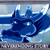
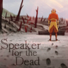
Others weren't so lucky, though. Yue simply couldn't take the heat; she was, after all, from a Land of Ice and Snow. Jet didn't fare too well, either. (Might've been the cactus juice...) Hakoda, like Yue, was used to colder climates and insisted, "If I Die in a Combat Zone, Box Me Up and Ship Me Home." Koh felt as if all of this were a Neverending Story and also succumbed to the heat. Zuko and Foofoocuddlypoops had a hard time, too, but a single redeeming favorite vote saved them :')
Lengthy exposures to sun are never good for you, though. As a result, everyone (Azula and Avatar Kyoshi included) is now afflicted with a burn! Oh no! :( However, Aang and Zuko have lucky charms, so they were saved from the burn! The charm broke afterward, though :( Anyway, I hope you can get rid of that soon, or else those marks will really start to add up!
Well, that's it! Onto the results!
Yue was eliminated with 0 points left. Sorry to see you go! Please stick around and continue to participate by voting, though; that'd be really appreciated! In addition to that, we may have a comeback round. (Details will be worked out soon!)
Anyway, the Character Status page has been updated (or will be right after this post goes up, so a little patience if it hasn't changed yet), if you'd just like to see the quick-'n-easy view of the new rankings.
Votes for favorites are on the top, followed by votes for least favorite, and finally general comments. The arrows indicate whether the iconmaker's points total went up or down.
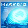
Icon #01
9+ 0- | ▲
[+] 01: First: OMG GABRIEL GARCIA MARQUEZ. Second: The title fits the cap PERFECTLY; it's great! The use of tiny text is superb, and the coloring is magnificent. :') I just wish there weren't that 1px line of black on the left, but that's because I'm nitpicky.
[+] 1: This icon is simple yet beautiful. The coloring is gorgeous, and the placement of the text is really good. The tiny text is a nice touch.
[+] #1: A perfect use of the book title and the theme of Avatar! I also love the coloring.
[+] 01: The composition is really simply and clean but the icon definitely stands out. The lighting is fantastic.
[+] 1: I really love the font you used and the way it fits with the screencap you chose, the whole feeling it brings up.
[+] 01: My favorite since the first time I watched this week's post, honestly. I think that the meaning of the caption and the image in general fits nicely.
[+] 1: Wonderful colors. Excellent pairing of text and image.
[+] 01: Simple as the cap may be, it goes wonderfully with the book title. The coloring is nice as well.
[+] #1: Love the text and the picture chosen--great execution and a very well put together icon.
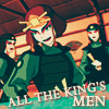
Icon #02
6+ 1- | ▲
[+] 02: I LOVE how the coloring brings out the complementary colors, and the text is done really nicely. The caption is great, too. XD
[+] 2: The texture at the bottom really goes well with the colors of the picture.
[+] #2: Very clever! Nice composition, and I love the expressions on the girls.
[+] 02: The way the crop is placed is really interesting. The text works well.
[+] 2: The coloring is really nice, and I love the sort of sarcastic-serious way the text brings up the screencap, sort of matching with the mood her face brings.
[+] #2: I normally don't like saturated colors, but it really works here, plus the text is awesome.
[-] 02: I don't know exactly what coloring technique you used, but it looks really odd. It's almost like when you look at a 3-D image without glasses and you can see the double lines, especially around the characters eyes.
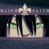
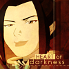
Icon #03
4+ 2- | ▲
[+] 03: Nice coloring and texture use! :D The fleur-de-lis was also a nice touch. The text is fitting, too.
[+] #3: Simply amazing, an extremely innovative way to use the book title! I also love the simple yet elaborate effects.
[+] 03: Strong composition and the image is cropped well. The center alignment works well here.
[+] #3: Fleur-de-lis is the perfect balance between the two words and eyes--love the text and the overall coloring of the icon.
[-] 03: Everything about this icon looks messy for me. The icon looks oversharpened, the textures doesn't fit and are distracting and the text above, even if the caption is good, looks badly executed in general.
[-] 3: The entire icon looks pixelated which is especially detrimental given that it is a close up. The tiny text detracts from the icon, as does the large fleur de lis, which both appear to be low quality.
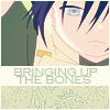
Icon #04
3+ 0- | ▬
4 || +3 -0 = +3
[+] 4: I love the croping for this icon! And the texture used really suits the text.
[+] 04: Love the coloring and the composition overall of the icon.
[+] 4: Beautiful muted colors, great crop and great composition! All the elements work well together.
[G] #4: Very innovative!
[G] #4: Very, very pretty--I love the unified color scheme, although the book title doesn't really correspond to any of the other elements in the icon, I think.
Icon #05
2+ 0- | ▬
[+] 5: The placement of the text for this icon is really good. The colors of the text and boxes behind it really go well with the rest of the icon.
[+] 5: Great composition and typography, and your understated color palette works well with the image.
[G] 5: Joseph Conrad FTW.
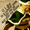
Icon #06
0+ 2- | ▼
[-] 6: The picture doesn't go well with the background texture, and the text takes up too much space. A different font also might have been more effective in this icon.
[-] 6: While I think it's a nice idea, I think that erasing all the background sort of steals for the whole picture.
[G] 06: Only because you used the most long title you deserve a comment! xD
[G] 6: That font doesn't really works well for something about death and war. Also, I wish you had capitalized the i in "if".
[G] #6: I like the title chosen, haha. :)
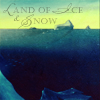
Icon #07
0+ 5- | ▼
[-] 07: The coloring feels a bit too bland, and there seems to be no real focal point in the icon. The text also looks messy and could have been arranged in a more visually appealing manner.
[-] 7: The coloring and text choice are nice but text placement makes the image feel crowded. It might have worked better if it was down in the water, filling up the large void, instead of cramming it in the sky. It also might have helped if the image had more ice and/or snow.
[-] 7: The icon is too dark, it's hard to appreciate it.
[-] #7: The image is much too dark, I can barely make out what it is.
[-] #7: It's an interesting title, but the icon itself really lacks any focus--the stock used is rather featureless and seems to be just a dark expanse, rather than a "land of ice and snow".
Icon #08
1+ 2- | ▬
[+] 8: Beautiful coloring and cropping!
[-] 08: The icon is really blurry, and the text, although fitting, feels bland.
[-] #8: Nice combination of stock and title choice, but the icon itself is too blurry and the coloring seems a tad overpowering.
Icon #09
0+ 2- | ▼
[-] 09: The text looks a bit distorted, maybe oversharpened. The border coloring seems a bit dull in comparison to the image.
[-] 09: Honestly I like this icon, but the text looks so weird and it hard to read and by technique, that ruins the whole icon.
Icon #10
2+ 0- | ▬
[+] 10: The text in the down-left corner and the subtle red on the top makes this icon amazing, but I really like the whole feeling this icon gives.
[+] 10: The darkness of this cap works really well with the text. The subtle ring around Aang brings your eyes to him without it being too harsh.
[-] 10: The text could be a bit more resolved, it feels like an afterthought. The crop could be a bit more intentional, the tree? on the left border is confusing.
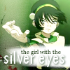
Icon #11
1+ 3- | ▼
[+] 11: The white line going down the left side works well with the motion of Toph's hand here. The text at the bottom is well placed and fits well with the scene, though having a little more focus on her eyes might have been nice.
[-] 11: The tiny text behind the book title doesn't look good with the rest of the icon, and "silver eyes" seems a little too big. Also, a different crop might have been more effective. If Toph had been a little bigger and the picture more focused on her face, it would have emphasized the fact that Toph has silver eyes.
[-] #11: The white and black text is too stark on such a dark icon, which detracts from the overall composition. It would look much better if more neutral tones such as a darker green or brown were used!
[-] 11: The colors are too faded, even while the contrast is too bright. The textures don't compliment the image very well and the typography could use some work.
Icon #12
1+ 0- | ▬
[+] 12: The text fits well with the image both in and out of context, and the grunge effect is used well
[G] 12: This icon might have been better had you chosen a different font color. The black doesn't seem to go well with the rest of the icon.
[G] 12: I like the coloring and everything about your icon, but I don't like the color choice of the text. But besides that, I really like it.
Icon #13
1+ 2- | ▬
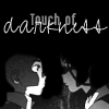
[+] 13: The use of B&W fits really well with the subject matter and works with the text. The use of a cursive font was a nice way to emphasize the word. The only down side is that the highlights on Aang's face are a little too bright.
[-] 13: It's so hard to see what's going on here. I understand that the screencap itself is hard to see but when done in greyscale, the picture becomes washed out and dull. It's very hard to make out the faces.
[-] 13: The typography seems thrown together and doesn't seem very cohesive with the image. The image is also unclear and the contrast is too high on Aang's face.
Please don't be discouraged if you got a lot of negative critiques; take them as a learning experience to improve, as that's the whole point of a LIMS :)
Comments to this entry are screened just so I can make sure that you're not accidentally giving away your identity. ^^ Your comment will stay screened if I feel that there is anything in it that may reveal your identity.
Meanwhile, I don't care if you reveal yourself as the author of a particular comment; comments are just kept anonymous so that no one feels like holding themselves back for fear of hurting someone else's feelings.
Plugs:
ohgreat_battle
videogame_lims
- hl
Well, our heroes managed to stumble into Wan Shi Tong's library with their haphazardly collected books. Panting with the heat, they collapsed into a heap at the entrance as Wan Shi Tong looked on disapprovingly.
Suki led the way, brandishing her fans and conjuring up a small breeze to help everyone out! She hurriedly flung 100 Years of Solitude in Wan Shi Tong's face and jumped in. (It was the only time she wasn't keen on wearing her thick armor.) Eager to protect her, Sokka followed in close behind, but he ended up being fanned by her as All the King's Men fell from his hands. Aang wasn't doing too badly, either--he was indeed very tired, but not so tired that he couldn't help make a breeze to cool people down as he flipped through the pages of Blind Faith.
Others weren't so lucky, though. Yue simply couldn't take the heat; she was, after all, from a Land of Ice and Snow. Jet didn't fare too well, either. (Might've been the cactus juice...) Hakoda, like Yue, was used to colder climates and insisted, "If I Die in a Combat Zone, Box Me Up and Ship Me Home." Koh felt as if all of this were a Neverending Story and also succumbed to the heat. Zuko and Foofoocuddlypoops had a hard time, too, but a single redeeming favorite vote saved them :')
Lengthy exposures to sun are never good for you, though. As a result, everyone (Azula and Avatar Kyoshi included) is now afflicted with a burn! Oh no! :( However, Aang and Zuko have lucky charms, so they were saved from the burn! The charm broke afterward, though :( Anyway, I hope you can get rid of that soon, or else those marks will really start to add up!
Well, that's it! Onto the results!
Yue was eliminated with 0 points left. Sorry to see you go! Please stick around and continue to participate by voting, though; that'd be really appreciated! In addition to that, we may have a comeback round. (Details will be worked out soon!)
Anyway, the Character Status page has been updated (or will be right after this post goes up, so a little patience if it hasn't changed yet), if you'd just like to see the quick-'n-easy view of the new rankings.
Votes for favorites are on the top, followed by votes for least favorite, and finally general comments. The arrows indicate whether the iconmaker's points total went up or down.
Icon #01
9+ 0- | ▲
[+] 01: First: OMG GABRIEL GARCIA MARQUEZ. Second: The title fits the cap PERFECTLY; it's great! The use of tiny text is superb, and the coloring is magnificent. :') I just wish there weren't that 1px line of black on the left, but that's because I'm nitpicky.
[+] 1: This icon is simple yet beautiful. The coloring is gorgeous, and the placement of the text is really good. The tiny text is a nice touch.
[+] #1: A perfect use of the book title and the theme of Avatar! I also love the coloring.
[+] 01: The composition is really simply and clean but the icon definitely stands out. The lighting is fantastic.
[+] 1: I really love the font you used and the way it fits with the screencap you chose, the whole feeling it brings up.
[+] 01: My favorite since the first time I watched this week's post, honestly. I think that the meaning of the caption and the image in general fits nicely.
[+] 1: Wonderful colors. Excellent pairing of text and image.
[+] 01: Simple as the cap may be, it goes wonderfully with the book title. The coloring is nice as well.
[+] #1: Love the text and the picture chosen--great execution and a very well put together icon.
Icon #02
6+ 1- | ▲
[+] 02: I LOVE how the coloring brings out the complementary colors, and the text is done really nicely. The caption is great, too. XD
[+] 2: The texture at the bottom really goes well with the colors of the picture.
[+] #2: Very clever! Nice composition, and I love the expressions on the girls.
[+] 02: The way the crop is placed is really interesting. The text works well.
[+] 2: The coloring is really nice, and I love the sort of sarcastic-serious way the text brings up the screencap, sort of matching with the mood her face brings.
[+] #2: I normally don't like saturated colors, but it really works here, plus the text is awesome.
[-] 02: I don't know exactly what coloring technique you used, but it looks really odd. It's almost like when you look at a 3-D image without glasses and you can see the double lines, especially around the characters eyes.
Icon #03
4+ 2- | ▲
[+] 03: Nice coloring and texture use! :D The fleur-de-lis was also a nice touch. The text is fitting, too.
[+] #3: Simply amazing, an extremely innovative way to use the book title! I also love the simple yet elaborate effects.
[+] 03: Strong composition and the image is cropped well. The center alignment works well here.
[+] #3: Fleur-de-lis is the perfect balance between the two words and eyes--love the text and the overall coloring of the icon.
[-] 03: Everything about this icon looks messy for me. The icon looks oversharpened, the textures doesn't fit and are distracting and the text above, even if the caption is good, looks badly executed in general.
[-] 3: The entire icon looks pixelated which is especially detrimental given that it is a close up. The tiny text detracts from the icon, as does the large fleur de lis, which both appear to be low quality.
Icon #04
3+ 0- | ▬
4 || +3 -0 = +3
[+] 4: I love the croping for this icon! And the texture used really suits the text.
[+] 04: Love the coloring and the composition overall of the icon.
[+] 4: Beautiful muted colors, great crop and great composition! All the elements work well together.
[G] #4: Very innovative!
[G] #4: Very, very pretty--I love the unified color scheme, although the book title doesn't really correspond to any of the other elements in the icon, I think.
Icon #05
2+ 0- | ▬
[+] 5: The placement of the text for this icon is really good. The colors of the text and boxes behind it really go well with the rest of the icon.
[+] 5: Great composition and typography, and your understated color palette works well with the image.
[G] 5: Joseph Conrad FTW.
Icon #06
0+ 2- | ▼
[-] 6: The picture doesn't go well with the background texture, and the text takes up too much space. A different font also might have been more effective in this icon.
[-] 6: While I think it's a nice idea, I think that erasing all the background sort of steals for the whole picture.
[G] 06: Only because you used the most long title you deserve a comment! xD
[G] 6: That font doesn't really works well for something about death and war. Also, I wish you had capitalized the i in "if".
[G] #6: I like the title chosen, haha. :)
Icon #07
0+ 5- | ▼
[-] 07: The coloring feels a bit too bland, and there seems to be no real focal point in the icon. The text also looks messy and could have been arranged in a more visually appealing manner.
[-] 7: The coloring and text choice are nice but text placement makes the image feel crowded. It might have worked better if it was down in the water, filling up the large void, instead of cramming it in the sky. It also might have helped if the image had more ice and/or snow.
[-] 7: The icon is too dark, it's hard to appreciate it.
[-] #7: The image is much too dark, I can barely make out what it is.
[-] #7: It's an interesting title, but the icon itself really lacks any focus--the stock used is rather featureless and seems to be just a dark expanse, rather than a "land of ice and snow".
Icon #08
1+ 2- | ▬
[+] 8: Beautiful coloring and cropping!
[-] 08: The icon is really blurry, and the text, although fitting, feels bland.
[-] #8: Nice combination of stock and title choice, but the icon itself is too blurry and the coloring seems a tad overpowering.
Icon #09
0+ 2- | ▼
[-] 09: The text looks a bit distorted, maybe oversharpened. The border coloring seems a bit dull in comparison to the image.
[-] 09: Honestly I like this icon, but the text looks so weird and it hard to read and by technique, that ruins the whole icon.
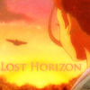
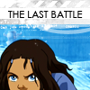
Icon #10
2+ 0- | ▬
[+] 10: The text in the down-left corner and the subtle red on the top makes this icon amazing, but I really like the whole feeling this icon gives.
[+] 10: The darkness of this cap works really well with the text. The subtle ring around Aang brings your eyes to him without it being too harsh.
[-] 10: The text could be a bit more resolved, it feels like an afterthought. The crop could be a bit more intentional, the tree? on the left border is confusing.
Icon #11
1+ 3- | ▼
[+] 11: The white line going down the left side works well with the motion of Toph's hand here. The text at the bottom is well placed and fits well with the scene, though having a little more focus on her eyes might have been nice.
[-] 11: The tiny text behind the book title doesn't look good with the rest of the icon, and "silver eyes" seems a little too big. Also, a different crop might have been more effective. If Toph had been a little bigger and the picture more focused on her face, it would have emphasized the fact that Toph has silver eyes.
[-] #11: The white and black text is too stark on such a dark icon, which detracts from the overall composition. It would look much better if more neutral tones such as a darker green or brown were used!
[-] 11: The colors are too faded, even while the contrast is too bright. The textures don't compliment the image very well and the typography could use some work.
Icon #12
1+ 0- | ▬
[+] 12: The text fits well with the image both in and out of context, and the grunge effect is used well
[G] 12: This icon might have been better had you chosen a different font color. The black doesn't seem to go well with the rest of the icon.
[G] 12: I like the coloring and everything about your icon, but I don't like the color choice of the text. But besides that, I really like it.
Icon #13
1+ 2- | ▬
[+] 13: The use of B&W fits really well with the subject matter and works with the text. The use of a cursive font was a nice way to emphasize the word. The only down side is that the highlights on Aang's face are a little too bright.
[-] 13: It's so hard to see what's going on here. I understand that the screencap itself is hard to see but when done in greyscale, the picture becomes washed out and dull. It's very hard to make out the faces.
[-] 13: The typography seems thrown together and doesn't seem very cohesive with the image. The image is also unclear and the contrast is too high on Aang's face.
Please don't be discouraged if you got a lot of negative critiques; take them as a learning experience to improve, as that's the whole point of a LIMS :)
Comments to this entry are screened just so I can make sure that you're not accidentally giving away your identity. ^^ Your comment will stay screened if I feel that there is anything in it that may reveal your identity.
Meanwhile, I don't care if you reveal yourself as the author of a particular comment; comments are just kept anonymous so that no one feels like holding themselves back for fear of hurting someone else's feelings.
Plugs:
ohgreat_battle
videogame_lims
- hl