Book 1, Chapter 6 - Results!
Another one-point margin DDD': But...
Vote-offs are on top, followed by general comments.

Icon #01
7 vote-offs
[-] There are things I like about this icon; the rounded edges and the crop, for example. But the overall product leaves me feeling underwhelmed. I don't think the grayscale is doing the image any favors, and the spot of light on Zuko's back distracts the eye. I think what you have here is a good base, but I'm left longing for something more.
[-] While the icon itself fits the theme, the asthetics give it away. The monochrome coloring is poor and dull, making the icon look very boring. The animation is hardly noticable, probably because there is no difference between the gray and the blue tones.
[-] The icon is too plain; I like the monochrome, but I think some text would've been nice to make the icon more interesting. The border seems to be rather generic, and the light-texture seems a little out of place.
[-] The image appears blurry (especially around the edges). The light brush doesn't fit in with the composition of the icon.
[-] while it definitely fits the theme, the icon itself is rather dull in terms of coloring or points of interest. The circle crop is interesting, but is negated by the white corners. The animation (which I just noticed now) is far too subtle in terms of changes in coloring to make it very noticable, although I do think the animating itself was well done. :)
[-] The icon is a bit empty on the right side, and that blob of light is just really, really distracting. x__x I don't see what it's supposed to be or emphasize, and the animation of the icon doesn't seem to have a purpose to it.
[-] The coloring is too washed out and the light texture is badly placed.
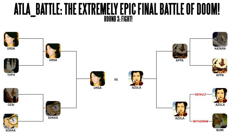
Icon #02
3 vote-offs
[-] the text is too difficult to read, and since that's the focal point of the icon it all just kind of falls apart.
[-] Even though I like the coloring, I think the first one matches in mysterious faceless theme better. The font and placement is also not carrying out the message well and is hard to read. Perhaps a sans-serif font following the horizon would have been better to keep the clean flow of the icon.
[-] There's something weird going on with the coloring. I don't know why but my eye keeps getting drawn to the ground/sand. Also, where the text is placed throws the icon really off balance. The main image has a really nice crop, but the text placement throws the composition out of whack.
[G] I adore this icon. It's simple and sweet, but it evokes a lot of emotion. Nicely done! :)
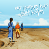
Icon #03
5 vote-offs
[-] The cropping is boring, as it has been done before. Though the coloring is nice, it doesn't make the icon stand out as much. The text also doesn't fit, and looks cluttered.
[-] The face in the image appears blurred. The text is difficult to read and the color of it doesn't fit in with the other colors of the icon.
[-] I actually sort of like this icon, but in terms of comparison, this unfortunately turns out the lesser of the two. I do like the text, but the picture is blurry and the crop is conventional and doesn't really evoke much emotion.
[-] It's a little blurry, and I think the lighting is a little too bright for such an angsty text
[-] THIS WAS HARD. T_T But on this icon, the border seems a bit superfluous and it doesn't quite blend well. The text is also very small and difficult to read. (as a side note: it's not as creative with the challenge--it's a rectangle instead of a square. 0_o)
[G] The coloring you did on this picture is absolutely fabulous *g* though Katara's a bit darker than that ;)
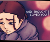
Icon #04
4 vote-offs
[-] The blue texture/pattern is really distracting because it's so busy and it takes away from the focus on Katara. The crop itself of the icon and its shape is nice, though.
[-] This was a hard vote. The sans-serif font is too blocky and offsets the balance of the entire icon. Finding another way, and font, that would have worked better with the text would have made the icon better. Right now, it's rather jarring, and doesn't fit in with the rest of the icon and seems like an afterthought. The pattern is also an undefined meaning in the icon. It's just there and subtracts from the overall design (which I think is great). The pattern also becomes the focus of the icon, not only because of the color (which would have worked better being flat), but because it is a pattern and our eyes our drawn to it and Katara becomes the third, less important, element.
[-] At first glance, I did like this one more, but the more I look at it, the more distracted I am by the blue pattern. I do like the circles and your typography (it matches the picture very well) but your use of that pattern totally overpowers Katara and everything else going on. My eyes jump to the pattern, when obviously the focus should be on Katara. :/
[-] The image used needs a lot more contrast. It's very flat and dull. I don't understand the reason the texture was used either. It's distracting and it doesn't seem like there's any good reason for it to be there. Also, where the "?!" is placed looks like it's bleeding into the white around the Katara-bubble and it looks like it's going to fall off or something.
[G] This icon is adorable. And the composition is excellent to boot! I love the use of that pattern in the circle to give it more visual interest.
[G] I like your daring circle layout, the off centre composition of the icon is really nice; and Katara's face perfectly fits the '?!'
[G] I love the unique crop and the use of pattern!
[G] I love it, it's very clever and very daring, while still being aesthetically pleasing. :)
Please don't be discouraged if you got a lot of negative critiques; take them as a learning experience to improve, as that's the whole point of a LIMS :)
Comments to this entry are screened just so I can make sure that you're not accidentally giving away your identity. ^^ Your comment will stay screened if I feel that there is anything in it that may reveal your identity.
Meanwhile, I don't care if you reveal yourself as the author of a particular comment; comments are just kept anonymous so that no one feels like holding themselves back for fear of hurting someone else's feelings.
I'll have your new challenges up in a second! :D
- hl
Vote-offs are on top, followed by general comments.
Icon #01
7 vote-offs
[-] There are things I like about this icon; the rounded edges and the crop, for example. But the overall product leaves me feeling underwhelmed. I don't think the grayscale is doing the image any favors, and the spot of light on Zuko's back distracts the eye. I think what you have here is a good base, but I'm left longing for something more.
[-] While the icon itself fits the theme, the asthetics give it away. The monochrome coloring is poor and dull, making the icon look very boring. The animation is hardly noticable, probably because there is no difference between the gray and the blue tones.
[-] The icon is too plain; I like the monochrome, but I think some text would've been nice to make the icon more interesting. The border seems to be rather generic, and the light-texture seems a little out of place.
[-] The image appears blurry (especially around the edges). The light brush doesn't fit in with the composition of the icon.
[-] while it definitely fits the theme, the icon itself is rather dull in terms of coloring or points of interest. The circle crop is interesting, but is negated by the white corners. The animation (which I just noticed now) is far too subtle in terms of changes in coloring to make it very noticable, although I do think the animating itself was well done. :)
[-] The icon is a bit empty on the right side, and that blob of light is just really, really distracting. x__x I don't see what it's supposed to be or emphasize, and the animation of the icon doesn't seem to have a purpose to it.
[-] The coloring is too washed out and the light texture is badly placed.
Icon #02
3 vote-offs
[-] the text is too difficult to read, and since that's the focal point of the icon it all just kind of falls apart.
[-] Even though I like the coloring, I think the first one matches in mysterious faceless theme better. The font and placement is also not carrying out the message well and is hard to read. Perhaps a sans-serif font following the horizon would have been better to keep the clean flow of the icon.
[-] There's something weird going on with the coloring. I don't know why but my eye keeps getting drawn to the ground/sand. Also, where the text is placed throws the icon really off balance. The main image has a really nice crop, but the text placement throws the composition out of whack.
[G] I adore this icon. It's simple and sweet, but it evokes a lot of emotion. Nicely done! :)
Icon #03
5 vote-offs
[-] The cropping is boring, as it has been done before. Though the coloring is nice, it doesn't make the icon stand out as much. The text also doesn't fit, and looks cluttered.
[-] The face in the image appears blurred. The text is difficult to read and the color of it doesn't fit in with the other colors of the icon.
[-] I actually sort of like this icon, but in terms of comparison, this unfortunately turns out the lesser of the two. I do like the text, but the picture is blurry and the crop is conventional and doesn't really evoke much emotion.
[-] It's a little blurry, and I think the lighting is a little too bright for such an angsty text
[-] THIS WAS HARD. T_T But on this icon, the border seems a bit superfluous and it doesn't quite blend well. The text is also very small and difficult to read. (as a side note: it's not as creative with the challenge--it's a rectangle instead of a square. 0_o)
[G] The coloring you did on this picture is absolutely fabulous *g* though Katara's a bit darker than that ;)
Icon #04
4 vote-offs
[-] The blue texture/pattern is really distracting because it's so busy and it takes away from the focus on Katara. The crop itself of the icon and its shape is nice, though.
[-] This was a hard vote. The sans-serif font is too blocky and offsets the balance of the entire icon. Finding another way, and font, that would have worked better with the text would have made the icon better. Right now, it's rather jarring, and doesn't fit in with the rest of the icon and seems like an afterthought. The pattern is also an undefined meaning in the icon. It's just there and subtracts from the overall design (which I think is great). The pattern also becomes the focus of the icon, not only because of the color (which would have worked better being flat), but because it is a pattern and our eyes our drawn to it and Katara becomes the third, less important, element.
[-] At first glance, I did like this one more, but the more I look at it, the more distracted I am by the blue pattern. I do like the circles and your typography (it matches the picture very well) but your use of that pattern totally overpowers Katara and everything else going on. My eyes jump to the pattern, when obviously the focus should be on Katara. :/
[-] The image used needs a lot more contrast. It's very flat and dull. I don't understand the reason the texture was used either. It's distracting and it doesn't seem like there's any good reason for it to be there. Also, where the "?!" is placed looks like it's bleeding into the white around the Katara-bubble and it looks like it's going to fall off or something.
[G] This icon is adorable. And the composition is excellent to boot! I love the use of that pattern in the circle to give it more visual interest.
[G] I like your daring circle layout, the off centre composition of the icon is really nice; and Katara's face perfectly fits the '?!'
[G] I love the unique crop and the use of pattern!
[G] I love it, it's very clever and very daring, while still being aesthetically pleasing. :)
Please don't be discouraged if you got a lot of negative critiques; take them as a learning experience to improve, as that's the whole point of a LIMS :)
Comments to this entry are screened just so I can make sure that you're not accidentally giving away your identity. ^^ Your comment will stay screened if I feel that there is anything in it that may reveal your identity.
Meanwhile, I don't care if you reveal yourself as the author of a particular comment; comments are just kept anonymous so that no one feels like holding themselves back for fear of hurting someone else's feelings.
I'll have your new challenges up in a second! :D
- hl