Book 1, Chapter 5: Results
Even after the voting extension, the winner of Pair #1 won by only one vote D: Kind of a testament to how equal you guys are in skill, eh? 8D
Vote-offs are on top, followed by general comments.
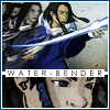
Icon #01
8 vote-offs
[-] This was a tough choice. I really like all the framing going on in this icon, but the image looks pretty oversharpened and flat.
[-] While I think your icon fits the theme better, I don't think it was executed as well, my main concern being that it's over-sharpened. Since the icons so mono-chromatic, it's hard to distinguish Toph from the background as well.
[-] The image quality appears overly sharp around the edges and the lack of contrast causes the details to not stand out. The border doesn't fit in with the rest of the icon.
[-] The first icon is a bit too washed out, and the composition seems to be lacking.
[-] The icon seems too dark and washed out, which besides being a bit monotonous doesn't give the icon much of a visual focus.
[-] While I feel that your icon fits the theme better, the icon itself is a bit lackluster. The thick white border takes away from the icon, and the space to the right of Toph looks a bit too empty. In addition to that, the icon itself seems to be a bit too flat.
[-] the stroked figure and brushes do nothing to enhance the icon, but instead make it look messy. The muddy coloring doesn't really help. Perhaps something less overworked, with cleaner, lighter colors?
[-] though number 2 doesn't necessarily adhere to the guidelines, this icon is much duller, and the image is lost in the antiquing effect. The key with this effect in to keep the image in focus, since that is what older images do-focus on the main subject, not the space around them.
[G] Beautiful job on the icon. I especially like the elegant stoke effect and the texture in the background.
Icon #02
7 vote-offs
[-] I didn't feel as if this icon portrays grundge well. The lines are too clean (Not saying they are crisp...) and the colors too bright. Azula is wearing clean and neat make - up while her standard self would have worked better for the theme. It also seems a bit...Christmasy (green & red). The placement of the kanji could have been better placed as well. It's too large for that particular area as well.
[-] This was a really, really difficult decision, but ultimately, the lack of a focus in #2 really hurt it for me. It's a very, very well put-together icon, but it doesn't have anything particularly eyecatching to draw the eye to.
[-] Some how the icon does not seem Grunge-y. The colors used for the main image are very bright. Also the icon looks a bit blurry. The color used for the Chinese text is very overpowering, it becomes the focal point rather than Azula.
[-] I have to say that the colors in the background spoilt the meaning of icon 2, with the word "Peace" in there, yet the colors don't give off such a feeling. In icon 1 the colors give off a rather nice texture and feeling towards the picture, giving off the subtlety instead, simple and good.
[-] Great composition... and I love how the colors of the texture complement the colors in the caps! However, there are also awkward parts to your image, such as the jagged parts of the texture that overlay the caps and the tiny text at the bottom left hand side of the image. The low-opacity jagged edges of the texture seem weak; it would look better if they were fully opaque or completely removed to make a flat border between the texture and the images. As for the tiny text, the shape of the text is interesting but the text itself is inconsistent in clarity. The parts of it that are fuzzy make it look awkward.
[-] The two images are a nice combination, but they are too small. Given how saturated they are, details are lost at that size. The red text is also too bright and the placement makes it appear pasted on and hard to read. It would have been better if it was a rusty orange like the strip on the bottom.
[-] So hard to say! They are both extremely good! But the coloring on 2 is a bit too bright, the complimentary colors are sort of glaring.
Icon #03
13 vote-offs
[-] The desaturated image repeat seems almost like that bar across there in a bright orange is trying to push it out of the icon. The top left image feels really out of place. And the text is... The placement and sizing is really weird, and the color choices really don't blend well.
[-] While the actual layout is fine, the colors, font(s) and wording (which creates another theme to work with) do not work well together. Besides Zuko being overly contrasted and fuzzy, the icon as a whole is not clear in its message. Your words are actually great with the image itself, but the typography is wrong for that particular message. The first line is in a handwtitten sort of font and the next in a gothic font; together they create a messy pair. It's either one or the other (mixing fonts is tricky). Secomd, the colors remind me of Halloween, certainly not the "saving heart" image I imagine. The faded image of Zuko, however, does work with the worded theme.
[-] The text is a little hard for me to read against the solid orange bar. And somehow, I feel as if the colors don't really match. The picture is a little blurry, and I think the font doesn't really match well.
[-] Interesting icon, but the text is hard to read (particularly the white text). :/
[-] The orange stripe down the middle is really distracting. Zuko's neck and shoulders look very oversharpened, and while I like the fonts you used and that they're two different colors, I don't really see how the text fits. From what I recall, Zuko is bending in that scene, so what does it have to do with his heart?
[-] The icon is oversharpened. The blend of the repeated image is not done properly, the black gradient used to the blend the black and white image does not blend properly with the orange strip. Its stands out rather than blending. Also the black and white repeated image is blurry
[-] The text (especially the white) on the orange background is difficult to read.
[-] While both icons have very unattractive blocky text, I feel that the composition on the second icon as a whole is better. The duplicate image on icon 3 does nothing to enhance the icon and seems rather pointless, whereas the close-up in icon 4 serves to emphasize a facial expression and thus has an actual use.
[-] The text doesn't match the image very well, and I think the image itself could be a better picture of Zuko. His facial expression is very non-descript, like the cap was taken mid-word or something, and what is he doing with his hand?
[-] because the evidence of real duplication is not really there. The icon itself was spoilt slightly by the orange middle, which I felt clashed with the grey part and the orange side.
[-] The orange bar seems out of place; it isn't a neutral color nor is it a color that is found in the icon. It stands out so much that it draws attention away from the images around it.
[-] The colors are too bright for the feel of the icon. Pure black and white with the colored band would have looked better.
[-] The text seems to be a bit slapped on, and Zuko is almost smushed by that diagonal line. The icon would've worked better if you'd rotated Zuko to match the slant of the line.
[G] I really like the word choice, but it's hard to read because it's so squished together. Also, the image choice doesn't quite seem relevant to the words.
Icon #04
0 vote-offs
[G] I really like the soft coloring. I know that your challenge was to do the duplicated image, and you pulled it off really well. :D I like that you didn't just use the same crop down at the bottom, it really pulled the icon together nicely. I also like that it looks like you colored the bottom image a bit differently, too.

Icon #05
5 vote-offs
[-] The soft and delicate colors are a nice touch, but the crop is far too harsh as the lines cut off suddenly when the chin is cut out.
[-] I wavered between these two icons for ages; I liked the cap you chose, and the colouring; but it feels...boring? I guess what sets the icon apart from a screencap with changed colours (since the crop isn't dramatic enough to attract attention based on that) is the light texture. Although I like the splotch of light over the flowers, the splotches right below his left ear and in the shadows of his right eyebrow seem out of place (the one by the flowers works because that's where the light source is coming from, but the other ones are where there should be shadows)
[-] I found that rather the Icon 5 had too much light on it, making the character look pale and losing the use of a close-up. In comparism to icon 6, which had a rather dark mysterious air, and since it was a darker tone, it complemented each other better.
[-] The crop is nice but the coloring is too washed out. Everything is too neutral, the flowers appear almost the same color as the background, which is almost the same color as Aang's skin, etc etc.
[-] This was a really hard choice. However, I think what ultimately led me to vote off this icon was that there's a lack of focus in the icon. The crop is a bit awkward, and I find myself drawn both to the blob of light on top of Aang's flowers and also to his grin at the same time, so in the end my eyes seem to be wandering all over and not really taking in the appeal of the icon as a whole. :/
[G] The coloring is so appropriate for this icon. It's perky, happy, and just so joyful and the light coloring reflects that really well. The only gripe I have with this icon is that it seems to be over-sharpened in some parts (particular around Aang's mouth), but other than that your icon is really pretty.
[G] Simple yet effective! The half-tone effect in the background mirrors Aang's bubbly personality in the cap.
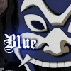
Icon #06
9 vote-offs
[-] In comparison to the other icon, it's rather plain and not much is going on that's interesting. The wording, while the font is appropraite in portraying the Blue Spirit, doesn't really mean anything to me other than the color in this icon. Sure, I can go into symbolisim, but there's nothing else in the icon suggesting this. The weird blue-ish blob under the word "Blue" would have been better non-existing.
[-] This was a tough choice, since I think both of them are very nice, but I feel like there isn't much done to this icon besides slapping on some text.
[-] The text is really, really awkward. If you didn't have the text on there it would've been a harder chioce between the two, but... that text is just so very distracting. Aside from using a font that doesn't seem like it fits, it's placed right over Blue Spirits face, and I find myself looking more at the text than him.
[-] The coloring is very dull/dark. More contrast/saturation with some brightness would have nicely brought out the colors of the image. Also the text seems slapped on.
[-] The image appears to be overly sharp around the edges and the text doesn't fit in with the rest of the icon.
[-] The text on icon 6 seems to be slapped on and doesn't mesh well with the rest of the icon.
[-] This one was tough. I think #6 could have used a little more texture in the background, instead of just the flat image.
[-] This is a great crop for an extreme close-up challenge but the lack of anything else makes it the weaker icon here. The text is just places there and there's nothing to making it appealing.
[-] The text doesn't fit very well with the icon. A different font, or a brush behind it maybe would have helped as well.
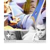
Icon #07
n/a
[G] It looks pretty dang awesome to me although the blue overlap on desaturated-Sokka's head is odd. Perhaps erase it next time? O:
[G] I LOVE Azula's Sokka icon! ^__^ The composition and layout is just stellar.
[G] Such a great composition! I love the way you've capped the DVD image and how you've blended these images together!
[G] There are a few minor details about this icon that prevent me from loving it. the duplicate image's placement makes it look like the boomerang is about to hit Sokka. Also, the black and white image is too white. If the brightness/contrast had been fiddled with, it would stand out more from the white frame.
[G] I love the duplication of the image and the composition of the icon. I think it looks unbalanced though, with the image attached to the top, rather than being centred.
Please don't be discouraged if you got a lot of negative critiques; take them as a learning experience to improve, as that's the whole point of a LIMS :)
Comments to this entry are screened just so I can make sure that you're not accidentally giving away your identity. ^^ Your comment will stay screened if I feel that there is anything in it that may reveal your identity.
Meanwhile, I don't care if you reveal yourself as the author of a particular comment; comments are just kept anonymous so that no one feels like holding themselves back for fear of hurting someone else's feelings.
Plugs:
tsubasa_battle's voting still appears to be open! ^^
- hl
Vote-offs are on top, followed by general comments.
Icon #01
8 vote-offs
[-] This was a tough choice. I really like all the framing going on in this icon, but the image looks pretty oversharpened and flat.
[-] While I think your icon fits the theme better, I don't think it was executed as well, my main concern being that it's over-sharpened. Since the icons so mono-chromatic, it's hard to distinguish Toph from the background as well.
[-] The image quality appears overly sharp around the edges and the lack of contrast causes the details to not stand out. The border doesn't fit in with the rest of the icon.
[-] The first icon is a bit too washed out, and the composition seems to be lacking.
[-] The icon seems too dark and washed out, which besides being a bit monotonous doesn't give the icon much of a visual focus.
[-] While I feel that your icon fits the theme better, the icon itself is a bit lackluster. The thick white border takes away from the icon, and the space to the right of Toph looks a bit too empty. In addition to that, the icon itself seems to be a bit too flat.
[-] the stroked figure and brushes do nothing to enhance the icon, but instead make it look messy. The muddy coloring doesn't really help. Perhaps something less overworked, with cleaner, lighter colors?
[-] though number 2 doesn't necessarily adhere to the guidelines, this icon is much duller, and the image is lost in the antiquing effect. The key with this effect in to keep the image in focus, since that is what older images do-focus on the main subject, not the space around them.
[G] Beautiful job on the icon. I especially like the elegant stoke effect and the texture in the background.
Icon #02
7 vote-offs
[-] I didn't feel as if this icon portrays grundge well. The lines are too clean (Not saying they are crisp...) and the colors too bright. Azula is wearing clean and neat make - up while her standard self would have worked better for the theme. It also seems a bit...Christmasy (green & red). The placement of the kanji could have been better placed as well. It's too large for that particular area as well.
[-] This was a really, really difficult decision, but ultimately, the lack of a focus in #2 really hurt it for me. It's a very, very well put-together icon, but it doesn't have anything particularly eyecatching to draw the eye to.
[-] Some how the icon does not seem Grunge-y. The colors used for the main image are very bright. Also the icon looks a bit blurry. The color used for the Chinese text is very overpowering, it becomes the focal point rather than Azula.
[-] I have to say that the colors in the background spoilt the meaning of icon 2, with the word "Peace" in there, yet the colors don't give off such a feeling. In icon 1 the colors give off a rather nice texture and feeling towards the picture, giving off the subtlety instead, simple and good.
[-] Great composition... and I love how the colors of the texture complement the colors in the caps! However, there are also awkward parts to your image, such as the jagged parts of the texture that overlay the caps and the tiny text at the bottom left hand side of the image. The low-opacity jagged edges of the texture seem weak; it would look better if they were fully opaque or completely removed to make a flat border between the texture and the images. As for the tiny text, the shape of the text is interesting but the text itself is inconsistent in clarity. The parts of it that are fuzzy make it look awkward.
[-] The two images are a nice combination, but they are too small. Given how saturated they are, details are lost at that size. The red text is also too bright and the placement makes it appear pasted on and hard to read. It would have been better if it was a rusty orange like the strip on the bottom.
[-] So hard to say! They are both extremely good! But the coloring on 2 is a bit too bright, the complimentary colors are sort of glaring.
Icon #03
13 vote-offs
[-] The desaturated image repeat seems almost like that bar across there in a bright orange is trying to push it out of the icon. The top left image feels really out of place. And the text is... The placement and sizing is really weird, and the color choices really don't blend well.
[-] While the actual layout is fine, the colors, font(s) and wording (which creates another theme to work with) do not work well together. Besides Zuko being overly contrasted and fuzzy, the icon as a whole is not clear in its message. Your words are actually great with the image itself, but the typography is wrong for that particular message. The first line is in a handwtitten sort of font and the next in a gothic font; together they create a messy pair. It's either one or the other (mixing fonts is tricky). Secomd, the colors remind me of Halloween, certainly not the "saving heart" image I imagine. The faded image of Zuko, however, does work with the worded theme.
[-] The text is a little hard for me to read against the solid orange bar. And somehow, I feel as if the colors don't really match. The picture is a little blurry, and I think the font doesn't really match well.
[-] Interesting icon, but the text is hard to read (particularly the white text). :/
[-] The orange stripe down the middle is really distracting. Zuko's neck and shoulders look very oversharpened, and while I like the fonts you used and that they're two different colors, I don't really see how the text fits. From what I recall, Zuko is bending in that scene, so what does it have to do with his heart?
[-] The icon is oversharpened. The blend of the repeated image is not done properly, the black gradient used to the blend the black and white image does not blend properly with the orange strip. Its stands out rather than blending. Also the black and white repeated image is blurry
[-] The text (especially the white) on the orange background is difficult to read.
[-] While both icons have very unattractive blocky text, I feel that the composition on the second icon as a whole is better. The duplicate image on icon 3 does nothing to enhance the icon and seems rather pointless, whereas the close-up in icon 4 serves to emphasize a facial expression and thus has an actual use.
[-] The text doesn't match the image very well, and I think the image itself could be a better picture of Zuko. His facial expression is very non-descript, like the cap was taken mid-word or something, and what is he doing with his hand?
[-] because the evidence of real duplication is not really there. The icon itself was spoilt slightly by the orange middle, which I felt clashed with the grey part and the orange side.
[-] The orange bar seems out of place; it isn't a neutral color nor is it a color that is found in the icon. It stands out so much that it draws attention away from the images around it.
[-] The colors are too bright for the feel of the icon. Pure black and white with the colored band would have looked better.
[-] The text seems to be a bit slapped on, and Zuko is almost smushed by that diagonal line. The icon would've worked better if you'd rotated Zuko to match the slant of the line.
[G] I really like the word choice, but it's hard to read because it's so squished together. Also, the image choice doesn't quite seem relevant to the words.
Icon #04
0 vote-offs
[G] I really like the soft coloring. I know that your challenge was to do the duplicated image, and you pulled it off really well. :D I like that you didn't just use the same crop down at the bottom, it really pulled the icon together nicely. I also like that it looks like you colored the bottom image a bit differently, too.
Icon #05
5 vote-offs
[-] The soft and delicate colors are a nice touch, but the crop is far too harsh as the lines cut off suddenly when the chin is cut out.
[-] I wavered between these two icons for ages; I liked the cap you chose, and the colouring; but it feels...boring? I guess what sets the icon apart from a screencap with changed colours (since the crop isn't dramatic enough to attract attention based on that) is the light texture. Although I like the splotch of light over the flowers, the splotches right below his left ear and in the shadows of his right eyebrow seem out of place (the one by the flowers works because that's where the light source is coming from, but the other ones are where there should be shadows)
[-] I found that rather the Icon 5 had too much light on it, making the character look pale and losing the use of a close-up. In comparism to icon 6, which had a rather dark mysterious air, and since it was a darker tone, it complemented each other better.
[-] The crop is nice but the coloring is too washed out. Everything is too neutral, the flowers appear almost the same color as the background, which is almost the same color as Aang's skin, etc etc.
[-] This was a really hard choice. However, I think what ultimately led me to vote off this icon was that there's a lack of focus in the icon. The crop is a bit awkward, and I find myself drawn both to the blob of light on top of Aang's flowers and also to his grin at the same time, so in the end my eyes seem to be wandering all over and not really taking in the appeal of the icon as a whole. :/
[G] The coloring is so appropriate for this icon. It's perky, happy, and just so joyful and the light coloring reflects that really well. The only gripe I have with this icon is that it seems to be over-sharpened in some parts (particular around Aang's mouth), but other than that your icon is really pretty.
[G] Simple yet effective! The half-tone effect in the background mirrors Aang's bubbly personality in the cap.
Icon #06
9 vote-offs
[-] In comparison to the other icon, it's rather plain and not much is going on that's interesting. The wording, while the font is appropraite in portraying the Blue Spirit, doesn't really mean anything to me other than the color in this icon. Sure, I can go into symbolisim, but there's nothing else in the icon suggesting this. The weird blue-ish blob under the word "Blue" would have been better non-existing.
[-] This was a tough choice, since I think both of them are very nice, but I feel like there isn't much done to this icon besides slapping on some text.
[-] The text is really, really awkward. If you didn't have the text on there it would've been a harder chioce between the two, but... that text is just so very distracting. Aside from using a font that doesn't seem like it fits, it's placed right over Blue Spirits face, and I find myself looking more at the text than him.
[-] The coloring is very dull/dark. More contrast/saturation with some brightness would have nicely brought out the colors of the image. Also the text seems slapped on.
[-] The image appears to be overly sharp around the edges and the text doesn't fit in with the rest of the icon.
[-] The text on icon 6 seems to be slapped on and doesn't mesh well with the rest of the icon.
[-] This one was tough. I think #6 could have used a little more texture in the background, instead of just the flat image.
[-] This is a great crop for an extreme close-up challenge but the lack of anything else makes it the weaker icon here. The text is just places there and there's nothing to making it appealing.
[-] The text doesn't fit very well with the icon. A different font, or a brush behind it maybe would have helped as well.
Icon #07
n/a
[G] It looks pretty dang awesome to me although the blue overlap on desaturated-Sokka's head is odd. Perhaps erase it next time? O:
[G] I LOVE Azula's Sokka icon! ^__^ The composition and layout is just stellar.
[G] Such a great composition! I love the way you've capped the DVD image and how you've blended these images together!
[G] There are a few minor details about this icon that prevent me from loving it. the duplicate image's placement makes it look like the boomerang is about to hit Sokka. Also, the black and white image is too white. If the brightness/contrast had been fiddled with, it would stand out more from the white frame.
[G] I love the duplication of the image and the composition of the icon. I think it looks unbalanced though, with the image attached to the top, rather than being centred.
Please don't be discouraged if you got a lot of negative critiques; take them as a learning experience to improve, as that's the whole point of a LIMS :)
Comments to this entry are screened just so I can make sure that you're not accidentally giving away your identity. ^^ Your comment will stay screened if I feel that there is anything in it that may reveal your identity.
Meanwhile, I don't care if you reveal yourself as the author of a particular comment; comments are just kept anonymous so that no one feels like holding themselves back for fear of hurting someone else's feelings.
Plugs:
tsubasa_battle's voting still appears to be open! ^^
- hl