Round 02 - Challenge 01 - Results
Eliminated:
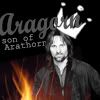
- irati86 [04 votes]
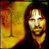
- taz34 [04 votes]
Please stick around for the special challenge and for voting! ♥
---
People's choice:
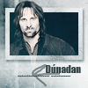
- mlledefer [03 votes]
---
Mod's Choice
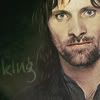
- idril_lalaith
1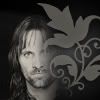
2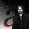
3
4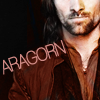
5
6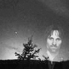
7
8
9
10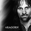
11
12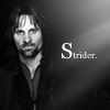
Votes:
[N = Negative votes & P = Positive votes]
01] - jadedanielle - N = 3/P = 0
[x] "The brush/texture takes away too much from Aragorn. His face also looks a little washed out."
[x] "It looks too flat, you should have added some contrast."
[x] "The brush is too distracting. Covering up part of his face takes away from the subject matter."
02] - letoist - N = 0/P = 1
[x] Positive [No comment]
03] - _elissabeth_ - N = 3/P = 0
[x] "The box around the smaller Aragorn stands out and distracts from the rest of the icon. Also bigger Aragorn's crop is rather awkward."
[x] "The crop of the larger Aragorn is off. You can see part of his right eye, but not the whole thing which makes it somewhat awkward."
[x] "the general idea is nice, but less interesting than it could be: the placement/cropping could be improved"
04] - own_the_sky - N = 1/P = 1
[x] "The text looks oversharpened"
[x] "most creative and clear icon with nice colouring!"
05] - irati86 - N = 4/P = 1
[x] "there is just too much on the icon"
[x] "The crown brush seems off, too big while the subject of the icon is small. Draws too much away from Aragorn."
[x] "the crown is a bit too much for this particular picture of Aragorn and his face is not clear, even if the idea could be fun"
[x] "there are too many things on the icon."
[x] "Nice composition, it fits well with his character."
06] - lunglock - N = 2/P = 0
[x] "You hardly see Aragorn."
[x] "the texture distracts from the picture, i look at the tree thing instead of aragorn"
07] - mata090680 - N = 3/P = 0
[x] "Too dark and small. Hard to actually see the subject."
[x] "the real picture is too small and not clear, overall the icon is too dark, even if there's a "creative" effect"
[x] "Aragorn is too little."
08] - mlledefer - N = 2/P = 3
[x] "too sharpened"
[x] "I love the design of this icon, but Aragorn's face is too bright/contrasted."
[x] "The coloruring is amazing, the use of text is really good too."
[x] "I like the 3D affect and how Aragorn seems to pop out of the picture."
[x] "The coloring is very pretty. Using three different fonts is also a nice touch."
09] - idril_lalaith - N = 0/P = 2
[x] "Gorgeous colouring and text use!"
[x] "the icon is simple and pretty"
10] - nevenilien - N = 2/P = 0
[x] "too sharpened"
[x] "The face looks oversharpened and overcontrasted."
11] - taz34 - N = 4/P = 0
[x] "the coloring in the background is lovely but it shouldn't be on Viggo "
[x] "The colors are too bright; there's too much of a contrast between the background and Aragorn. Also, the blending is too blurry."
[x] "the icon is blurry and the coloring is unflattering"
[x] "The icon looks blurry overall, and the colouring doesn't really suit his skin."
12] - phantom_phan06 - N = 0/P = 0
Participants Status
The following people are still in the contest. If you're name is not in this list, it means you have been eliminated/disqualified.
_elissabeth_
idril_lalaith
jadedanielle
letoist
lunglock
mata090680
mlledefer
nevernilien
own_the_sky
phantom_phan06
Thank you to all who participated in the challenge and voting.
A new challenge will be put up soon.

- irati86 [04 votes]

- taz34 [04 votes]
Please stick around for the special challenge and for voting! ♥
---
People's choice:

- mlledefer [03 votes]
---
Mod's Choice

- idril_lalaith
1

2

3

4

5

6

7

8

9

10

11

12

Votes:
[N = Negative votes & P = Positive votes]
01] - jadedanielle - N = 3/P = 0
[x] "The brush/texture takes away too much from Aragorn. His face also looks a little washed out."
[x] "It looks too flat, you should have added some contrast."
[x] "The brush is too distracting. Covering up part of his face takes away from the subject matter."
02] - letoist - N = 0/P = 1
[x] Positive [No comment]
03] - _elissabeth_ - N = 3/P = 0
[x] "The box around the smaller Aragorn stands out and distracts from the rest of the icon. Also bigger Aragorn's crop is rather awkward."
[x] "The crop of the larger Aragorn is off. You can see part of his right eye, but not the whole thing which makes it somewhat awkward."
[x] "the general idea is nice, but less interesting than it could be: the placement/cropping could be improved"
04] - own_the_sky - N = 1/P = 1
[x] "The text looks oversharpened"
[x] "most creative and clear icon with nice colouring!"
05] - irati86 - N = 4/P = 1
[x] "there is just too much on the icon"
[x] "The crown brush seems off, too big while the subject of the icon is small. Draws too much away from Aragorn."
[x] "the crown is a bit too much for this particular picture of Aragorn and his face is not clear, even if the idea could be fun"
[x] "there are too many things on the icon."
[x] "Nice composition, it fits well with his character."
06] - lunglock - N = 2/P = 0
[x] "You hardly see Aragorn."
[x] "the texture distracts from the picture, i look at the tree thing instead of aragorn"
07] - mata090680 - N = 3/P = 0
[x] "Too dark and small. Hard to actually see the subject."
[x] "the real picture is too small and not clear, overall the icon is too dark, even if there's a "creative" effect"
[x] "Aragorn is too little."
08] - mlledefer - N = 2/P = 3
[x] "too sharpened"
[x] "I love the design of this icon, but Aragorn's face is too bright/contrasted."
[x] "The coloruring is amazing, the use of text is really good too."
[x] "I like the 3D affect and how Aragorn seems to pop out of the picture."
[x] "The coloring is very pretty. Using three different fonts is also a nice touch."
09] - idril_lalaith - N = 0/P = 2
[x] "Gorgeous colouring and text use!"
[x] "the icon is simple and pretty"
10] - nevenilien - N = 2/P = 0
[x] "too sharpened"
[x] "The face looks oversharpened and overcontrasted."
11] - taz34 - N = 4/P = 0
[x] "the coloring in the background is lovely but it shouldn't be on Viggo "
[x] "The colors are too bright; there's too much of a contrast between the background and Aragorn. Also, the blending is too blurry."
[x] "the icon is blurry and the coloring is unflattering"
[x] "The icon looks blurry overall, and the colouring doesn't really suit his skin."
12] - phantom_phan06 - N = 0/P = 0
Participants Status
The following people are still in the contest. If you're name is not in this list, it means you have been eliminated/disqualified.
_elissabeth_
idril_lalaith
jadedanielle
letoist
lunglock
mata090680
mlledefer
nevernilien
own_the_sky
phantom_phan06
Thank you to all who participated in the challenge and voting.
A new challenge will be put up soon.