(no subject)
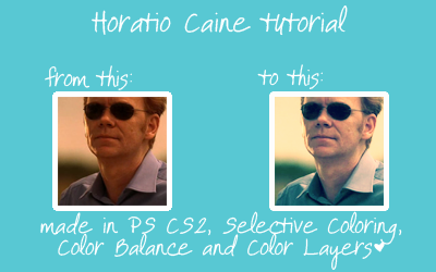
1. Here's our base, ladies and gentlemen. The first thing I don't like about it is that it's way too dark and the second one is that it's a bit reddish:
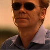
2. To lighten it, I duplicated the base and set the layer to Screen, 100%, but it still seemed a bit dark, so I duplicated the layer and set the second one to Screen, 50%. Note that this will not work with all the images. Some can be very dark and may need three, four or more Screen layers. Some are light enough to use only one or not to use any at all.

->
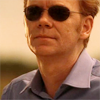
->

3. Then I decided to add just a little of contrast - I duplicated the base once again, dragged it onto the top and set it to Soft Light, 25%

->

4. Now it's time to fix the color. Make a Selective Coloring layer, set it to Normal, 100%
Reds: +63, 0, -43, 0
Yellows: +28, 0, -15, -15
Cyans: + 58, 0, +60, 0
Neutrals: +26, -14, -19, +10

->

5. So, the picture is not so yellow anymore, and it's time to play with the Color Balance layer (Normal, 100%).
Shadows: -20, -2, -5
Midtones: -36, 0, -4
Highlights: -18, 0, -3

->

6. Now make a new Color Fill layer, fill it with #fdf3cf and set it to Color Burn, 72%

->

7. Make another Color Fill layer, fill it with #4587ad and set it to Soft Light, 45%

->

8. Now make another Color Fill layer (don't worry, this is the last one), fill it with #01092f and set to Exclusion, 100%

->

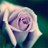
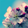
Here's some other icons made with this tut:

