I already love Half Life 2 after having played it for a grand total of five minutes. But there was one thing that kind of bothered me. See if you can identify it from this screen shot I took.
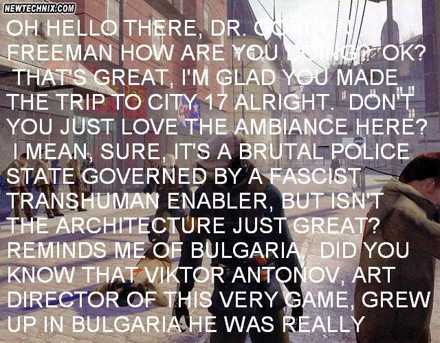
Hmmm.....Would it be white lettering on a white sky? And poor punctuation? On top of that, all caps is difficult to read. The eye is used to the rise and fall of the lowercase letters. It makes it easier to know what the words are without actually looking at sach individual letter. (just a little marketing education coming through)
Other than that, I don't know. I'm sort of in the last century when it comes to computer games. Heck, I still liek Pong!
Nah, it was the 96-point font they used for subtitles. It's even better with full on closed captions, which fills up the bottom half of the screen with things like *BARNACLE DIGESTING* and *STEAM HISSING* It really is that big, though!
But it is a pretty great game, though. Not as good as pong.
Comments 2
(just a little marketing education coming through)
Other than that, I don't know. I'm sort of in the last century when it comes to computer games. Heck, I still liek Pong!
Reply
But it is a pretty great game, though. Not as good as pong.
Reply
Leave a comment