Round 01: Challenge 01 Voting
I AM SO SORRY FOR MY ABSENCE! My internet was messed up when the repairman fixed the phone and we couldn't get the internet fixed until today. I'm sorry to those if they were too late for the sign-up but they closed on Friday even if I didn't close it, pixelwater announced that it had closed.
Another matter, when submitting your icon. Please give us the image of your icon AND a direct link (URL) to your icon so it's easier for the mods to copy & paste to upload onto our own servers for voting.
ELIMINATED: (Did not submit) openlyhidden, oulan, faintscribbles, monochroma, suwaner, wonkiebonky.
Thanks for signing-up, feel free to submit an icon to the Comeback Challenge when it arrives :)
→ Anyone may participate in voting. You don't have to be a member or a watcher or even a participant to vote. But it is highly recommended for participants to vote.
→ You are voting for FIVE least favourite/lesser quality icons. And you are voting for THREE favourite/people's choice icons. The icon with the highest votes will win People's Choice and the icon with the second most votes will Runner-Up. When voting for icons to be eliminated, please vote according to quality and technique. Personal preferences will not be accepted. You will also be asked to give a reason why you do not feel that the icon is of lesser quality. When voting for favourite/people's choice icons, you do not need to give a reason but it is HIGHLY ENCOURAGED.
→ Please do not vote for yourselves. If you do, we will ask you to vote again, if it is a mistake, please change it. If it remains unchanged, I will remind you only ONCE. To avoid this mistake, it is advised that you check your vote before submitting it. If you repeat it again, I will disqualify you for cheating. Please also do not ask your friends to vote for you. It's cheating. Once I find out, you will be banned from this LIMS. It's not fair to the other participants.
→ The words "I" and "me" are not allowed to be used.
→ Here is an example vote:
LESSER QUALITY ICONS:
#8: The image quality is poor and the use of text has not been thought out properly.
#18: The texture use doesn't fit with the overall icon and looks like it was an after-thought.
#23: The text is placed inappropriately on the character's face which is distracting and unappealing.
#30: The icon doesn't look like much was done to it and the text just doesn't fit with the icon in terms of font and colour.
#41: The cropping is off and doesn't look right and the image is too grainy.
FAVOURITE ICONS:
#5: The style and technique used is beautiful.
#7: The colours are absolutely stunning and well used.
#10: Wonderful use of brushes, it really brightens up the entire icon.
Use this form when voting:
LESSER QUALITY ICONS:
#: reason here
#: reason here
#: reason here
#: reason here
#: reason here
FAVOURITE ICONS:
#: reason here
#: reason here
#: reason here
→ Voting ends 29th Friday 11am GMT+8 Singapore Time.
→ Here is a great voting tutorial for voters
PLEASE DOUBLE-CHECK YOUR VOTE BEFORE SUBMITTING IT TO AVOID MISHAPS. IT IS IN YOUR BEST INTEREST AND EVERYONE ELSES TO DOUBLE-CHECK. THANKS
1
2
3
4
5
6

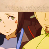


7
8
9
10
11
12


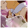


13
14
15
16
17
18
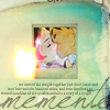


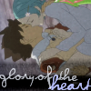

19
20
21
22
23
24




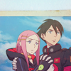
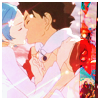
25
26
27
28
29
30




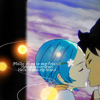

31
32
33
34
35
36

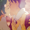


37
38
39
40
41
42




43
All votes are screened.
If there are any mistakes in this post, please tell me.
Good luck! :)
Another matter, when submitting your icon. Please give us the image of your icon AND a direct link (URL) to your icon so it's easier for the mods to copy & paste to upload onto our own servers for voting.
ELIMINATED: (Did not submit) openlyhidden, oulan, faintscribbles, monochroma, suwaner, wonkiebonky.
Thanks for signing-up, feel free to submit an icon to the Comeback Challenge when it arrives :)
→ Anyone may participate in voting. You don't have to be a member or a watcher or even a participant to vote. But it is highly recommended for participants to vote.
→ You are voting for FIVE least favourite/lesser quality icons. And you are voting for THREE favourite/people's choice icons. The icon with the highest votes will win People's Choice and the icon with the second most votes will Runner-Up. When voting for icons to be eliminated, please vote according to quality and technique. Personal preferences will not be accepted. You will also be asked to give a reason why you do not feel that the icon is of lesser quality. When voting for favourite/people's choice icons, you do not need to give a reason but it is HIGHLY ENCOURAGED.
→ Please do not vote for yourselves. If you do, we will ask you to vote again, if it is a mistake, please change it. If it remains unchanged, I will remind you only ONCE. To avoid this mistake, it is advised that you check your vote before submitting it. If you repeat it again, I will disqualify you for cheating. Please also do not ask your friends to vote for you. It's cheating. Once I find out, you will be banned from this LIMS. It's not fair to the other participants.
→ The words "I" and "me" are not allowed to be used.
→ Here is an example vote:
LESSER QUALITY ICONS:
#8: The image quality is poor and the use of text has not been thought out properly.
#18: The texture use doesn't fit with the overall icon and looks like it was an after-thought.
#23: The text is placed inappropriately on the character's face which is distracting and unappealing.
#30: The icon doesn't look like much was done to it and the text just doesn't fit with the icon in terms of font and colour.
#41: The cropping is off and doesn't look right and the image is too grainy.
FAVOURITE ICONS:
#5: The style and technique used is beautiful.
#7: The colours are absolutely stunning and well used.
#10: Wonderful use of brushes, it really brightens up the entire icon.
Use this form when voting:
LESSER QUALITY ICONS:
#: reason here
#: reason here
#: reason here
#: reason here
#: reason here
FAVOURITE ICONS:
#: reason here
#: reason here
#: reason here
→ Voting ends 29th Friday 11am GMT+8 Singapore Time.
→ Here is a great voting tutorial for voters
PLEASE DOUBLE-CHECK YOUR VOTE BEFORE SUBMITTING IT TO AVOID MISHAPS. IT IS IN YOUR BEST INTEREST AND EVERYONE ELSES TO DOUBLE-CHECK. THANKS
1
2
3
4
5
6


7
8
9
10
11
12


13
14
15
16
17
18


19
20
21
22
23
24


25
26
27
28
29
30


31
32
33
34
35
36


37
38
39
40
41
42


43

All votes are screened.
If there are any mistakes in this post, please tell me.
Good luck! :)