Haden tut!
Want to know how to achieve this coloring? 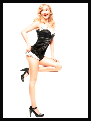
And with that coloring you can make this banner
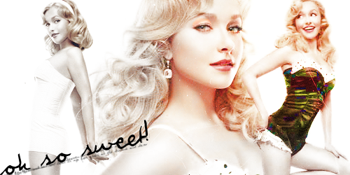
All done is PSPx most likely translatable. Everything is under the cut since this is a longer tut(not super long it won't take you a lifetime but its longer than my other tuts)
Alright this is a two part tut but the results are worth it. So we'll be starting with this picture of the lovely Haden.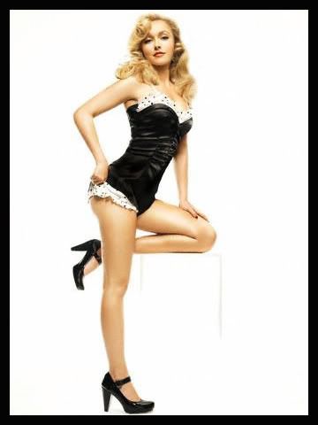
now we'll turn that into
And once you achieve that coloring you can make the banner!
The first part is just an example of how to get the coloring! But its not all we do. Got it so stick with me!!
These steps are for the first part. WE'LL BE GOING FROM THIS TO THIS
1.duplicate your base and set it to screen(now its going to look lighter and you may be thinking wait thats too light! No its not trust me.)
2. go to layers----->new adjustment layer------>Hue/sat/lightness
3. set hue to -12 and sat to 11
Now you've gotten the first part done! Repete for all the pictures you'll be using(this is optional to repete but thats what I did.
These steps are to get the final product.
THESE ARE THE STEPS TO MAKE THE BANNER. YOU WILL NEED TO USE THE FIRST PART IF YOU WANT THE RESULTS I GOT!
1.open a new canvas. I just went into paint and made a box that was 500x250 then coppied it into PSPx.
2.get the pictures you'll be using. If you want the coloring to be like the Haden picture then make sure you've repeted the first part for all of them. I used three pictures of Haden.
3.place them the way you want(since all the pictures I was using had white backrounds I set them all the darken and erased the parts the overlapped and looked weird.) and if the overlap then blend them together
4. to get the scratchiness I used this texture(I'm not sure who made this texture so if you did let me know and I'll give you credit!!) set it to screen, duplicated it twice and set it over all three pictures. I've merged nothing yet. So don't merge anything!!
5. then I took this texture by _overmyhead(on deviantart I believe) and set it to saturation. I erased a little bit of the texture that was over her eyes of the second picture(thats optional I did it because her eyes looked almost bloodshot but you can't really tell I erased anything) The texture should be in a layer above all others. Remember that!
6. I added some tiny text and the big text that says 'oh so sweet' its compleatly up to you what you do after the first five steps of the second part!
Feel free to mess around with the steps above. =) Both in the first and second part!
So in the end we've got this lovely banner....
If you have questions be sure to ask them! And I'd love to see what you guys came up with.
For this tut you need to have a general idea of what layers are, what adjustment layers are, blending(if its needed) and you need to have creativity! This was very experimental so play around and don't be afraid to try things. ^^
I'd love to see what you guys come up with.
This is easier if your working with smaller things like banners and signatures and icons, its not so easy if your making a desktop. Its harder to get the coloring on the black corset for a desktop(trust me I tried to make a desktop with these pics).
I hope this wasn't too complicated!!

And with that coloring you can make this banner

All done is PSPx most likely translatable. Everything is under the cut since this is a longer tut(not super long it won't take you a lifetime but its longer than my other tuts)
Alright this is a two part tut but the results are worth it. So we'll be starting with this picture of the lovely Haden.

now we'll turn that into

And once you achieve that coloring you can make the banner!

The first part is just an example of how to get the coloring! But its not all we do. Got it so stick with me!!
These steps are for the first part. WE'LL BE GOING FROM THIS TO THIS
1.duplicate your base and set it to screen(now its going to look lighter and you may be thinking wait thats too light! No its not trust me.)
2. go to layers----->new adjustment layer------>Hue/sat/lightness
3. set hue to -12 and sat to 11
Now you've gotten the first part done! Repete for all the pictures you'll be using(this is optional to repete but thats what I did.
These steps are to get the final product.
THESE ARE THE STEPS TO MAKE THE BANNER. YOU WILL NEED TO USE THE FIRST PART IF YOU WANT THE RESULTS I GOT!
1.open a new canvas. I just went into paint and made a box that was 500x250 then coppied it into PSPx.
2.get the pictures you'll be using. If you want the coloring to be like the Haden picture then make sure you've repeted the first part for all of them. I used three pictures of Haden.
3.place them the way you want(since all the pictures I was using had white backrounds I set them all the darken and erased the parts the overlapped and looked weird.) and if the overlap then blend them together
4. to get the scratchiness I used this texture(I'm not sure who made this texture so if you did let me know and I'll give you credit!!) set it to screen, duplicated it twice and set it over all three pictures. I've merged nothing yet. So don't merge anything!!
5. then I took this texture by _overmyhead(on deviantart I believe) and set it to saturation. I erased a little bit of the texture that was over her eyes of the second picture(thats optional I did it because her eyes looked almost bloodshot but you can't really tell I erased anything) The texture should be in a layer above all others. Remember that!
6. I added some tiny text and the big text that says 'oh so sweet' its compleatly up to you what you do after the first five steps of the second part!
Feel free to mess around with the steps above. =) Both in the first and second part!
So in the end we've got this lovely banner....

If you have questions be sure to ask them! And I'd love to see what you guys came up with.
For this tut you need to have a general idea of what layers are, what adjustment layers are, blending(if its needed) and you need to have creativity! This was very experimental so play around and don't be afraid to try things. ^^
I'd love to see what you guys come up with.
This is easier if your working with smaller things like banners and signatures and icons, its not so easy if your making a desktop. Its harder to get the coloring on the black corset for a desktop(trust me I tried to make a desktop with these pics).
I hope this wasn't too complicated!!