Tutorial - Massu
This tut was requested by panonychus. :D
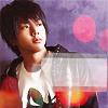
I recreated the way I made this icon:
On a further note, I am aware these icons look almost nothing alike. :3 But in general, the way I made this tut is the way I made the original icon of Koyama. I'm sorry this tutorial doesn't explain much in depth. If you have any questions, just comment and I'll answer them.
This tutorial was made in Adobe Photoshop CS.
How to go from this to this.
First, we start out with a base of Massu (NewS) that I got from a scan at boys_paper.

I wanted to brighten it up a little bit, so I used a soft light layer at 55% to achieve the effect.

After all this, your icon might be a little oversharpened. Feel free to take the smudge tool and smooth out a few edges or the subject's skin.

Now we're going to add this texture on lighten. (I forgot who made it. I also altered it from the original.)

Then we're going to use this simple texture created with a few brushes by teh_indy on lighten, 73% opacity. You can change the opacity according to the darkness of your image.

Now it's time for text. I usually put larger text in a prettier or more appealing font on the top, and all caps, spaced out Times New Roman at the bottom. In this icon, the larger text is the font Ambrosia Demo at 7 pt size and the smaller text is TNR at 2.4 pt size. Add a few small text brushes on a seperate layer to make it a little more interesting.

You might want to go back and erase part of your light texture to make the text easier to see, but it's your call.
This icon's coloring isn't that appealing so far, so I added a layer filled with #a69897 on color to get a desaturated look. Move the layer beneath your light texture so that you still get the contrast from the red.

We're almost finished now. I went back and added a new layer at the top, using a border brush in #FFFFFF. I forgot who made the brush.

You can stop here if you want, but I went on to mess with my icon's coloring a little with the Color Balance feature (Image - Adjustments) to get my final product.

I recreated the way I made this icon:

On a further note, I am aware these icons look almost nothing alike. :3 But in general, the way I made this tut is the way I made the original icon of Koyama. I'm sorry this tutorial doesn't explain much in depth. If you have any questions, just comment and I'll answer them.
This tutorial was made in Adobe Photoshop CS.
How to go from this to this.
First, we start out with a base of Massu (NewS) that I got from a scan at boys_paper.

I wanted to brighten it up a little bit, so I used a soft light layer at 55% to achieve the effect.

After all this, your icon might be a little oversharpened. Feel free to take the smudge tool and smooth out a few edges or the subject's skin.

Now we're going to add this texture on lighten. (I forgot who made it. I also altered it from the original.)

Then we're going to use this simple texture created with a few brushes by teh_indy on lighten, 73% opacity. You can change the opacity according to the darkness of your image.

Now it's time for text. I usually put larger text in a prettier or more appealing font on the top, and all caps, spaced out Times New Roman at the bottom. In this icon, the larger text is the font Ambrosia Demo at 7 pt size and the smaller text is TNR at 2.4 pt size. Add a few small text brushes on a seperate layer to make it a little more interesting.

You might want to go back and erase part of your light texture to make the text easier to see, but it's your call.
This icon's coloring isn't that appealing so far, so I added a layer filled with #a69897 on color to get a desaturated look. Move the layer beneath your light texture so that you still get the contrast from the red.

We're almost finished now. I went back and added a new layer at the top, using a border brush in #FFFFFF. I forgot who made the brush.

You can stop here if you want, but I went on to mess with my icon's coloring a little with the Color Balance feature (Image - Adjustments) to get my final product.
