In which Amy tries to create a new layout for Experience Pearls
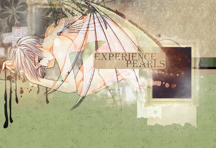
So I've been working on updating a few of my older sites and I decided to create a new layout for my Clover site. I'm sort of pleased with the results, but I'm not quite sure. There are a few things that I think could be better. First of all, there is the title. Is the font OK? How could I do it better? Second is the black behind her wing on the upper right side--does it look good? I want to do something a little more visually complex than the other layouts I've done recently, but is it too busy? I don't know. Thoughts?
edit: Thank you to everyone who commented. I've made a few changes so I will post the new preview below the cut.
edit: Thank you to everyone who commented. I've made a few changes so I will post the new preview below the cut.