Tutorial #4
guesswork_ requested a tutorial for this icon: 
But since I’m a loser, I can’t find the original picture. So here’s a tut for the same sort of coloring, but with a different picture.
Go from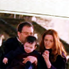
to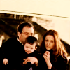
using Photoshop Elements
1. Start out with your base. I couldn’t for the life of me find the picture I used for the icon requested, so I chose a different one. Sharpen and do whatever you normally do to your liking. Here’s my base:

2. Duplicate the base layer and desaturate it (ctrl+shift+u). Set that layer on screen
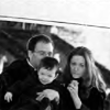
>>>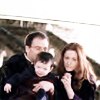
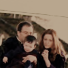
3. Fill a new layer with a dull brownish color (#B8A68E). Set the layer on Multiply, 100%

>>>
4. Fill another layer with the same color. Set that layer on Color, 50%

>>>
5. Fill a new layer with a yellowish color (#F4EAC8). Set that layer on Color Burn, 50%

>>>
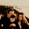
6. Go back to your base and duplicate it. Bring the duplicate to the top and set it on Soft Light, 100%

>>>
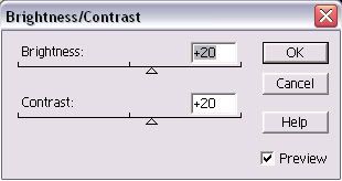
7. I wanted a little more brightness and contrast, so I added a new adjustment layer. To do that on my program, I went to Layer>New Adjustment Layer>Brightness/Contrast. Set both to +20.
>>>
And that’s it! I hope that helps, even though it’s not exactly the same. Feel free to ask questions :)

But since I’m a loser, I can’t find the original picture. So here’s a tut for the same sort of coloring, but with a different picture.
Go from

to

using Photoshop Elements
1. Start out with your base. I couldn’t for the life of me find the picture I used for the icon requested, so I chose a different one. Sharpen and do whatever you normally do to your liking. Here’s my base:

2. Duplicate the base layer and desaturate it (ctrl+shift+u). Set that layer on screen

>>>

3. Fill a new layer with a dull brownish color (#B8A68E). Set the layer on Multiply, 100%

>>>

4. Fill another layer with the same color. Set that layer on Color, 50%

>>>

5. Fill a new layer with a yellowish color (#F4EAC8). Set that layer on Color Burn, 50%

>>>

6. Go back to your base and duplicate it. Bring the duplicate to the top and set it on Soft Light, 100%

>>>

7. I wanted a little more brightness and contrast, so I added a new adjustment layer. To do that on my program, I went to Layer>New Adjustment Layer>Brightness/Contrast. Set both to +20.

>>>

And that’s it! I hope that helps, even though it’s not exactly the same. Feel free to ask questions :)