Tutorial #9: Jim and Tutorial #10: Rachel
Happy Friday! I come bearing two tutorials :)
How to go from

to

in Photoshop Elements, as requested by x__leah__x
1. As always, start out with a 100x100 base. Mine is of Jim from The Office.

2. Duplicate the base twice. Set the layer closest to the bottom on screen and the layer on top to soft light, both at 100% opacity (though this and the # of layers depends on your base).

>>

3. Create a new layer and fill it with a navy color (#001838). Set the layer to soft light, 100%.

>>

4. Create another new layer and fill it with a light blue color (#99DDF6). Set that layer soft light, 100%.

>>

5. Create another new layer and fill it with a light tan color (#FDEBD0). Set that layer to multiply, 60%.

>>

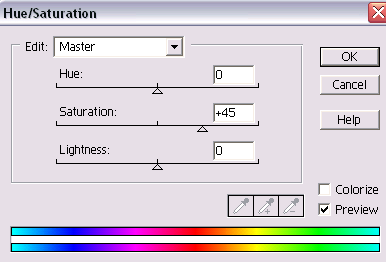
6. It’s not looking too good right now, right? Very washed out. So I go to Layer>New Adjustment Layer>Hue/Saturation and increase the saturation to +45 (though, again, this can vary depending on your image). Leave the other options alone.
>>

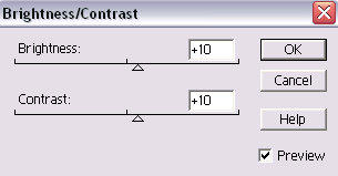
7. Almost done! Now, because I always like a little extra contrast in my icons, I go to Layer>New Adjustment Layer>Brightness/Contrast and increase both Brightness and Contrast to +10.
>>

And that’s it! Pretty easy, right?
How to go from

to

in Photoshop Elements, as requested by x__leah__x
1. Start out with your 100x100 base. Mine is of Rachel from Friends.

2. Duplicate the base three times. Set the bottom two on screen and the top one on soft light. All layers should be at 100% opacity. (Note: As always, the number of layers and the opacities will vary depending on your base).

>>

3. Create a new layer and fill it with a light blue color (#99DDF6). Set the layer on soft light, 100%.

>>

4. Create a new layer and fill it with the same color (#99DDF6), but this time set the layer on color burn, 100%

>>

5. Create a new layer and fill it with a different light blue (#D0EFFD). Set the layer to color burn, 100%.

>>

6. Create another new layer and fill it with a light tan (#FDEBD0). Set the layer to multiply, 90%.

>>

7. It looks pretty gross at this point, so to give it more color, I go to Layer>New Adjustment Layer>Hue/Saturation and change the saturation to +40 (though again, this will depend on your picture). Leave the other options alone.

>>

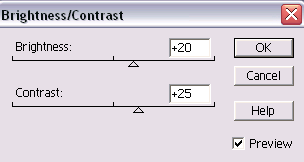
8. Finally, I go to Layer>New Adjustment Layer>Brightness/Contrast and change the brightness to +20 and the contrast to +25.
>>

And you’re done!
If you have any questions about either of these tutorials, don’t hesitate to ask! I'd love to see your results if you use them :)