Round 1: Challenge 5 results
Okay. Finally we have enough votes. :) Thank you to everyone who voted.
Eliminated: (please stick around, vote and participate in the comeback challenge)

loving_w (-7 votes)
People's Choice:

starrynyc (+2 votes)
TALLIES:
01. - 3 + 1 = -2
02. - 7 + 0 = -7
03. - 4 + 3 = -1
04. - 2 + 4 = +2
ICON #01
(+) Love the crop
(-) icon needs something decorative; just crop looks boring
(-) Coloring is too bland.
(-) The coloring is too pale and could use a bit more yellow.
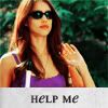
ICON #02
(-) too yellow face; bad text
(-) The coloring is too red and the font is misplaced
(-) the text really offsets the overall icon feel. the icon feels off kilter with the gray bar at the bottom.
(-) it's a bit oversaturated and text doesn't make a nice composition, it's too big
(-) text does not relate to image
(-) The coloring is too orange.
(-) Her skin is too yellow.
ICON #03
(+) great composition and colouring!
(+) good idea and the pic is good for this kind of cropping
(+) great coloration and repetition effect, very original-looking
(-) lacks detail. had a hard time figuring out what was going on in the icon.
(-) Not enough contrast in the icon.
(-) icon lacks visual interest, text or a brush/texture would have helped
(-) The cropping is boring.
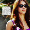
ICON #04
(+) the icon appears complete and doesn't lack in detail, coloring, cropping, brushes, etc. like some of the other icons do.
(+) Love the coloring
(+) Great coloring!!
(+) The cropping and coloring are nice. The texture is a nice touch.
(-) Too blurry
(-) coloring is dark-ish and slightly unnatural
Eliminated: (please stick around, vote and participate in the comeback challenge)

loving_w (-7 votes)
People's Choice:

starrynyc (+2 votes)
TALLIES:
01. - 3 + 1 = -2
02. - 7 + 0 = -7
03. - 4 + 3 = -1
04. - 2 + 4 = +2
ICON #01
(+) Love the crop
(-) icon needs something decorative; just crop looks boring
(-) Coloring is too bland.
(-) The coloring is too pale and could use a bit more yellow.
ICON #02
(-) too yellow face; bad text
(-) The coloring is too red and the font is misplaced
(-) the text really offsets the overall icon feel. the icon feels off kilter with the gray bar at the bottom.
(-) it's a bit oversaturated and text doesn't make a nice composition, it's too big
(-) text does not relate to image
(-) The coloring is too orange.
(-) Her skin is too yellow.
ICON #03
(+) great composition and colouring!
(+) good idea and the pic is good for this kind of cropping
(+) great coloration and repetition effect, very original-looking
(-) lacks detail. had a hard time figuring out what was going on in the icon.
(-) Not enough contrast in the icon.
(-) icon lacks visual interest, text or a brush/texture would have helped
(-) The cropping is boring.
ICON #04
(+) the icon appears complete and doesn't lack in detail, coloring, cropping, brushes, etc. like some of the other icons do.
(+) Love the coloring
(+) Great coloring!!
(+) The cropping and coloring are nice. The texture is a nice touch.
(-) Too blurry
(-) coloring is dark-ish and slightly unnatural