Taking A Stab At It
Whoo. So. I'm going to attempt to write my first ever tutorial. :D
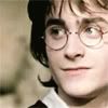
We're going from
<- that to this ->
in ten ridiculously easy steps. :)
+ Made in Photoshop 6.0, but VERY easily translatable.
+ Minimal knowledge of your program required.
+ DON'T steal it (i.e., don't make the exact same icon and attempt to pass it off as your own somewhere. Using techniques from this tutorial, but with a different image, etc., is fine).
+ You can take the icon, of course, just credit.
+ If you have any questions, feel free to ask, and I'll do my best to answer them.
+ Show me what you made with it - I'd love to see! :)
1. This is your base.
It is your friend. Be nice to it.
2. Lightening. Go to Image -> Adjust -> Levels. Slide the rightmost tab and the middle tab over a bit (input levels: 0, 1.18, 237).
3. More lightening, and the dreaded desaturated soft light layer. Duplicate your base (ctrl+J in Photoshop) and desaturate it (ctrl+shift+U). Go to Image -> Adjust -> Brightness/Contrast, with the brightness set at 15 and the contrast at 20. Set the layer to Soft Light at 50% opacity.
4. Sharpening. Sharpen the Soft Light layer (Filter -> Sharpen -> Sharpen). Use Unsharp Mask (Filter -> Sharpen -> Unsharp Mask) on the base. I kept the settings at default (Amount: 40%; Radius: 3.0px; Threshold: 3 levels), but you can play around with them if you want. :)
5. Coloring! Create a new layer (ctrl+shift+N) and floodfill it with a tannish/peachy color. I used #F1D0BA. Set the layer mode to Color at 80% opacity.
6. ...More coloring! Take your base layer, duplicate it, and drag it to the top of all your layers. Set it to Soft Light at 70% opacity. Now your icon will be somewhat sepia and washed-out, but not overly so.
7. Color enhancement. I'm not sure if I'm alone in this or not, but it's always kind of bugged me that Daniel Radcliffe's eyes are greyish-blue, especially in PoA when he was told approximately seventy-two times that he had his mother's eyes. I mean, I understand that he was allergic to the contacts and everything, but... perhaps I'm just odd? Anyway, I decided to make his eyes in this icon omgcanon!green. So, make a new layer and select a soft round brush in a really green color - I used #00A63E - and color in his eyes. Zoom in on the image and erase any bits that are on his eyelights or cheeks.
For your amusement:
And since you are not, whatever you do, going to leave it like that... layer type: Overlay; opacity: 60%. It should look something like this:
Now I did something similar to his lips and cheeks with a reddish color on separate layers. #EBA69D, Color, 35% opacity for the lips, #9E0039, Soft Light, 40% opacity for the cheeks.
8. Coloring... again. Create a new layer and drag it under your base duplicate that's set at Soft Light (above the peach-colored floodfill layer). I used a gradient by the brilliant crumblingwalls, and set the layer to Hard Light at 40% opacity.

->
9. Texture. New layer; I used this brush, again by crumblingwalls in a light brown color I picked from the image (#E3C8AD) to add texture and create a makeshift border. Normal, 68% opacity.
->
10. Text. Create your text layer under the texture layer. I recommend using a dark brown color, like #1E0900. My small text is in bold Book Antiqua, anti-alias crisp, size two.

Annnnd you're done! :)
We're going from

<- that to this ->

in ten ridiculously easy steps. :)
+ Made in Photoshop 6.0, but VERY easily translatable.
+ Minimal knowledge of your program required.
+ DON'T steal it (i.e., don't make the exact same icon and attempt to pass it off as your own somewhere. Using techniques from this tutorial, but with a different image, etc., is fine).
+ You can take the icon, of course, just credit.
+ If you have any questions, feel free to ask, and I'll do my best to answer them.
+ Show me what you made with it - I'd love to see! :)
1. This is your base.

It is your friend. Be nice to it.
2. Lightening. Go to Image -> Adjust -> Levels. Slide the rightmost tab and the middle tab over a bit (input levels: 0, 1.18, 237).

3. More lightening, and the dreaded desaturated soft light layer. Duplicate your base (ctrl+J in Photoshop) and desaturate it (ctrl+shift+U). Go to Image -> Adjust -> Brightness/Contrast, with the brightness set at 15 and the contrast at 20. Set the layer to Soft Light at 50% opacity.

4. Sharpening. Sharpen the Soft Light layer (Filter -> Sharpen -> Sharpen). Use Unsharp Mask (Filter -> Sharpen -> Unsharp Mask) on the base. I kept the settings at default (Amount: 40%; Radius: 3.0px; Threshold: 3 levels), but you can play around with them if you want. :)

5. Coloring! Create a new layer (ctrl+shift+N) and floodfill it with a tannish/peachy color. I used #F1D0BA. Set the layer mode to Color at 80% opacity.

6. ...More coloring! Take your base layer, duplicate it, and drag it to the top of all your layers. Set it to Soft Light at 70% opacity. Now your icon will be somewhat sepia and washed-out, but not overly so.

7. Color enhancement. I'm not sure if I'm alone in this or not, but it's always kind of bugged me that Daniel Radcliffe's eyes are greyish-blue, especially in PoA when he was told approximately seventy-two times that he had his mother's eyes. I mean, I understand that he was allergic to the contacts and everything, but... perhaps I'm just odd? Anyway, I decided to make his eyes in this icon omgcanon!green. So, make a new layer and select a soft round brush in a really green color - I used #00A63E - and color in his eyes. Zoom in on the image and erase any bits that are on his eyelights or cheeks.
For your amusement:

And since you are not, whatever you do, going to leave it like that... layer type: Overlay; opacity: 60%. It should look something like this:

Now I did something similar to his lips and cheeks with a reddish color on separate layers. #EBA69D, Color, 35% opacity for the lips, #9E0039, Soft Light, 40% opacity for the cheeks.

8. Coloring... again. Create a new layer and drag it under your base duplicate that's set at Soft Light (above the peach-colored floodfill layer). I used a gradient by the brilliant crumblingwalls, and set the layer to Hard Light at 40% opacity.

->

9. Texture. New layer; I used this brush, again by crumblingwalls in a light brown color I picked from the image (#E3C8AD) to add texture and create a makeshift border. Normal, 68% opacity.

->

10. Text. Create your text layer under the texture layer. I recommend using a dark brown color, like #1E0900. My small text is in bold Book Antiqua, anti-alias crisp, size two.

Annnnd you're done! :)