06. MS Paint Icons
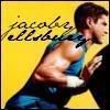
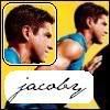
Since I'm really bored, and my dad's laptop doesn't have Photoshop, I decided to make some fairly crappy icons using MS Paint (and Microsoft Office Photo Editor). This is just purely for amusement.. and this entry might be deleted once I can get my hands on my beloved Photoshop again.
*hint* The later ones are the better ones. I haven't used MS Paint in years, so I was a little rusty at first.. *blush*
Includes:
[1-10, 22-23] Jacoby Ellsbury
[11-21] Jed Lowrie
[22-30] Jon Lester (including the icon I'm using)
01.
02.
03.
04.
05.
06.
07.
08.
09.
10.
11.
12.
13.
14.
15.
16.
17.
18.
19.
20.
21.
22.
23.
24.
25.
26.
27.
28.
29.
30.
→ Comment and credit please! Because it makes me a little less self-deprecating and makes my ego grow a bit. Because that's what good people do. And I would credit your stuff, so please credit mine. (Kindergarten time! Now kids, what's the golden rule? Hehe.)
→ These may not be as good as my usual icons, but they took just as much time and effort. Maybe more, because I have limited resources. *ahemPaint*
→ If you want to edit these, please let me know! (Because I'd like to see what you've done, so I can leave a nice comment!)
Photos from Mens Vogue, The Boston Herald, Sons of Sam Horn, SoxBlog.mlblogs.com & Sox Nest
List of what I hate most about MS Paint:
01. No layers.
02. No color adjustment.
03. No resizing. (Had to use Microsoft Photo Editor for both resizing and colors)
04. Screws up the pixels, making the final product/graphic look... screwy.
05. UGLEH
But! Still fun.