[R2] Challenge 006: Voting
I'm so sorry this is so late. D:
Disqualified: n/a
Rules:
→ You are voting for one least favorite and favorite. Reasons must be included.
→ Choose your icons based on the quality, not the style/trend/personal opinions.
→ If I ask you to re-vote you must do before the deadline or your vote doesn't count.
→ Incomplete forms will not count.
→ Votes such as "The icon is too plain" or "... no effort in the icon" will not count unless you have another reason to back it up with.
Example of a BAD vote:
Least Favorite:
A: The scenary here makes no sense and the icon is too plain.
Favorite:
B: I like this icon because the character looks pretty!
Example of a GOOD vote:
Least Favorite:
A: The icon is oversharpened which makes the overall icon look pixelated. Blurring the icon a bit might fix that though.
Favorite:
B: The coloring of the icon is nice since it brings out the character, but isn't oversaturated.
THEME: PROVIDED TEXTURES:
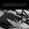
001
002
003
004

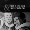
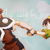
005
006

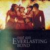
Please use this form to vote:
Lesser Quality:
# - REASON
Favorite Icons:
#- REASON
→ Voting ends on Tuesday, December 15th @ 5PM EST.
→ All icons must remain anonymous until results are posted.
CHANGE IN VOTING RULES:
→ Along with the rules provided above on how your votes should be, your votes must INCLUDE A "BECAUSE" or a "why statement" in your critiques because LIMS voter might receive contradicting votes or they want to know why it doesn't look good or they just wanted to try out a new technique.
Ex.The coloring compliments the icon well because it brings out the color of the clothes and doesn't oversaturate the icon. or The textures do not work well with the icon because it makes the icon very grainy and covers the subject.
I will no longer accept votes such as, "The coloring is off." or "The text placement is horrible."
All comments are screened.
Disqualified: n/a
Rules:
→ You are voting for one least favorite and favorite. Reasons must be included.
→ Choose your icons based on the quality, not the style/trend/personal opinions.
→ If I ask you to re-vote you must do before the deadline or your vote doesn't count.
→ Incomplete forms will not count.
→ Votes such as "The icon is too plain" or "... no effort in the icon" will not count unless you have another reason to back it up with.
Example of a BAD vote:
Least Favorite:
A: The scenary here makes no sense and the icon is too plain.
Favorite:
B: I like this icon because the character looks pretty!
Example of a GOOD vote:
Least Favorite:
A: The icon is oversharpened which makes the overall icon look pixelated. Blurring the icon a bit might fix that though.
Favorite:
B: The coloring of the icon is nice since it brings out the character, but isn't oversaturated.
THEME: PROVIDED TEXTURES:
001
002
003
004
005
006
Please use this form to vote:
Lesser Quality:
# - REASON
Favorite Icons:
#- REASON
→ Voting ends on Tuesday, December 15th @ 5PM EST.
→ All icons must remain anonymous until results are posted.
CHANGE IN VOTING RULES:
→ Along with the rules provided above on how your votes should be, your votes must INCLUDE A "BECAUSE" or a "why statement" in your critiques because LIMS voter might receive contradicting votes or they want to know why it doesn't look good or they just wanted to try out a new technique.
Ex.The coloring compliments the icon well because it brings out the color of the clothes and doesn't oversaturate the icon. or The textures do not work well with the icon because it makes the icon very grainy and covers the subject.
I will no longer accept votes such as, "The coloring is off." or "The text placement is horrible."
All comments are screened.