Tutorial 1.
Community: adventawards.
Placement: Third Place.
Confirmation: Proof of place here.
Credits: N/A.
Parent Tutorial: N/A.
Program: PS CS2.

This is my first tutorial so please be kind.
I decided to do a tutorial on this icon because I've also had a few people tell me they love it’s vibrant colours. This is a very simple way to give a dull icon much needed colour.
I'm not going to tell you when to sharpen, blur or match colour because everyone is different and frankly I can't remember how much and where I did so also some icons my not look that good if you sharpen, etc. where I have.
On to my tutorial.
1) Grab your image and crop it how you want it, Copy and paste it into a new canvas, just so you still have the original, now back to your icon, sharpen, blur, match colour how ever you want it.
2) I think your icon will turn out better if you use the colour that dominates your base, mine was purple, grab your colour and put it to "Colour Burn" 100%.
3) Get your base that you've copied to a new canvas, paste it into your icon, lighten it (until your happy) then set in to "Luminosity" 50%.
4) Paste it again into your icon then darken it (until your happy) then set it to "Soft Light" 100%.
5) Get a darker version of the colour you used and set it to "Colour Burn" 20%.
I've made another icon using my tutorial and I got this: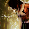
Enjoy!
Placement: Third Place.
Confirmation: Proof of place here.
Credits: N/A.
Parent Tutorial: N/A.
Program: PS CS2.
This is my first tutorial so please be kind.
I decided to do a tutorial on this icon because I've also had a few people tell me they love it’s vibrant colours. This is a very simple way to give a dull icon much needed colour.
I'm not going to tell you when to sharpen, blur or match colour because everyone is different and frankly I can't remember how much and where I did so also some icons my not look that good if you sharpen, etc. where I have.
On to my tutorial.
1) Grab your image and crop it how you want it, Copy and paste it into a new canvas, just so you still have the original, now back to your icon, sharpen, blur, match colour how ever you want it.
2) I think your icon will turn out better if you use the colour that dominates your base, mine was purple, grab your colour and put it to "Colour Burn" 100%.
3) Get your base that you've copied to a new canvas, paste it into your icon, lighten it (until your happy) then set in to "Luminosity" 50%.
4) Paste it again into your icon then darken it (until your happy) then set it to "Soft Light" 100%.
5) Get a darker version of the colour you used and set it to "Colour Burn" 20%.
I've made another icon using my tutorial and I got this:
Enjoy!