Tutorial #3 - John Winchester
I can't believe it's been over two years since I last posted a tutorial. Huh.
Anyway we're going from this: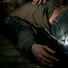
to this: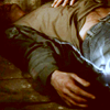
I don't know if it's translatable because I haven't had PSP for years, but there's no selective color so I assume it is.
So, I took a cap from Supernatural ep. 1x22 'Devils Trap'. This cap is from Marishna, come to think of it all my SPN caps are by her. Check her out.
Blah, blah, cropped it, blah, blah, shrunk it to 100x100.
And since it's SPN season one I don't have to tell you that it's dark.
See?
My favorite new trick for darkish caps is to add a black and white gradient map adjustment layer and set that to screen.
Now I have this:
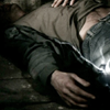
Then I added a hue/saturation adjustment layer and in the master setting I upped the saturation. I usually up it anywhere from 45% - 55% depending on the cap. I tend to go for more a bit more saturated than I think I'll need because I can always lower the opacity of the layer to kill some of the saturation.
So at that point I have this:

Now I'm telling you this, it isn't much different than the old 'duplicate the base, set to screen' method, but I think this preserves the quality. The difference is slight, but I prefer it. If the cap needs further lightening I've found that if I merge the base and the gradient map set to screen layer, duplicate that and set the duplicate to screen then do the hue/sat layer it gives me a cleaner result than two duplicated base layers set to screen. Clear as mud? Cool. Moving on.
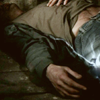
Next I added a new layer and flood filled it with a dark red with a hint of brown, set to exclusion, this icon used color code #170902.
Giving me this:
Not quite what I was going for, so I duplicated the exclusion layer.
Here's what I'm lookin' at:

Lately I have been loving the channel mixer adjustment layer. If you're not familiar with it it looks like this:

I'm not going to give exact settings because it depends on the cap and your taste. For this icon I have the Red Output Channel at apprx. +125, -10, -10, then in the drop down I changed from red to blue and set the Blue Output Channel at apprx. -15, -10, +135. I didn't pull down the green, I left the Green Output Channel alone. Again, these are not exact, fiddle with it.
If you have absolutely no idea what the Channel Mixer does, this tutorial is a good place to learn the basics, in my opinion.
After fiddling I have this:

Subtle, but nice, it's richer, the blue is bluer, but not overly so.
Next, I made a Levels adjustment layer.
If you're unfamiliar with it, Levels looks like this:
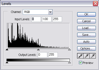
Now in Levels you'll default with RGB, which is what I usually use unless I want to mess with the colors more, but for his icon I only want to control the contrast.
Ok, see the box with the squiggly equalizer looking stuff? That's the Input Levels. Now see those three little triangles? If you move them to the left you'll get brighter, but lose contrast, if you move to the right you'll get more depth/contrast, but you'll lose brightness.
Again, fiddle with them, til you've got what you like. For this icon I moved the far right triangle to the left a bit, then moved the middle triangle to the the left, then moved the far left to the right a bit.
I realize that is one mess of a sentence, so, for visual reference, what I used was more or less this:
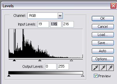
Which left me with this:
And that's it.
Question/comments welcome, unfortunately, the icon is not sharable.
Thanks for reading.
Anyway we're going from this:
to this:
I don't know if it's translatable because I haven't had PSP for years, but there's no selective color so I assume it is.
So, I took a cap from Supernatural ep. 1x22 'Devils Trap'. This cap is from Marishna, come to think of it all my SPN caps are by her. Check her out.
Blah, blah, cropped it, blah, blah, shrunk it to 100x100.
And since it's SPN season one I don't have to tell you that it's dark.
See?
My favorite new trick for darkish caps is to add a black and white gradient map adjustment layer and set that to screen.
Now I have this:
Then I added a hue/saturation adjustment layer and in the master setting I upped the saturation. I usually up it anywhere from 45% - 55% depending on the cap. I tend to go for more a bit more saturated than I think I'll need because I can always lower the opacity of the layer to kill some of the saturation.
So at that point I have this:
Now I'm telling you this, it isn't much different than the old 'duplicate the base, set to screen' method, but I think this preserves the quality. The difference is slight, but I prefer it. If the cap needs further lightening I've found that if I merge the base and the gradient map set to screen layer, duplicate that and set the duplicate to screen then do the hue/sat layer it gives me a cleaner result than two duplicated base layers set to screen. Clear as mud? Cool. Moving on.
Next I added a new layer and flood filled it with a dark red with a hint of brown, set to exclusion, this icon used color code #170902.
Giving me this:
Not quite what I was going for, so I duplicated the exclusion layer.
Here's what I'm lookin' at:
Lately I have been loving the channel mixer adjustment layer. If you're not familiar with it it looks like this:
I'm not going to give exact settings because it depends on the cap and your taste. For this icon I have the Red Output Channel at apprx. +125, -10, -10, then in the drop down I changed from red to blue and set the Blue Output Channel at apprx. -15, -10, +135. I didn't pull down the green, I left the Green Output Channel alone. Again, these are not exact, fiddle with it.
If you have absolutely no idea what the Channel Mixer does, this tutorial is a good place to learn the basics, in my opinion.
After fiddling I have this:
Subtle, but nice, it's richer, the blue is bluer, but not overly so.
Next, I made a Levels adjustment layer.
If you're unfamiliar with it, Levels looks like this:
Now in Levels you'll default with RGB, which is what I usually use unless I want to mess with the colors more, but for his icon I only want to control the contrast.
Ok, see the box with the squiggly equalizer looking stuff? That's the Input Levels. Now see those three little triangles? If you move them to the left you'll get brighter, but lose contrast, if you move to the right you'll get more depth/contrast, but you'll lose brightness.
Again, fiddle with them, til you've got what you like. For this icon I moved the far right triangle to the left a bit, then moved the middle triangle to the the left, then moved the far left to the right a bit.
I realize that is one mess of a sentence, so, for visual reference, what I used was more or less this:
Which left me with this:
And that's it.
Question/comments welcome, unfortunately, the icon is not sharable.
Thanks for reading.