Tutorial #1 - Justin Taylor (muted like whoa)
I've noticed a lot of black 'n white icons with one brightly colored accented focal point popping up. I really like them... but, I have a thing for the muted. The following will be showing how to make a muted colored icon with a stand out, yet also muted, focal point. I'm also of fan of simple subtly. So, tonight we'll be going from
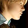
this: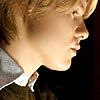
to this: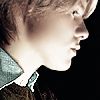
Ok, the base:
#1. I duplicated the layer and sharpened the top layer once, which left me with:
Blergh! I didn't like it... except that it made the pattern of the collar of the button down shirt under his sweater stand out (omgbuttondownshirt!kink) so I erased everything from the top layer except the visible collar and merged down, leaving me with:
Subtle, but necessary. (Note: as we know erasing can kill the eyes, what I like to do is duplicate the bottom layer again, desaturate it and stick it in between the original layer and the layer I'll be erasing bits from. The color contrast is helpful and then I delete the desat. layer before merging)
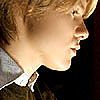
#2. I set an oval brush to apprx. 10px, set it to the Sharpen Tool at strength 15% and carefully ran it over Randy's hair to help the texture stand out. I then use the Blur Tool (also using an oval brush set to apprx. 7px, strength 20%) and blurred out his skin. Careful on the nose! And avoid the area around the eyes and lips. I don't use the Smudge Tool to do large areas of skin, because I feel it gives an artificial look, however for the area around the lips and eyes I tend to use the Smudge Tool set to strength 10% and carefully smooth those areas. The result is a soft, porcelainy skin look without the risk of blurring out the eyes/lips with the Blur Tool. (I hope that made sense). So that leaves us with our base:

Again, it's all very subtle, but enhances the quality nicely IMO.
#3. Next I added this gradient:

to a new blank/transparent layer, erased everything except the visible parts of the collar (again) and set it to Hue 81%; giving me this:
(again, v.v. subtle, I know.)
#4. I then added this gradient:

to a new blank/transparent layer and set it to Vivid light, 68%.
#5. Then, of course, I added everyone's very best friend: the exclusion layer. For this icon I used #072952, set to 82%

#6. I then moved the collar only layer (from step #3) above the layers from steps #4 and #5. I then duplicated the base layer twice. On the first layer I adjusted the brightness/contrast to 7 and 33 respectively. I set that layer to Luminosity 90%.
Looks like this:
I desaturated the second duped layer and set it to Color 37%
#7. I added a new blank/transparent layer, filled it with straight up white (#FFFFFF), set it to Color 45%
Review: Your layers should look vaguely like this:

Color 45% (only has a border so it would show up)
Color 37%
Luminosity 90%

Hue 81% (on white background and framed only for visual purposes, as layer it should be transparent other than the blue collar-y part)
Exculsion 82%>
Vivid Light 68%
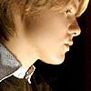
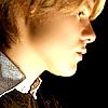
Final base:
This was a coloring tut. so the icon itself is unfinished.
I hope some of this was helpful to someone in some way. I forgot where I got the cap and I believe the gradients are by crumblingwalls, but I'm not 100% sure on that.
this:
to this:
Ok, the base:
#1. I duplicated the layer and sharpened the top layer once, which left me with:
Blergh! I didn't like it... except that it made the pattern of the collar of the button down shirt under his sweater stand out (omgbuttondownshirt!kink) so I erased everything from the top layer except the visible collar and merged down, leaving me with:
Subtle, but necessary. (Note: as we know erasing can kill the eyes, what I like to do is duplicate the bottom layer again, desaturate it and stick it in between the original layer and the layer I'll be erasing bits from. The color contrast is helpful and then I delete the desat. layer before merging)
#2. I set an oval brush to apprx. 10px, set it to the Sharpen Tool at strength 15% and carefully ran it over Randy's hair to help the texture stand out. I then use the Blur Tool (also using an oval brush set to apprx. 7px, strength 20%) and blurred out his skin. Careful on the nose! And avoid the area around the eyes and lips. I don't use the Smudge Tool to do large areas of skin, because I feel it gives an artificial look, however for the area around the lips and eyes I tend to use the Smudge Tool set to strength 10% and carefully smooth those areas. The result is a soft, porcelainy skin look without the risk of blurring out the eyes/lips with the Blur Tool. (I hope that made sense). So that leaves us with our base:
Again, it's all very subtle, but enhances the quality nicely IMO.
#3. Next I added this gradient:
to a new blank/transparent layer, erased everything except the visible parts of the collar (again) and set it to Hue 81%; giving me this:
(again, v.v. subtle, I know.)
#4. I then added this gradient:
to a new blank/transparent layer and set it to Vivid light, 68%.
#5. Then, of course, I added everyone's very best friend: the exclusion layer. For this icon I used #072952, set to 82%
#6. I then moved the collar only layer (from step #3) above the layers from steps #4 and #5. I then duplicated the base layer twice. On the first layer I adjusted the brightness/contrast to 7 and 33 respectively. I set that layer to Luminosity 90%.
Looks like this:
I desaturated the second duped layer and set it to Color 37%
#7. I added a new blank/transparent layer, filled it with straight up white (#FFFFFF), set it to Color 45%
Review: Your layers should look vaguely like this:
Color 45% (only has a border so it would show up)
Color 37%
Luminosity 90%
Hue 81% (on white background and framed only for visual purposes, as layer it should be transparent other than the blue collar-y part)
Exculsion 82%>
Vivid Light 68%
Final base:
This was a coloring tut. so the icon itself is unfinished.
I hope some of this was helpful to someone in some way. I forgot where I got the cap and I believe the gradients are by crumblingwalls, but I'm not 100% sure on that.