tutorial #9
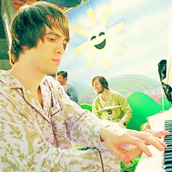
Go from this::

to this::

Made entirely with PSP9, so it should be translatable.
Difficulty: intermediate (if you follow everything exactly), advanced (if you have to manipulate settings to fit your base).
This colouring only works with some types of pictures. More advanced knowledge of program features and effects is needed to modify this tutorial to fit other pictures.
1)Crop your base, and keep it at its original size (unless of course it's *huge* then resize it to about 500x500). This helps us retain quality.
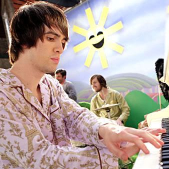
2)Duplicate the background layer and open your histogram settings (ctrl+shift+h) and set them like this and say ok.
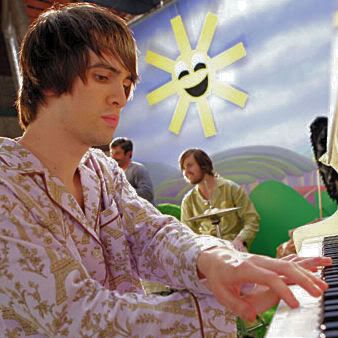
3)Duplicate the layer you just created and set it to screen 100%.
4)Copy merged layers (ctrl+shift+c) then paste as new layer (ctrl+l). Go adjust>>sharpness>>unsharp mask, set to radius:0.75 strength:159 clipping:0 luminance:UNCHECKED! and say ok. Set that layer to 40% opacity.
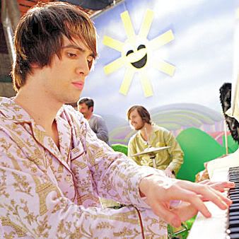
5)Create a new raster layer, fill with #0b2853 and set to exclusion 62%.
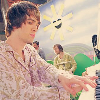
6)Create a new raster layer, paste this gradient by me and set to burn 34% (Hint: use your deform tool to stretch the gradient to fit your image).
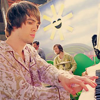
7)Create a new raster layer, paste this gradient by me and set to soft light 30% (Hint: resize to your canvas size again).
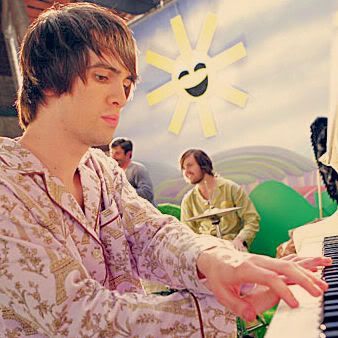
8)Create a new raster layer, fill with #fffcde at 40% opacity (not the layer at 40%, the fill tool at 40%) and set to dodge 12%.
9)Duplicate the previous layer and set to colour (legacy) at 38%.
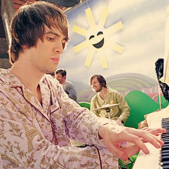
10)Copy the background layer and paste as a new layer on top. Set to screen 52%.
11)Duplicate the previous layer and set to multiply 14%.
12)Duplicate the layer again and set to soft light 42%.
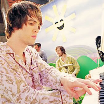
13)Create a new raster layer and fill with #caba9c and set to soft light 100%.
14)Create a new raster layer and fill with #aedcfc and set to burn 70%.
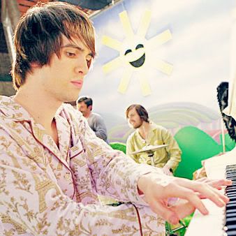
15)Create a new raster layer and fill with #a0a0a0 and set to screen 32%.
16)Create a new raster layer and fill with #070723 and set to exclusion 62%.
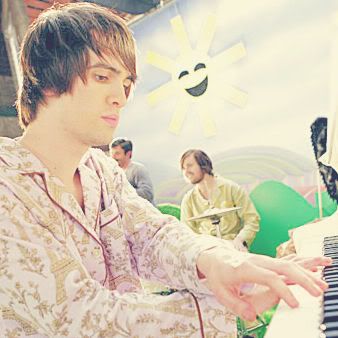
17)Create a new levels adjustment layer. Set your Red channel input to: 0|0.81|255. Set your Green channel input to: 0|1.04|255. Set your Blue channel input to: 0|0.83|240. Say ok.
18)Duplicate the previous levels layer, and set to 52% opacity.
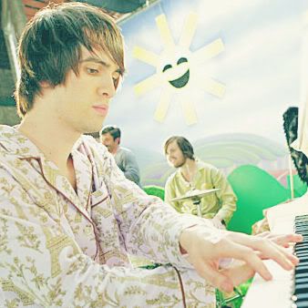
19)Create a new hue/saturation/lightness layer and set the master saturation to 40, say ok.
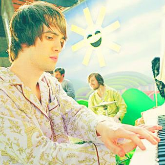
20)Here's the complicated part. Turn off the visibility on the "hue/sat/light" (step 19) layer, the “exclusion" (step 16) layer, the "screen" (step 15) layer, and the "burn" (step 14) layer. (Your layers palette should look like this.) Copy merged (ctrl+shift+c) and paste on top of everything. Set this layer to luminance (legacy) 100%.
21)Create a new raster layer and fill with #3b2b1b and set to exclusion 36%.
22)Create a new raster layer and fill with #f0f0f0. Set it to burn 100%.
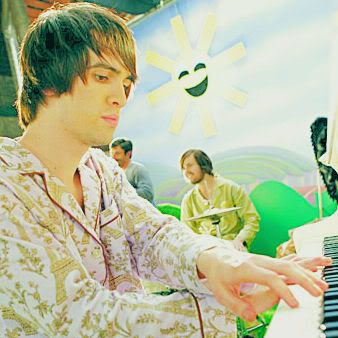
23)At this point, you're pretty much done. If you're making an icon, I'd reccommend to copy merged layers (ctrl+shift+c) and paste on top of everything. Resize to 100x100. Go adjust>>sharpness>>unsharp mask, set to radius:0.50 strength:112 clipping:1 luminance:UNCHECKED! and say ok.

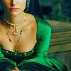
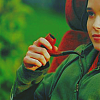
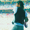
SOME (modified) EXAMPLES!
Note: the first icon was made just as the tutorial suggests, the other two were modified
SOME HINTS!
+ If your icon is too green/blue, you can eliminate either of the two (or both of the) "levels" (step[s] 17/18) layers.
+ If your icon is too dark, increase the opacity of one or more of the following layers: "dodge" (step 8), "screen" (step 10); or decrease the opacity of one or more of the following layers: "multiply" (step 11), "burn" (step 14), "exclusion" (step 21).
+ If your icon is too light, increase the opacity of the "exclusion" (step 21) layer. Also, you could duplicate the "burn" (step 22) layer.
+If you have any questions, please feel free to ask.
+I'd love to see what you can come up with.
+This tutorial was inspired by this amazing tutorial, by 21astound. Except I like colour too much. =D It wasn't really requested, I just enjoy putting up tutorials. xD
+Tutorials are mostly ways to learn different combinations of effects that you may not have experimented with in your program. Take this, make it better, make it you! Adapt it to your own style and kick some butt with your unique icons!
+Share the love.